Creating custom dialogs
A dialog is a popup UI element that contains a header, body and footer, each containing specific types of sub-components. Dialogs also have an instance API and several configuration options, including configurable callback functions for certain dialog events.
| TinyMCE also supports URL dialogs. Configuring a URL dialog is different to configuring a standard TinyMCE dialog. |
Use cases
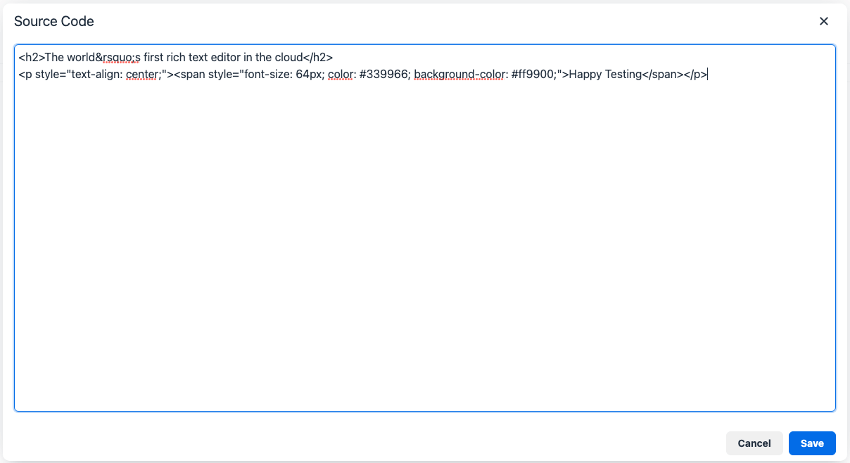
Display basic information
The code plugin’s dialog is an example of a simple dialog. It contains only one body panel component that displays the HTML code from the content.
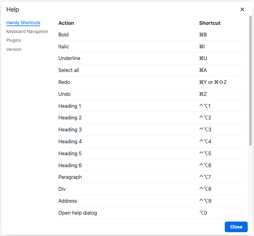
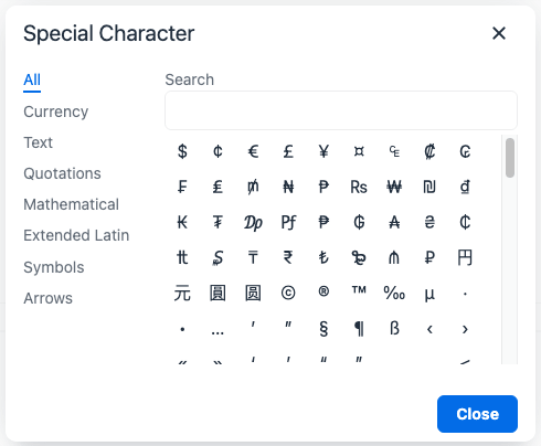
Display complex information
More complex dialogs can use tab panels and various layouts to categorise and organise information displayed to the user. For example, the help and character map plugins use dialogs with tabbed panels to categorise and separate information.
Interactive dialogs
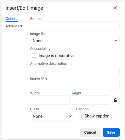
TinyMCE dialogs can also contain interactive components such as buttons, checkboxes and input fields.
For example, the image plugin’s dialog allows for users to link to or upload an image, input a description, title, class, caption, height and width, then insert it into the editor.
Body components
The body of a dialog must be either a panel (a single panel) or a tabpanel (a collection of panels). Each panel can contain panel components such as inputs, buttons and text.
| TinyMCE also supports URL dialogs. Configuring a URL dialog is quite different to configuring a standard TinyMCE dialog. |
Panel
The basic dialog type is a panel dialog. A panel is a container for panel components. A panel type dialog only has one panel.
{
  type: 'panel',
  items: [ ... ] // array of panel components
}
TabPanel
A tabpanel dialog contains multiple panels, and a tab navigation menu on the left-hand side of the dialog to allow for switching between panels. Each panel can contain different panel components, allowing for complex dialogs.
See the tab panel component reference for tab panel configuration options.
{
  type: 'tabpanel',
  tabs: [ // array of tab panel specifications
    {
      name: 'mytab',
      title: 'My Tab',
      items: [ ... ] // array of panel components
    },
    ...
  ]
}
The name of the panel can be used with the dialogApi.showTab('tabName') method to programmatically switch tabs. It is also passed to onTabChange as part of the details object.