Dialog
A dialog is a popup UI element that contains a header, body and footer, each containing specific types of sub-components. Dialogs also have an instance API and several configuration options, including configurable callback functions for certain dialog events.
| TinyMCE also supports URL dialogs. Configuring a URL dialog is quite different to configuring a standard TinyMCE dialog. |
Use cases
Display simple information
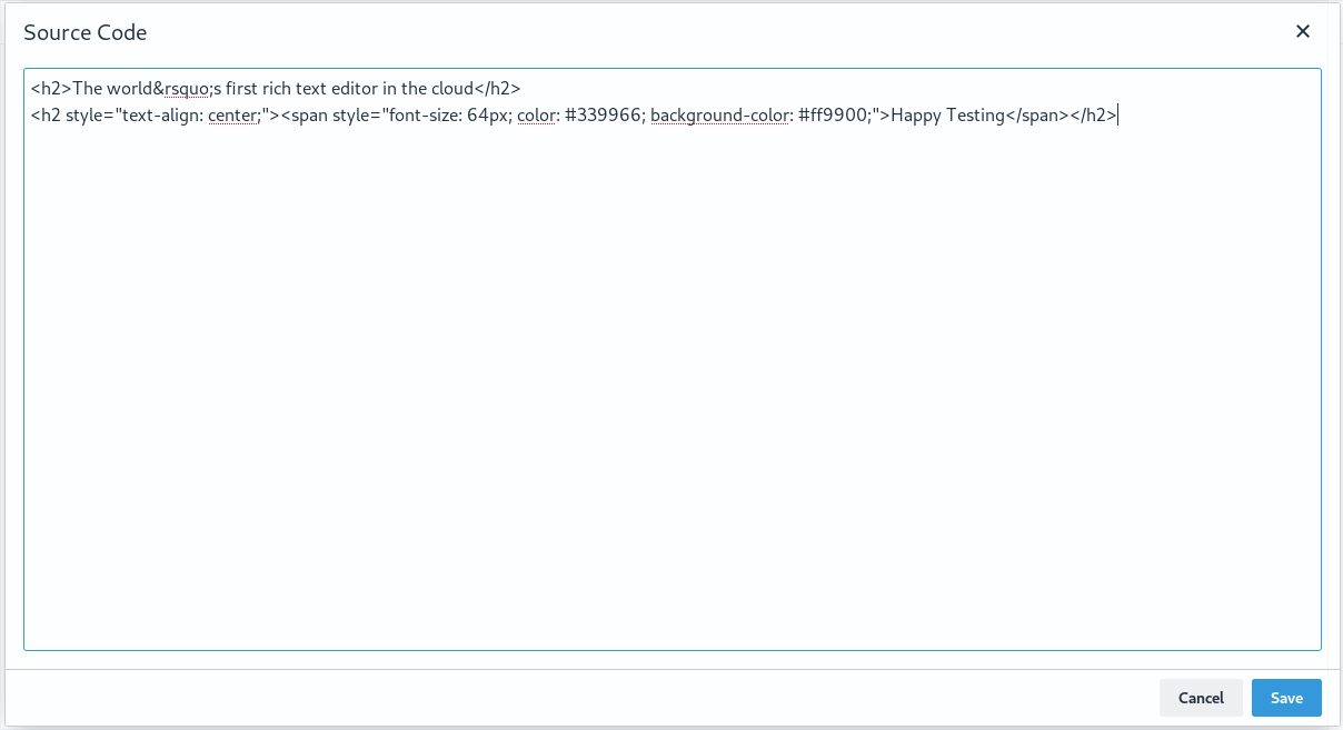
The code plugin’s dialog is an example of a simple dialog. It contains only one body panel component that displays the HTML code from the content.
Display complex information
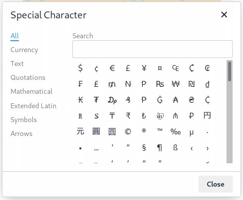
More complex dialogs can use tab panels and various layouts to categorise and organise information displayed to the user. For example, the help and character map plugins use dialogs with tabbed panels to categorise and separate information.
Interactive dialogs
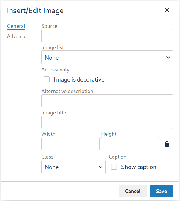
TinyMCE dialogs can also contain interactive components such as buttons, checkboxes and input fields.
For example, the image plugin’s dialog allows for users to link to or upload an image, input a description, title, class, caption, height and width, then insert it into the editor.
Dialog configuration
A dialog configuration has three main parts to match the three main parts of the dialog’s UI:
-
Title: The title of the dialog. This will display in the header of the dialog.
-
Body: The body of the dialog. The body component can be a panel or a tab panel, which can contain an array of panel components such as buttons, inputs and text.
-
Buttons: An array of footer buttons that are displayed in the dialog’s footer.
Basic example
The configuration for a basic dialog that displays HTML information might look like this:
tinymce.activeEditor.windowManager.open({
  title: 'Dialog Title', // The dialog's title - displayed in the dialog header
  body: {
    type: 'panel', // The root body type - a Panel or TabPanel
    items: [ // A list of panel components
      {
        type: 'htmlpanel', // A HTML panel component
        html: 'Panel content goes here.'
      }
    ]
  },
  buttons: [ // A list of footer buttons
    {
      type: 'submit',
      text: 'OK'
    }
  ]
});
Configuration options
| Name | Value | Requirement | Description |
|---|---|---|---|
title |
string |
required |
The title of the dialog. This will display in the header of the dialog. |
body |
|
required |
The specification for the body component. |
buttons |
|
required |
An array of footer buttons to render in the footer of the dialog. |
size |
|
optional |
default: |
initialData |
object |
optional |
An object containing initial values for the dialog’s panel components. |
onAction |
|
optional |
Function invoked when a user interacts with a |
onSubmit |
|
optional |
Function invoked when a Submit type footer button is clicked. |
onCancel |
|
optional |
Function invoked when the dialog is cancelled. The dialog header’s close button and a Cancel type footer button invoke this function. |
onChange |
|
optional |
Function invoked when the value of an |
onClose |
|
optional |
Function invoked when the dialog is closed. The dialog header’s close button, a Cancel type footer button and the dialog instance API’s |
onTabChange |
|
optional |
This method only applies to tab panel dialogs. Function invoked when the user changes tabs. |
For more information on the dialogApi object that is passed to some of the configuration options, see the dialog instance API documentation.
Event callback functions
Each of the event callback functions - onAction, onSubmit, onCancel, onChange, onClose and onTabChange - are shared between all dialog components that may trigger them. For example, Custom type footer buttons and dialog panel buttons all trigger onAction. Therefore, callback functions that may be triggered by multiple components are passed an object (called details above) that contains the name of the component that triggered the event.
Any callback function that is not passed a details object assumes that the dialog will only contain one component which can trigger it or that it does not matter if the function is triggered by multiple components. For example, onSubmit is only triggered when a user clicks on a Submit type footer button, and TinyMCE assumes that a dialog will only have one Submit type button. In comparison, onCancel and onClose are both triggered by clicking the X button in the top right of a dialog or by clicking a Cancel type footer button. These two buttons have the same functionality, and therefore TinyMCE does not differentiate between them.
Body components
The body of a dialog must be either a panel (a single panel) or a tabpanel (a collection of panels). Each panel can contain panel components such as inputs, buttons and text.
| TinyMCE also supports URL dialogs. Configuring a URL dialog is quite different to configuring a standard TinyMCE dialog. |
Panel
The basic dialog type is a panel dialog. A panel is a container for panel components. A panel type dialog only has one panel.
{
  type: 'panel',
  items: [ ... ] // array of panel components
}
TabPanel
A tabpanel dialog contains multiple panels, and a tab navigation menu on the left-hand side of the dialog to allow for switching between panels. Each panel can contain different panel components, allowing for complex dialogs.
See the tab panel component reference for tab panel configuration options.
{
  type: 'tabpanel',
  tabs: [ // array of tab panel specifications
    {
      name: 'mytab',
      title: 'My Tab',
      items: [ ... ] // array of panel components
    },
    ...
  ]
}
The name of the panel can be used with the dialogApi.showTab('tabName') method to programmatically switch tabs. It is also passed to onTabChange as part of the details object.
Footer buttons
A button is a clickable component that can contain text or an icon. There are three types of buttons (primary, secondary and menu buttons). Primary and secondary buttons will perform an action when clicked, however they are styled differently. Primary buttons are intended to stand out. The color will depend on the chosen skin. Menu buttons will open a menu with more options when clicked, instead of performing an action.
| Dialog footer buttons are different to dialog panel buttons. |
Configuration
| Name | Type | Requirement | Description |
|---|---|---|---|
type |
|
required |
Must be |
text |
string |
required |
Text to display in the button if |
name |
string |
optional |
An identifier for the button. If not specified, the button will be assigned a randomly generated |
icon |
string |
optional |
include::partial$misc/predefinedIconsOnly.adoc[] When configured, the button will display the icon instead of text. |
primary |
boolean |
optional |
default: |
disabled |
boolean |
optional |
default: |
align |
|
optional |
default: |
| Buttons do not support mixing icons and text at the moment. |
Disabling and enabling buttons
To toggle between a button’s disabled and enabled states, use enable(name) or disable(name) from the dialog instance API, where name is the identifier the button was configured with.
Button types and event callbacks
The different footer button types will invoke different callbacks when clicked:
-
A Submit type button will invoke the
onSubmitcallback function provided in the dialog configuration. -
A Cancel type button will invoke the
onCancelandonClosecallback functions. These callback functions are also fired when a user clicks theXbutton in the top right of the dialog. -
A Custom type button will invoke the
onActioncallback function, and pass it the button’snamein thedetailsobject. This allows developers to create a click handler for each Custom type footer button in the dialog. See the Redial example for an example of how to use this. -
A Menu type button will fetch a list of options and display them in a drop-down menu. When a menu button item is clicked, the item
nameis passed to the dialogonActioncallback. For details, see: Dialog menu buttons.
See the dialog configuration options documentation for more information.
Example: Dialog footer button
{
  type: 'submit', // button type
  name: 'submitButton', // identifying name
  text: 'Submit', // text for the button
  // icon: 'checkmark', // will replace the text if configured
  disabled: false, // button is active when the dialog opens
  primary: true, // style the button as a primary button
  align: 'start' // align the button to the left of the dialog footer
}
Dialog menu buttons
A dialog menu button is a drop-down button that can be used to provide a drop-down list of items in a dialog footer.
When dialog menu items are clicked, a dialog onAction callback is triggered. The name of the menu item is passed into the onAction callback.
Clicking on the menu footer button won’t trigger any callbacks and will only open the menu of specified items.
Dialog menu button
The following options can be specified for a dialog menu button:
| Name | Value | Requirement | Description |
|---|---|---|---|
items |
array |
required |
An array of dialog menu items. |
name |
string |
optional |
An identifier for the button. If not specified, the button will be assigned a randomly generated |
text |
string |
optional |
Text to display if no icon is found. |
icon |
string |
optional |
include::partial$misc/predefinedIconsOnly.adoc[] |
tooltip |
string |
optional |
Text for button tooltip. |
Dialog menu items
The following options can be specified for a dialog menu button item:
| Name | Value | Requirement | Description |
|---|---|---|---|
name |
string |
required |
Identifier for the dialog menu item which is passed to the dialog |
type |
string |
required |
The type |
text |
string |
optional |
Text to display if no icon is found. |
value |
string |
optional |
A value to associate with the menu item. |
Example: Dialog footer menu button
buttons: [
  {
    type: 'menu', // button type
    name: 'myMenuButton', // identifying name
    text: 'My Menu', // text for the button
    // icon: 'user', // will replace the text if configured
    disabled: false, // button is active when the dialog opens
    align: 'start', // align the button to the left of the dialog footer
    tooltip: 'This is "My" button.',
    items: [
      {
        name: 'dialogMenuButtonItem1',
        type: 'togglemenuitem',
        text: 'Item 1.'
      },
      {
        name: 'dialogMenuButtonItem2',
        type: 'togglemenuitem',
        text: 'Item 2.'
      }
    ]
  }
]
Dialog instance API
When a dialog is created, a dialog instance API is returned. For example, const instanceApi = editor.windowManager.open(config);. The dialog API instance is also passed to some of the dialog configuration options.
The instance API is a JavaScript object containing methods attached to the dialog instance. When the dialog is closed, the instance API is destroyed.
Dialog API methods
| Methods | Description |
|---|---|
|
|
|
|
|
Calling |
|
Calling |
|
Calling |
|
Calling |
|
Calling |
|
Calling the |
|
Calling |
|
This method only applies to tab panel dialogs. Calling |
Dialog data and state
All dialogs have an internal data store, which is used to track the value and/or state of the dialog’s panel components.
This data store takes the form of a JavaScript object, where the object’s keys are the names of the configured panel components. For example, if a dialog contains a checkbox component configured with name: myCheckbox and the checkbox is not checked then the dialog’s data object will contain { myCheckbox: false }.
The current value of a dialog’s data store can be accessed using the dialog instance API’s getData() function. It can also be set using setData() which will automatically update the relevant components. For example, if you call setData({ myCheckbox: true }) with the previous example, the checkbox would be toggled to checked.
To set initial values for components when the dialog is opened, use the initialData dialog configuration option. For example, you could set the checkbox in the previous example to be checked when the dialog opens by including initialData: { myCheckbox: true } in the dialog’s configuration.
Redial
Redial is a concept that allows developers to replace a dialog’s configuration with a new configuration. This can be used for advanced applications such as:
-
Programmatically changing the information displayed in a dialog while it is open.
-
Changing panel components on user action. For example, updating the options in a
selectboxcomponent based on user input to another interactive component. -
Creating a multipage form where a button leads to the next page.
To redial a dialog, pass a new dialog configuration to the redial() method from the dialog instance API.
| At the moment, Redial does not support partial dialog replacement or the replacement of specific components. Redial must be passed an entire dialog configuration. |
See the redial example for more information on how to use Redial.
Examples
Simple interactive dialog
The following example demonstrates how data flows through the dialog and how buttons are configured. This is an interactive dialog that inserts the name of a cat into the editor content on submit.
-
TinyMCE
-
HTML
-
JS
-
Edit on CodePen
<textarea id="dialog-pet-machine">
  <p>Click on the custom {;} toolbar button</p>
</textarea>
/* example dialog that inserts the name of a Pet into the editor content */
var dialogConfig = {
title: 'Pet Name Machine',
body: {
type: 'panel',
items: [
{
type: 'input',
name: 'catdata',
label: 'enter the name of a cat'
},
{
type: 'checkbox',
name: 'isdog',
label: 'tick if cat is actually a dog'
}
]
},
buttons: [
{
type: 'cancel',
name: 'closeButton',
text: 'Cancel'
},
{
type: 'submit',
name: 'submitButton',
text: 'Do Cat Thing',
primary: true
}
],
initialData: {
catdata: 'initial Cat',
isdog: false
},
onSubmit: function (api) {
var data = api.getData();
var pet = data.isdog ? 'dog' : 'cat';
tinymce.activeEditor.execCommand('mceInsertContent', false, '<p>My ' + pet +'\'s name is: <strong>' + data.catdata + '</strong></p>');
api.close();
}
};
tinymce.init({
selector: 'textarea#dialog-pet-machine',
toolbar: 'dialog-example-btn',
setup: function (editor) {
editor.ui.registry.addButton('dialog-example-btn', {
icon: 'code-sample',
onAction: function () {
editor.windowManager.open(dialogConfig)
}
})
},
content_style: 'body { font-family:Helvetica,Arial,sans-serif; font-size:14px }'
});The dialog in this example contains two interactive components - an input component named catdata and a checkbox component named isdog. These names are used in the initialdata configuration property to set the initial values for these components. In this case, when the dialog loads the input will contain the text initial Cat and the checkbox will not be checked.
The dialog also contains two footer buttons - a submit type button and a cancel type button. Since the dialog’s configuration does not contain an onCancel callback, clicking the cancel type button will just close the dialog. However, the configuration does contain an onSubmit callback that will be fired when the submit type button is clicked.
In the onSubmit callback, the dialog instance API that is passed into the callback is used to call getData(). This function returns the dialog’s data store, from which we are able to get the state of the isdog checkbox and the value of the catadata input. This information is used to construct a sentence which is then inserted into the editor. Finally, close() is called to manually close the dialog.
Interactive example using Redial
Redial can be used to change information that is displayed in the dialog, create a multipage form where the next button loads a new form page, or to re-create the dialog with different components or options.
The following example demonstrates one way of implementing a multipage form dialog using the redial() method. Custom buttons are used to switch between the two pages of the form by calling redial() with the appropriate dialog configuration.
To see the output of the code, click on the TinyMCE tab on the fiddle below.
-
TinyMCE
-
HTML
-
JS
-
Edit on CodePen
<textarea id="redial-demo">
  <p>Click on the custom {;} toolbar button to open a dialog that uses Redial to render a multipage form.</p>
</textarea>
var page1Config = {
title: 'Redial Demo',
body: {
type: 'panel',
items: [{
type: 'htmlpanel',
html: '<p>Redial allows for the contents of a dialog to be replaced with new contents. This can be used to create multipage form dialogs.</p><br/><p>The Next button is initially disabled. When the <strong>checkbox</strong> is checked, the Next button should be enabled.</p>'
}, {
type: 'checkbox',
name: 'anyterms',
label: 'I agree to disagree'
}, {
type: 'htmlpanel',
html: '<p>Pressing the Next button will call redial() to reload the dialog with the next page of the form.</p><br /><p>Press Next to continue.</p>'
}]
},
initialData: {
anyterms: false
},
buttons: [
{
type: 'custom',
name: 'doesnothing',
text: 'Previous',
disabled: true
},
{
type: 'custom',
name: 'uniquename',
text: 'Next',
disabled: true
}
],
onChange: function (dialogApi, details) {
var data = dialogApi.getData();
/* Example of enabling and disabling a button, based on the checkbox state. */
var toggle = data.anyterms ? dialogApi.enable : dialogApi.disable;
toggle('uniquename');
},
onAction: function (dialogApi, details) {
if (details.name === 'uniquename') {
dialogApi.redial(page2Config);
} else if (details.name === 'doesnothing') {
/* this case should never be met as the button is never enabled. */
}
}
};
var page2Config = {
title: 'Redial Demo - Page 2',
body: {
type: 'panel',
items: [
{
type: 'selectbox',
name: 'choosydata',
label: 'Choose a pet',
items: [
{ value: 'meow', text: 'Cat' },
{ value: 'woof', text: 'Dog' },
{ value: 'thunk', text: 'Rock' }
]
},
{
type: 'htmlpanel',
html: '<p>Click done and the dialog will log a message to the console, insert a sentence into the editor and close.</p>'
}
]
},
buttons: [
{
type: 'custom',
name: 'lastpage',
text: 'Done',
disabled: false
}
],
initialData: {
choosydata: ''
},
onAction: function (dialogApi, details) {
var data = dialogApi.getData();
var result = 'You chose wisely: ' + data.choosydata;
console.log(result);
tinymce.activeEditor.execCommand('mceInsertContent', false, '<p>' + result + '</p>');
dialogApi.close();
}
};
tinymce.init({
selector: 'textarea#redial-demo',
toolbar: 'wizardExample',
height: '900px',
setup: function (editor) {
editor.ui.registry.addButton('wizardExample', {
icon: 'code-sample',
onAction: function () {
editor.windowManager.open(page1Config)
}
})
},
content_style: 'body { font-family:Helvetica,Arial,sans-serif; font-size:14px }'
});The example JavaScript code contains two dialog configurations - page1Config and page2Config. The TinyMCE initialization code adds a button to the editor that when clicked calls editor.windowManager.open(page1Config) to open a dialog using the first configuration.
The configuration for the first page of the multipage form contains a description of the form and a checkbox. The checkbox, via the dialog’s onChange() callback function, toggles whether the next button is disabled or enabled. The next button when clicked fires the onAction() callback function, which in turn triggers redial() which will replace the page1Config dialog with the page2Config dialog.
More specifically:
The onChange() callback in page1Config is fired when the checkbox is toggled. It uses enable and disable from the dialog instance API to disable and enable the Next button. The code uses getData() from the dialog instance API to get the state of the checkbox called anyterms (which is true if checked and false if unchecked) and choose enable() or disable() based on its value. It assigns the correct function to a variable, then calls that variable with the component name uniquename to toggle the state of the Next button.
The onAction() callback in page1Config is fired when either of the footer buttons are clicked, since they are both custom type footer buttons. onAction() is passed the dialog instance API and an object containing some data about the change event, including the name of the component that triggered it. This is important since the same onAction() handler is shared across all compatible dialog components. The code checks the name of the component that triggered onAction() and if it is uniquename (the name of the Next button) redial(page2Config) is called. If the component’s name is donothing then the code does nothing.
In page2Config the onAction() callback uses getData() to get the value of the selectbox component, and specifically whether the user has chosen Cat, Dog or Rock. It then constructs a sentence using this value, inserts it into the editor content and calls close() to manually close the dialog.