


Even if you set aside time to read and understand how to make form design stylish, you might find there’s no time left to create a high quality design for your customers. That’s why CSS resources like Bootstrap help when you’re looking for a faster way to get your form inputs completed to a quality standard..
In this guide, you’ll find a side-by-side comparison of the essential Bootstrap input classes, alongside another essential website component for inputs in forms, the TinyMCE rich text editor.
Making use of TinyMCE in your forms can speed up the design stage of your project. It’s reliable components like Bootstrap and TinyMCE that free up time for you to put toward building new features that provide the most value for your customers.
Bootstrap inputs explained
Bootstrap inputs are a useful set of classes provided by the Bootstrap framework. When installed, they give your website a professional style and responsiveness. They're a valuable CSS resource that frees up time, and complements existing website design aesthetics.
Bootstrap inputs also have some capacity for type validation. That’s useful if the Bootstrap input you’re building needs to collect different kinds of data – for example email addresses or numbers.
Bootstrap inputs essential classes
The essential information to know when setting up Bootstrap inputs is which classes to include. The standard Bootstrap input class is form-control, but there are two variations to know about, that provide specific form control style:
- Bootstrap class form-control-sm
- Bootstrap class form-control-lg
These two classes are essentially two different sized Bootstrap inputs for improving your web design. Fitting in alongside the form control class is the useful form-label class, which keeps the label HTML element alongside the input element aligned, and aesthetically pleasing.
The following step-by-step guide provides a demonstration of how these classes look in a demo form and uses TinyMCE as the text editor.
How to add different Bootstrap inputs for comparison
To test out the Bootstrap input classes available, start by configuring Bootstrap.
✏️NOTE: For this demo, you’ll need a text editor like Visual Studio or Sublime Text to create and edit HTML files.
- Start your text editor, and set up a new HTML file as the demo index.html file
- Copy the following starter content into the file:
<!DOCTYPE html>
<html lang="en">
<head>
    <meta charset="UTF-8">
    <meta name="viewport" content="width=device-width, initial-scale=1.0">
    <title>Bootstrap inputs side-by-side</title>
    <style>
        div {
            display: grid;
           padding: 1%;
        }
    </style>
</head>
<body>
    <div>
        <div>
            <label>Input</label>
            <input>
        </div>
        <div>
            <label>Bootstrap Input with form control</label>
            <input>
        <div>
            <label>Bootstrap Input with form control large</label>
            <input>
        </div>
        <div>
            <label>Bootstrap Input TinyMCE textarea</label>
            <textarea>
        </div>
      </div>
</body>
</html>
- Copy the Bootstrap CDN links and add them to the same locations in your HTML file (that is, within the head section, and at the end of the body section):
The first link:
<!DOCTYPE html>
<html lang="en">
<head>
<meta charset="UTF-8">
<meta name="viewport" content="width=device-width, initial-scale=1.0">
<title>Bootstrap inputs side-by-side</title>
<link href="https://cdn.jsdelivr.net/npm/bootstrap@5.3.2/dist/css/bootstrap.min.css" rel="stylesheet" integrity="sha384-T3c6CoIi6uLrA9TneNEoa7RxnatzjcDSCmG1MXxSR1GAsXEV/Dwwykc2MPK8M2HN" crossorigin="anonymous">

<style> And the second:
</div>
	<script src="https://cdn.jsdelivr.net/npm/bootstrap@5.3.2/dist/js/bootstrap.bundle.min.js" integrity="sha384-C6RzsynM9kWDrMNeT87bh95OGNyZPhcTNXj1NW7RuBCsyN/o0jlpcV8Qyq46cDfL" crossorigin="anonymous"></script>
</body>

</html>- With Bootstrap configured, you can now add some Bootstrap classes to style the input section of the demo.
- Add the grid gap-3 to the highest parent div element
- Add the ms-2 class to the second div element
<body>
<div class="grid gap-3">
     <div class="ms-2">
         <label>Input</label>
         <input>
- Save the changes
With these setup steps done, it’s now time to add the Bootstrap input classes, and options, along with TinyMCE for the input comparison. If you need more information on setting up Bootstrap with a WYSIWYG editor, check on the how-to guide, which has more detail on setting up TinyMCE.
Bootstrap inputs and TinyMCE
- Add the following for and type Bootstrap options to the input HTML:
    <div class="grid gap-3">
        <div class="ms-2">
            <label for="bootstrapInputTinyMCE0a">Input</label>
            <input type="email">
        </div>
        <div>
            <label for="bootstrapInputTinyMCE0a">Bootstrap Input with form control</label>
            <input type="email">
        <div>
            <label for="bootstrapInputTinyMCE0a">Bootstrap Input with form control large</label>
            <input type="email">
        </div>
        <div>
            <label for="bootstrapInputTinyMCE0a">Bootstrap Input TinyMCE textarea</label>
            <textarea>
        </div>
      </div>
    </div>
- Add the Bootstrap input form classes:
    <div class="grid gap-3">
        <div class="ms-2">
            <label for="bootstrapInputTinyMCE0a">Input</label>
            <input type="email">
        </div>
        <div>
            <label for="bootstrapInputTinyMCE0a">Bootstrap Input with form control</label>
            <input type="email">
        <div>
            <label for="bootstrapInputTinyMCE0a">Bootstrap Input with form control large</label>
            <input type="email">
        </div>
        <div>
            <label for="bootstrapInputTinyMCE0a">Bootstrap Input TinyMCE textarea</label>
            <textarea>
        </div>
      </div>
    </div>
- Give the textarea element the following id value, which is needed for TinyMCE to initialize on the element:
        <div>
            <label for="bootstrapInputTinyMCE0a" class="form-label">Bootstrap Input TinyMCE textarea</label>
            <textarea class="form-control" id="editor">
        </div>
- Navigate back to the head section of your demo file, and copy the following TinyMCE configuration script tags into the head section:
<title>Bootstrap inputs side-by-side</title>
    <link href="https://cdn.jsdelivr.net/npm/bootstrap@5.3.2/dist/css/bootstrap.min.css" rel="stylesheet" integrity="sha384-T3c6CoIi6uLrA9TneNEoa7RxnatzjcDSCmG1MXxSR1GAsXEV/Dwwykc2MPK8M2HN" crossorigin="anonymous">
    <script src="https://cdn.tiny.cloud/1/add-your-api-key/tinymce/6-dev/tinymce.min.js" referrerpolicy="origin"></script>
    <script>
        tinymce.init({
            selector: "#editor",
            plugins: "advcode advtable autocorrect autolink checklist codesample editimage emoticons image link linkchecker lists media mediaembed powerpaste table tinymcespellchecker",
            menubar: false,
            height: 150,
            width: '100%'
        })
    </script>
💡NOTE: Include your TinyMCE API key within the TinyMCE init script. You can get your FREE API key when you sign up for a TinyMCE account (you can make use of Google or GitHub credentials) and doing so prevents any error messages related to contacting administration or domain names. Your API key also comes with a 14-day free trial of TinyMCE’s Premium plugins.
- Save the changes, and then open the demo file in your browser:
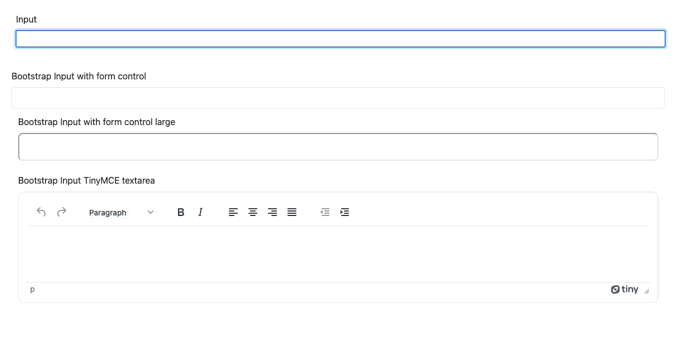
You can see a side-by-side, the design improvements brought about by the Bootstrap input classes. TinyMCE in this demo, based on the Workflow solution, also provides a useful text entry input for longer responses.
✏️NOTE: When TinyMCE initializes, it replaces the textarea element, loading the editor in an iframe. This replaces any styles applied to the textarea. As you can see in this demo, TinyMCE as part of a Bootstrap input is not styled by the form-control class.
More on Bootstrap, inputs, and forms
For more information on creating forms with Bootstrap inputs, check on the how-to guide that covers forms – with Bootstrap and TinyMCE specifically targeting inline inputs – with more grids and password inputs.
If you’d like to see more on how TinyMCE seamlessly changes appearance for a workflow app interface, read through the complete Tutorial that explains how to create a workflow app with TinyMCE.
Contact us if you need any more information about Bootstrap and TinyMCE, and how your website or application can reach your design requirements earlier, giving you more time to refine the features your customers really need.


