


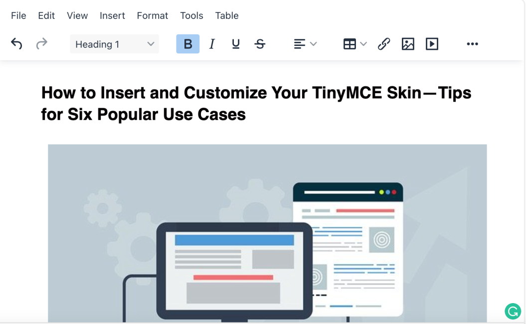
Creating a certain look for a website, makes all the difference to how the viewer perceives and uses what’s on the page. And that’s as true for your customer-facing design, as it is the components that work behind the scenes to create the page.
So, you know the look you want your customer’s to see… but what about the user interface (UI) of your WYSIWYG editor? It should also be engaging, familiar, stylish and in keeping with the design aesthetic you're looking to deliver to your website customers.
But, you’re not a designer. So how can you quickly and easily create the ‘perfect’ editor UI that you want?
One component that is flexible enough to fit your vision is TinyMCE. After setting up TinyMCE for the first time, you might wonder if it’s possible to customize the look and feel of the editor to enhance your UX. Fortunately, it’s easy.
Using TinyMCE’s skin and icon packs and this article, you can learn how to customize your editor’s UI.. It walks through some different looks based on a variety of use cases.
- For more information, check out our comprehensive Premium Skins and Icon Packs documentation.
- You might also be interested in our blog post on configuring TinyMCE toolbar options.
Let’s get started.
Hat tip: This article’s content would not have been possible without the work of Marshall Chikari.
Contents
Looking at TinyMCE skins and icon packs
Testing TinyMCE Skins and Icons
What TinyMCE Skins and Icons are available?
How to customize skins for different situations
Content Management System (CMS) skin customization
Email and Messaging Platform skin customization
Document Management System (DMS) skin customization
Customer Relationship Management (CRM) System skin customization
Workflow and Collaboration Platform skin customization
Learning Management System (LMS) skin customization
Looking at TinyMCE skins and icon packs
When it comes to achieving your desired UI and UX, Tiny’s Premium Skins and Icon Packs have been designed to be easy to insert and customize. They’re available with the Professional Plus and Flexible Pricing Plans.
With a FREE API key, that’s available when you set up and log into your TinyMCE account for the first time, you can access 14 days free use of TinyMCE’s Premium Skins and Icon Packs.
You can try out TinyMCE’s skins and icons right away in the following demo:
Testing TinyMCE Skins and Icons
-
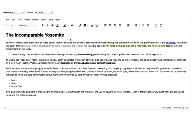
Paste the following code into the TinyMCE init script. These options activate the “snow” skin and icons. Three new skins were released at the same time as TinyMCE 5.2, and the snow skin is one of those:
<script type="text/javascript">
tinymce.init({
//skipped for brevity…
   skin: "snow", //Add these two options
   icons: "thin"
});
</script>-
Observe the changes to the Demo. The following Demo already has the skins and icons added in:
The Snow skin and icons are just one of the many skin and icon packs available for you to try out.
Insert Skins and Icons into your TinyMCE init script to change its appearance using the skin option, and the icons option.
What TinyMCE Skins and Icons are available?
You can check out our documentation for the full range of Tiny MCE skins and icons. There’s also an overview of our classic skins and icon packs in a previous blog post.
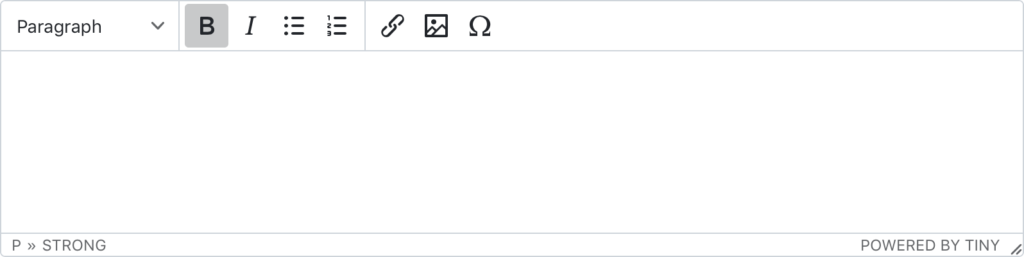
The “naked” skin
The naked skin completely removes the outside borders as well as the borders separating the toolbar, menubar and statusbar. It’s been designed so you can use it with your own custom editor frame where you want a clean and simple text input experience, such as chat or comments.
How to configure the skin:
<script type="text/javascript">
tinymce.init({
   selector: "textarea",
   skin: "naked"
});
</script>Here’s a live example:
The “outside” skin
The outside skin completely removes the outside borders, but provides a thin border around the editable area. Like the naked skin, this one is designed for a clean and simple text input experience for chat or comment applications.
How to configure the skin:
<script type="text/javascript">
tinymce.init({
   selector: "textarea",
   skin: "outside"
});
</script>Here’s a live example:
The “bootstrap” skin
The bootstrap skin closely follows the default Bootstrap design, especially the dialogs and buttons.
|
See our comprehensive blog post about how to enhance Bootstrap forms with our WYSIWYG editor. The following is a demo you can explore: |
The “material classic” skin
The material classic skin is based on the classic Material Design system. Here’s an example form built using the classical Material Design web components, and TinyMCE configured with the material classic skin and material icon pack. Also check out the material outline skin. Check it out in the demo:
The “fabric” skin
The fabric skin follows the Microsoft Fabric UI, allowing you to build experiences that fit seamlessly into a broad range of Microsoft products. By default, it has no border around the editor to make it easier to implement as a full screen editor, but you can create one of your own.
See the demo here:
The “borderless” skin
The borderless skin removes the outer border from the default editor, allowing you to wrap TinyMCE in your app. It’s a great option for fullscreen use. Check out the borderless skin demo in the TinyMCE documentation.
How to configure Icon Packs
Again, configuring TinyMCE icons is as easy as adding one line of code. For example, to configure TinyMCE with the small icons, add icons: "small" to the init script.
Available values for icon packs:
- material – designed for use with the material skins
- small – designed for more compact scenarios, where horizontal space is limited (plus a small skin to match)
- jam – based on the popular open source Jam icon library (plus a jam skin to match)
- thin – designed for our new, lightweight snow skin
You can pretty much mix and match all of the skins and icon packs, but there are a few exceptions. Here’s a useful compatibility matrix.
Here’s an example of the jam skin and icons combo:
Icons packs not loading?
If you’ve configured your icons, but they’re not showing up in the editor interface, it may be caused by bundling issues. To correct the issue, try manually bundling the icons JS with the TinyMCE JS:
-
Bundle the icons JavaScript with the TinyMCE JavaScript:
cat tinymce.min.js icons/default/icons.min.js > tinymce.full.min.js-
If you’re using a module loader, include the following:
import 'tinymce/icons/default`-
Save the changes, and test out the icon packs to make sure they load. Find out more on the TinyMCE GitHub.
Customizing TinyMCE Skins
To change the TinyMCE skin and customize the editor appearance, create a copy of the underlying Less format files that compile to create the TinyMCE skins, and modify the copy as needed.
|
Note: It’s important not to edit the less format files you can find inside the TinyMCE source directory. The goal is to create a new .less file with your custom skin. |
Follow these steps to customize your TinyMCE skin:
-
Download the latest version of TinyMCE from the TinyMCE source code
-
Install yarn if you have not already since it’s used to build and test TinyMCE custom skins:
yarn install-
Change into the directories within the source code, navigating through to the modules/oxide/src/less/ folder. You should see the following folders:
theme;
skins;
-
Change directories into the /skins/ui/
-
Create a new directory for your custom skin:
mkdir new/-
Copy the contents of the default folder found in the ui/ directory into your new skins folder:
cp -r /default/ /path/to/new/-
In your new skin folder (“new/”) open the skin.less file in a text editor, and make any customization changes to the content of the file. For example:
@import 'src/less/theme/theme';
//
// Place your variables here
//
@background-color: blue;-
Save the changes when complete
-
It’s helpful to see changes you make to your skin as they happen, so start a build server by changing back into the modules/ folder and using the yarn start command, which then means you can access TinyMCE on the localhost address (http://localhost:3000):
cd /path/to/modules/
yarn oxide-start-
Open TinyMCE from the yarn start command in the browser, and select your new skin from the menubar to switch it on. For example:
How to customize skins for different situations
Now that you’ve set up new skin, you can customize it further. You can make adjustments based on the specific, custom skin you need. Use the following block of code in every skin.less file for the custom skins.
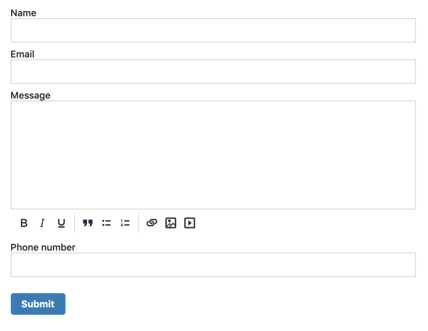
Content Management System (CMS) skin customization
TinyMCE works well for different kinds of CMS platforms.
-
Create a folder under modules/oxide/src/less/skins/ui/ named cms.
-
Change into the two folders, and create two files called content.less and skin.less.
-
Inside cms/content.less, add the CSS below:
@import 'src/less/theme/content-ui';
body {
  background-color: #fff;
  margin: 0 50px;
}

body img {
  height: 350px;
  object-fit: cover;
  object-position: center;
  width: auto;
}-
Save the changes, and test out the CMS custom skin:
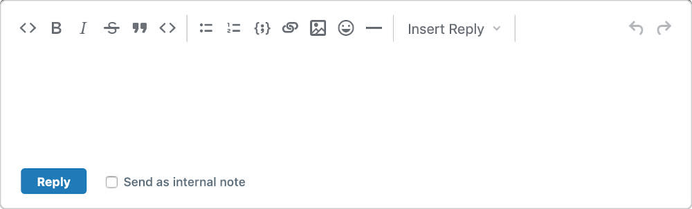
Email and Messaging Platform skin customization
For an Email or messaging platform, TinyMCE can provide a powerful solution.
-
Create a new skin folder and name it email
-
Include two files, content.less and skin.less
-
Add the code below inside emails-and-messages/content.less
@import 'src/less/theme/theme';

textarea {
  background-color: #fff;
  border: 1px thin lightgrey;
  border-radius: 15px;
  color: #131339;
  font-size: 15px;
  margin: 80px;
  padding: 5px;
}


html {
  background-color: rgb(230, 230, 230);
}-
Save the changes, and test out the skin by restarting yarn, and loading the skin in the browser:
Document Management System (DMS) skin customization
With TinyMCE, you can configure your editor so that it provides a reliable DMS experience.
-
Create another folder under modules/oxide/src/less/skins/ui/ named dms
-
Create two files called content.less and skin.less.
-
Add the CSS style below in the dms/skin.less file:
@import 'src/less/theme/theme';

html {
  background: lightgrey;
  min-height: 100%;
}

body {
  background-color: #fff;
  box-shadow: 0 0 4px rgba(0, 0, 0, .15);
  box-sizing: border-box;
  height: 860px;
  margin: 1rem auto;
  max-width: 620px;
  padding: 20px !important;
}-
Save the changes, and test out the new skin:
Customer Relationship Management (CRM) System skin customization
TinyMCE can change into a CRM to help manage customer relationships more efficiently.
-
Create a crm/ file
-
Create a content.less and skin.less file
-
Add the following code inside your custom skin.less file:
@import 'src/less/theme/theme';

body {
  background-color: #fff;
  border: 2px thin rgb(76, 75, 75);
  border-radius: 15px;
  color: #131339;
  font-size: 15px;
  margin: 80px;
  padding: 5px;
}

html {
  background-color: rgb(255, 255, 255);
}Save the changes, and test out the CRM skin:
Workflow and Collaboration Platform skin customization
A workflow and collaboration platform is vital for delivering projects on time. TinyMCE can change for this case, and provide a streamlined collaborative experience:
-
Create workflow/ file
-
Change into the workflow folder, and create a content.less and skin.less file
-
Add the following code inside your custom skin.less file:
@import 'src/less/theme/theme';

body {
  background-color: #fff;
  border: 2px solid lightgrey;
  border-radius: 8px;
  color: #131339;
  font-size: 15px;
  margin: 5px;
  min-height: 50px;
  padding: 5px;
}

html {
  background-color: #f2f2f2;
  padding: 10%;
}

.toolbar {
  display: none;
}

.editor {
  padding: 10px;
}

.label {
  color: #131339;
  font-size: 15px;
  font-weight: bold;
}

.wrapper.enabled .toolbar {
  display: block;
}

button {
  background-color: #1d789c;
  border: none;
  border-radius: 5px;
  color: #fff;
  padding: 10px;
}-
Save the changes, and test out the Workflow skin:
Learning Management System (LMS) skin customization
For learning and teaching, TinyMCE can change to best support teachers and students worldwide with an enterprise-grade LMS.
-
Create a skin folder called lms/
-
Change into the lms/ directory, and create a content.less and skin.less file
-
add the CSS below to lms/content.less:
@import 'src/less/theme/content-ui';

body {
  background-color: #fff;
  margin: 0 100px;
  padding: 30px !important;
}

img {
  height: 250px !important;
  object-fit: cover;
  object-position: center;
  width: auto;
}-
Save the changes, and check on the LMS custom skin in the browser:
What next?
The Premium Skins and Icon Packs are included in Professional Plus and Flexible plans. These plans also grant access to Premium Plugins, such as PowerPaste plugin. For related blog posts explaining more on TinyMCE appearance:
- Customizing the TinyMCE toolbar
- Dark mode for the TinyMCE rich text editor
- Text or treat: TinyMCE’s seasonally spooky skin
For support in customizing skins and icons with TinyMCE, contact us and let us know more about your planned design.


