

Building a CMS in React takes thoughtful planning, especially when deciding on the tools you’ll use for content creation. That’s where TinyMCE fits perfectly. It’s a rich text editor with a dedicated React component, making it easy to add to your project. TinyMCE is easy to integrate, highly customizable, and trusted by industry giants like Microsoft, Shopify, and NASA. With features like markdown support, accessibility tools, and more, it gives you flexibility and control over your editor.
In October, we joined MLH Global Hackweek for Open Source to show developers how to build a CMS with React using TinyMCE and OpenAI. This guide builds on that workshop with a step-by-step walkthrough you can complete in about an hour or two depending on your familiarity with the TinyMCE ecosystem.
We’ll start by exploring six of TinyMCE’s 30+ free plugins, followed by premium options for Content Editing, Compliance, and Workflow & AI. Whether you’re building a blog, a technical documentation platform, or a full-scale CMS, this guide will give you everything you need to create a professional-grade rich text editor.
Prerequisites
Before we dive in, here’s what you’ll need:
- Clone the TinyMCE Github Boilerplate Code: Clone the starter boilerplate from our repository to get up and running quickly.
- A free API key via a TinyMCE Cloud Account: You'll need a TinyMCE API key, which you can obtain by signing up for a free TinyMCE account.
- OpenAI API Account: Sign up for a free OpenAI account and get an API key to enable AI-powered features.
Part One: Setting up TinyMCE in a React project
To get started, we need to integrate TinyMCE into our React project. Below is the step-by-step guide to build a CMS with React and to replace a basic <textarea> with a fully functional WYSIWYG editor.
Step One: Prepare your React project
Before we dive into setting up TinyMCE, ensure your project is running correctly.
If you’re starting fresh or using a starter template:
1. Install dependencies and start development server:
npm install
npm run dev2. Open your browser and navigate to the local development URL (usually http://localhost:3000). You should see a basic page with a <textarea> element.
This component will be the focus of this article. We'll replace it with a fully-featured TinyMCE editor to create a CMS-like text editing experience.
Step Two: Install TinyMCE React integration
Add the @tinymce/tinymce-react package to your project dependencies. This package provides a ready-to-use TinyMCE component for React.
npm i @tinymce/tinymce-reactMake sure the new dependency is added to your package.json:
"dependencies": {
  "@tinymce/tinymce-react": "^5.1.1",
  "react": "^18.3.1",
  "react-dom": "^18.3.1"
}Step Three: Create a TinyEditor component
The TinyEditor component will handle the integration of TinyMCE into your React project. This step involves setting up the editor with basic configuration, including plugins and toolbar options, to provide a functional rich text editing experience.
In your project’s src/components directory, create a new file named TinyEditor.jsx. This file will house the configuration for the TinyMCE editor, making it reusable in other parts of your application and easy to maintain.
import { useRef } from "react";
import { Editor } from "@tinymce/tinymce-react";

export default function TinyEditor() {
  const editorRef = useRef(null);
  return (
    <Editor
      apiKey={import.meta.env.VITE_TINYMCE_API_KEY} // Use your TinyMCE API key
      onInit={(_evt, editor) => (editorRef.current = editor)}
      init={{
        plugins: "wordcount", // Add basic plugin
        toolbar:
          "undo redo | blocks fontfamily fontsize | bold italic underline strikethrough", // Toolbar configuration
      }}
      initialValue="Write your blog post here..." // Initial content for the editor
    />
  );
}
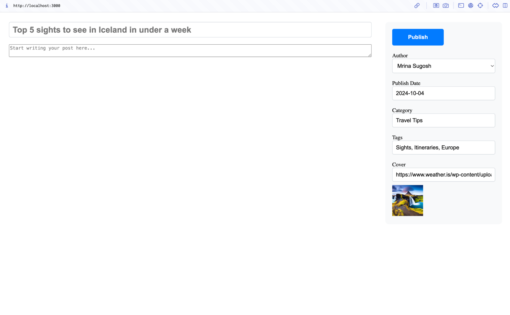
Step Four: Update the blog component
Now, replace the basic <textarea> in your Blog component with the TinyEditor component.
import React from "react";
import TinyEditor from "./TinyEditor";

const Blog = ({ formData, onFormChange }) => {
  return (
    <div className="blog">
      <input
        type="text"
        name="title"
        placeholder="Title"
        value={formData.title}
        onChange={onFormChange}
      />
      <TinyEditor /> //replace this component
    </div>
  );
};

export default Blog;
💡 NOTE: Make sure you have a TinyMCE API key. If you don't have one, you can sign up for a 14-day trial of TinyMCE today, in the cloud or on your own servers. Store your API key securely in a local .env file, and not in your front-end facing files:
VITE_TINYMCE_API_KEY = your - api - key - here;
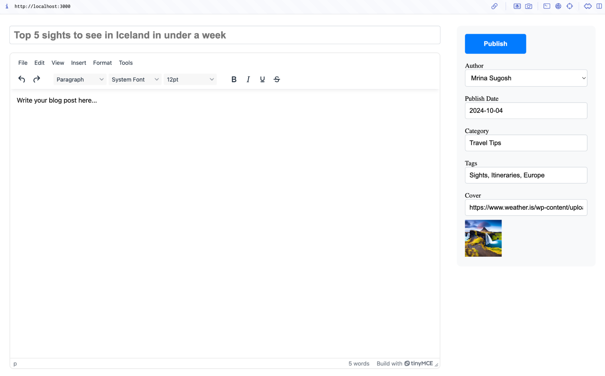
Step Five: Run the application
Restart your development server to see the changes:
npm run devNavigate to your local development URL. The <textarea> will be replaced with a TinyMCE editor, featuring basic tools like undo, redo, bold, and italic.
Part Two: Adding open source plugins to TinyMCE
In the previous step, we set up a basic TinyMCE editor with just the wordcount plugin. Now, let’s take it further by adding more open-source plugins that are available for free and work straight out of the box. These plugins offer developers valuable features like:
- Autolinking
- Special character insertion
- Code sample highlighting
This makes it easy to build a rich and functional CMS editor with minimal effort.
Step One: Add the Code plugin
Let’s start with the Code plugin. This allows users to view and edit the raw HTML behind their content, making it a useful tool for creating and troubleshooting custom layouts or advanced styling within a CMS. With this feature, users can toggle between the WYSIWYG editor and the source code view to make precise changes to the content's HTML structure.
Update the configuration
To enable the Code plugin, update the plugins string and add the code button to the toolbar:
init={{
  plugins: 'wordcount code',
  toolbar: 'undo redo | blocks fontfamily fontsize | bold italic underline strikethrough | code',
}}Run your application, and you’ll see a new "Code" button in the toolbar.
Clicking this button will open a modal dialog displaying the underlying HTML of your content. You can edit the HTML directly, save the changes, and see them reflected in the rich text editor.
Step Two: Add the Anchor plugin
The Anchor plugin allows developers to insert anchors or bookmarks into their content, making it easier to create internal links within a webpage.
Update the configuration
Add anchor to the plugins string and include the anchor button in the toolbar:
init={{
    plugins: 'wordcount code anchor',
    toolbar: 'undo redo | blocks fontfamily fontsize | bold italic underline strikethrough | code anchor',
}}Run your application, and you’ll see a new "Anchor" button in the toolbar. Clicking this button will prompt the user to enter an anchor name, which will be added to the HTML as an anchor ID at the cursor’s position.
This feature is particularly useful in a CMS for creating internal links to specific sections of content, improving navigation and usability for both creators and readers.
Step Three: Add the Autolink plugin
The Autolink plugin automatically converts valid URLs into clickable hyperlinks as users type, saving time and improving usability for content creators.
Update the Configuration
To enable the Autolink plugin, add autolink to the plugins string. Since this plugin works automatically, no toolbar button is needed:
init={{
    plugins: 'wordcount code anchor autolink',
    toolbar: 'undo redo | blocks fontfamily fontsize | bold italic underline strikethrough | code anchor',
}}Run your application, and the Autolink plugin will handle URL detection as you type. For example, typing www.example.com will instantly turn it into a clickable hyperlink.
This plugin is particularly helpful in CMS platforms where users frequently add links to their content, such as blogs, product descriptions, or documentation.
Step Four: Add the Character Map plugin
The Character Map plugin provides a character map dialog, allowing users to easily insert special Unicode characters into their content. This is particularly valuable in a CMS for content creators who need to include unique symbols, accents, or specialized characters, such as currency symbols, scientific notations, or special punctuation.
Update the configuration
To enable the Character Map plugin and customize it for your CMS, configure it as follows:
init={{
  plugins: 'wordcount code anchor autolink charmap',
  toolbar: 'undo redo | blocks fontfamily fontsize | bold italic underline strikethrough | code charmap anchor',
  charmap: [ // Fully customize the character map (optional)
    [0x2615, 'Coffee'], // ☕
    [0x2764, 'Heart'],  // ❤
  ],
  charmap_append: [ // Append additional characters to the default map (optional)
    [0x2600, 'Sun'],    // ☀
    [0x2601, 'Cloud'],  // ☁
  ],
}}How it works
- Default Functionality:
By adding thecharmapplugin and toolbar button, users can open a character map dialog that displays a grid of Unicode characters. Clicking on a character inserts it directly into the content. - Customizing the Character Map:
- Use the
charmapoption to override the default character map entirely. This is useful if your CMS requires specific symbols or limits options to a curated set of characters.
- Use the
Use charmap_append to extend the default map by adding custom characters without removing the built-in options.
For example, a blog post about climate science can include symbols like ± or °C, while an e-commerce CMS can enable quick insertion of currency symbols like € or ¥. By enabling the Character Map plugin, you empower content creators to do their work without needing external tools or manual code editing.
Step Five: Add the Code Sample plugin
The Code Sample plugin allows users to insert syntax-highlighted code snippets into the editor, making it an excellent feature for technical content like tutorials or documentation. By default, it uses Prism.js for syntax highlighting and works out of the box after integrating Prism.js and its styles.
Install Prism.js
Run the following command in your project’s terminal to install Prism.js:
npm install prismjsThis will make sure that Prism.js is available as a dependency in your project for syntax highlighting.
Import Prism.js in TinyEditor.jsx
At the top of your TinyEditor.jsx file, add the following imports to bring in Prism.js and its default styles:
import "prismjs"; // Import Prism.js
import "prismjs/themes/prism.css"; // Import Prism.js default styles
Configure TinyMCE
In the init configuration of your TinyMCE editor (in the TinyEditor.jsx file), update the plugins and toolbar settings as shown below:
init={{
  plugins: 'wordcount code anchor autolink charmap codesample',
  toolbar: 'undo redo | blocks fontfamily fontsize | bold italic underline strikethrough | code charmap anchor codesample',
  ...//ADD configuration for charmap from previous step
  codesample_global_prismjs: true, // Enable Prism.js globally
  codesample_languages: [ // Define supported languages
    { text: 'HTML/XML', value: 'markup' },
    { text: 'JavaScript', value: 'javascript' },
    { text: 'CSS', value: 'css' },
    { text: 'Python', value: 'python' },
    { text: 'Java', value: 'java' },
  ],
}}This step adds the Code Sample plugin to your editor, enables Prism.js, and defines the programming languages supported for code snippets. Now, you can refresh your app, and you'll see the "Code Sample" button in the toolbar. Click it to open a dialog box where you can insert syntax-highlighted code snippets and see them rendered beautifully within the editor.
With this plugin, your CMS editor can become a powerful tool for creating and sharing professional, developer-friendly content.
Step Six: Add the Emoticons plugin
The Emoticons plugin enhances your CMS editor by allowing users to easily insert emoji into their content. It features a dialog accessible via a toolbar button or menu item, as well as an autocomplete feature that lets users insert emoji by typing a colon : followed by at least two characters. This is especially useful for adding personality and visual appeal to content such as blog posts, social media drafts, or casual communication.
Update TinyMCE configuration
To enable the Emoticons plugin, add it to the plugins list and include the button in the toolbar in the TinyMCE Configuration as follows:
init={{
        plugins: 'markdown wordcount code anchor autolink charmap codesample emoticons',
        toolbar: 'undo redo | blocks fontfamily fontsize | bold italic underline strikethrough | code anchor codesample | charmap emoticons',
// add the rest of your configuration
}}Test the Emojis
After refreshing your app, you’ll see a new "Emoticons" button in the toolbar. Clicking it opens a dialog that lets you browse and insert emoji. You can also type : followed by two characters (e.g., :sm) to bring up an autocomplete popup for emoji suggestions.
So far, we explored five powerful open-source plugins (Autolink, Character Map, Anchor, Code Sample, and Emoticons) that can transform your TinyMCE editor into a feature-rich content creation tool. These plugins are just a glimpse of what TinyMCE has to offer. In fact, TinyMCE provides over 30 free plugins that can elevate your editor from great to exceptional, making it the perfect choice for building a robust CMS.
Part Three: Add Premium Plugins to TinyMCE
While we’ve covered six open-source plugins that enhance your editor, TinyMCE also offers a range of premium plugins that work out of the box and can take your editor from great to exceptional. These plugins have advanced functionality designed for professional-grade CMS platforms and enterprise-level use cases.
Content Editing and Management
Modern CMS editors need powerful tools for content conversion and embedding. These seven TinyMCE premium plugins allow users to import, export, and embed various content types with ease, streamlining workflows and enhancing flexibility.
- Markdown: Write in Markdown and automatically convert it to rich text, perfect for developers and technical writers.
- Enhanced Media Embed: Embed rich media like videos and interactive content effortlessly.
- Inline CSS: Apply inline styles for precise control over content appearance.
- Page Embed: Embed entire web pages for interactive or reference purposes.
- Document Converters: Import from Word and export to Word or PDF, simplifying document management.
To get a feel for how these seven premium plugins can elevate your content creation, you can quickly set up your editor with a free trial configuration. Follow these steps to see them work:
Configure your editor
Paste the following configuration into your project to enable premium plugins for content conversion and embedding:
init={{
        plugins: '...markdown media mediaembed inlinecss pageembed exportpdf importword exportword',
        toolbar: 'importword exportword exportpdf | undo redo | blocks fontfamily fontsize | bold italic underline strikethrough | code anchor codesample media pageembed | charmap emoticons',
	//...Add all the configuration for open source plugins in previous steps
        mediaembed_max_width: 450,
	// Contact us for the respective service urls and add them to your .env file
        importword_service_url: import.meta.env.VITE_IMPORTWORD_SERVICE_URL,
        exportword_service_url: import.meta.env.VITE_EXPORTWORD_SERVICE_URL,
        exportpdf_service_url: import.meta.env.VITE_EXPORTPDF_SERVICE_URL,
}}Test the features
Once your editor is configured, refresh your app to explore how each plugin works. Try writing in Markdown and watch it convert to rich text automatically, embed videos or interactive media using Enhanced Media Embed, and apply custom inline styles with Inline CSS. Experiment with Page Embed to insert entire web pages, or manage documents with ease by importing Word files or exporting your content to Word or PDF using Document Converters.
All of the premium features we’ve discussed—Markdown, Enhanced Media Embed, Inline CSS, Page Embed, and more are available as part of TinyMCE’s Essential Plan. While the Document Converters (Import from Word, Export to Word, and Export to PDF) are not included by default in the Essential Plan, they can be added as individual add-ons. Each plugin enhances your editor’s functionality, making it more versatile and user-friendly.
Compliance
CMS editors must also prioritize accessibility, usability, and compliance with global standards. These five premium plugins developed by TinyMCE make content adhere to accessibility and quality standards while quickly adding real value to the editing experience for creators.
- Link Checker: Automatically validates hyperlinks in your content, preventing broken links.
- Accessibility Checker: Ensures your content complies with accessibility standards like WCAG by identifying and fixing issues directly within the editor.
- Advanced Typography: Provides precise control over text styling with advanced features like letter spacing, line height, and text alignment.
- Spell Checker: Detects and highlights spelling errors in real time, ensuring high-quality written content.
- Spelling Autocorrect: Automatically corrects common spelling errors as you type, streamlining the writing process.
To see how these premium plugins can add value to your CMS editor, you can configure and test them using our 14 day free trial of TinyMCE.
Configure your editor
Paste the following configuration into your project to enable these compliance-focused premium plugins:
init={{
        plugins: '... linkchecker a11ychecker typography tinymcespellchecker autocorrect', //...Add all the plugins in previous steps
        toolbar: 'importword exportword exportpdf | a11ycheck typography spellchecker language spellcheckdialog | ... ', // Add the configuration for plugins in previous steps
       //...ADD Additional configuration for plugins in previous steps
        a11y_advanced_options: true,
        a11ychecker_html_version: 'html5',
        a11ychecker_level: 'aaa',
        typography_default_lang:  "en-US",
        spellchecker_languages: 'en_US',
        spellchecker_active: true,
        spellchecker_dialog: true
}}Test the features
Once your editor is configured, refresh your app to see how each compliance plugin works. Use the Accessibility Checker to identify and resolve issues and validate hyperlinks with Link Checker. Try out Spell Checker and Spelling Autocorrect to catch and fix errors instantly. With Advanced Typography, you can easily apply detailed text styling, such as automatically converting "F" to "°F" for accurate formatting.
These plugins give developers and content creators the tools to build accessible, high-quality editors. Link Checker is in the Essential Plan, and the rest are part of the Professional Plan: Accessibility Checker, Spell Checker, Spelling Autocorrect, and Advanced Typography.
Workflow and AI
CMS editors aren’t just about creating accessible and compliant content. They also need to support efficient workflows and smart tools for enhanced productivity. TinyMCE offers several plugins designed to improve your editing workflow. In this section, we’ll focus on Revision History and AI Assistant, two powerful tools available as add-ons in the paid plans (Essential and Professional).
- Revision History: This plugin allows you to track and restore changes made to your content over time. Perfect for collaborative environments, it makes managing multiple edits simple by showing a complete version history.
- AI Assistant: This plugin integrates with most AI providers to bring smart content suggestions, text improvements, and custom prompts directly into your editor. It eliminates the need to switch tabs or tools, keeping everything within the CMS.
Configure your editor
To try out these workflow-focused plugins, paste the following configuration into your project. For a more detailed implementation of Revision History and AI Assistant, check out our guides on How to Set Up and Use Revision History in TinyMCE and How to Integrate ChatGPT with TinyMCE.
export default function TinyEditor() {
const revisions = [
{
revisionId: "3",
createdAt: "2025-01-24T10:11:21.578Z",
content: `
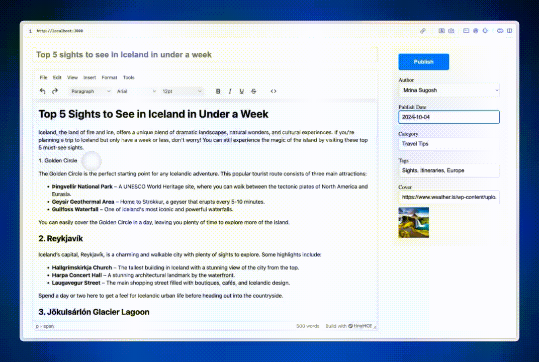
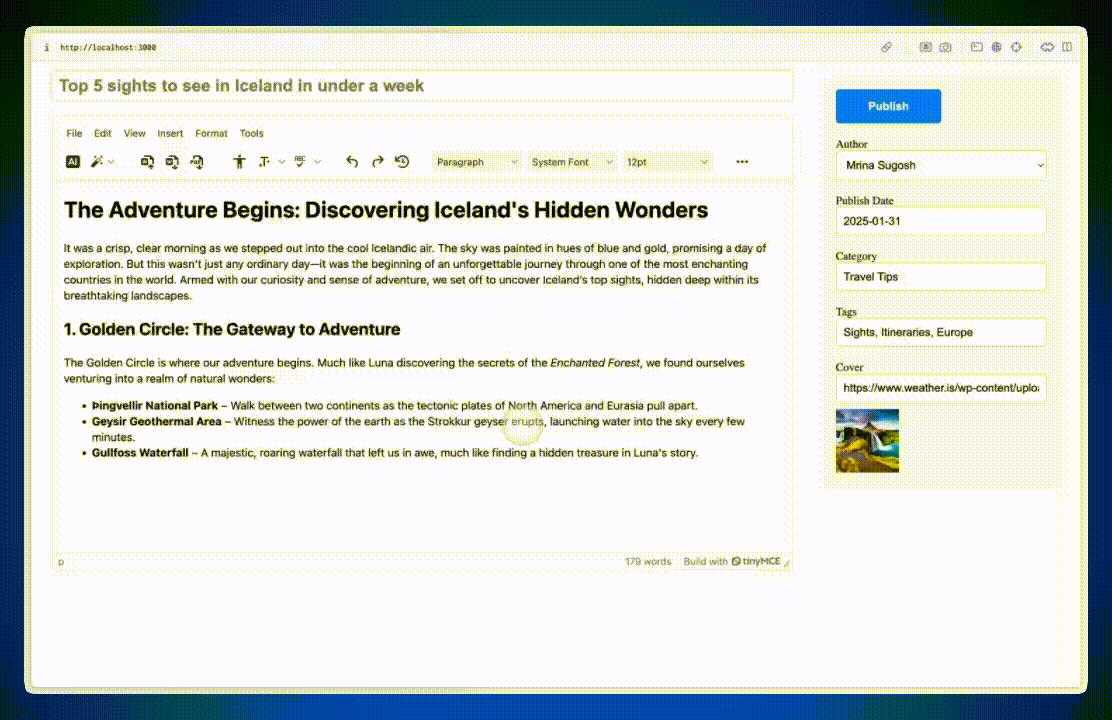
<h1>The Adventure Begins: Discovering Iceland's Hidden Wonders</h1>
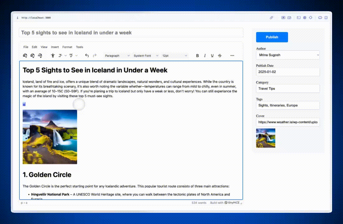
<p>It was a crisp, clear morning as we stepped out into the cool Icelandic air. The sky was painted in hues of blue and gold, promising a day of exploration. But this wasn't just any ordinary day—it was the beginning of an unforgettable journey through one of the most enchanting countries in the world. Armed with our curiosity and sense of adventure, we set off to uncover Iceland’s top sights, hidden deep within its breathtaking landscapes.</p>
<p>Our first stop: the famous <strong>Golden Circle</strong>, a must-see route that includes <em>Þingvellir National Park</em>, <strong>Geysir Geothermal Area</strong>, and the magnificent <strong>Gullfoss Waterfall</strong>.</p>
`,
},
{
revisionId: "2",
createdAt: "2025-01-24T08:30:21.578Z",
content: `
<h1>Reykjavík: A City of Charm and Mystery</h1>
<p>After exploring the wilds of the Golden Circle, we ventured into the heart of Iceland: Reykjavík. This vibrant city offered a perfect blend of history, culture, and modern charm. We marveled at the towering architecture of <strong>Hallgrímskirkja Church</strong>, explored the shimmering <strong>Harpa Concert Hall</strong>, and strolled down <em>Laugavegur Street</em>, savoring Icelandic cuisine and picking up unique souvenirs.</p>
<p>The city was a treasure trove of experiences, much like the glowing stone Luna discovered on her journey.</p>
`,
},
{
revisionId: "1",
createdAt: "2025-01-22T22:26:21.578Z",
content: `
<h1>Jökulsárlón Glacier Lagoon: A Hidden Gem</h1>
<p>Our adventure continued to the southeast coast, where we discovered the breathtaking <strong>Jökulsárlón Glacier Lagoon</strong>. Massive icebergs drifted lazily across the crystal-clear waters, creating a surreal and otherworldly scene. We stood in awe, watching nature at its finest.</p>
<p>Nearby, the <strong>Diamond Beach</strong> sparkled with ice formations, and we couldn’t help but feel like we had stumbled upon a secret wonder, much like Luna uncovering a hidden treasure in the <em>Enchanted Forest</em>.</p>
`,
},
];
const getRandomDelay = () => {
const minDelay = 500;
const maxDelay = 2000;
return Math.floor(Math.random() * (maxDelay - minDelay + 1)) + minDelay;
};
const revisionhistory_fetch = () =>
new Promise((resolve) => {
setTimeout(() => {
resolve(
revisions
.sort((a, b) =>
new Date(a.createdAt) < new Date(b.createdAt) ? -1 : 1
)
.reverse()
);
}, getRandomDelay());
});
const fetchApi = import(
'<a href="https://unpkg.com/@microsoft/fetch-event-source@2.0.1/lib/esm/index.js">https://unpkg.com/@microsoft/fetch-event-source@2.0.1/lib/esm/index.js</a>'
).then((module) => module.fetchEventSource);
// This example stores the API key in the client side integration. This is not recommended for any purpose.
// Instead, an alternate method for retrieving the API key should be used.
const api_key = import.meta.env.VITE_OPENAI_API_KEY;
const ai_request = (request, respondWith) => {
// Implementation in the docs for Streaming response <a href="https://www.tiny.cloud/docs/tinymce/latest/ai-openai/">https://www.tiny.cloud/docs/tinymce/latest/ai-openai/</a>
};
const editorRef = useRef(null);
return (
<Editor
apiKey={import.meta.env.VITE_TINYMCE_API_KEY}
onInit={(_evt, editor) => (editorRef.current = editor)}
init={{
plugins: "... revisionhistory ai",
toolbar:
"aidialog aishortcuts | importword exportword exportpdf | a11ycheck typography spellchecker language spellcheckdialog | undo redo revisionhistory | blocks fontfamily fontsize | bold italic underline strikethrough | code anchor codesample media pageembed | charmap emoticons",
//
revisionhistory_fetch,
ai_request,
}}
initialValue="<h1>The Adventure Begins: Discovering Iceland's Hidden Wonders</h1>
<p>It was a crisp, clear morning as we stepped out into the cool Icelandic air. The sky was painted in hues of blue and gold, promising a day of exploration. But this wasn't just any ordinary day—it was the beginning of an unforgettable journey through one of the most enchanting countries in the world. Armed with our curiosity and sense of adventure, we set off to uncover Iceland’s top sights, hidden deep within its breathtaking landscapes.</p>
<h2>1. <strong>Golden Circle: The Gateway to Adventure</strong></h2>
<p>The Golden Circle is where our adventure begins. Much like Luna discovering the secrets of the <em>Enchanted Forest</em>, we found ourselves venturing into a realm of natural wonders:</p>
<ul>
<li><strong>Þingvellir National Park</strong> – Walk between two continents as the tectonic plates of North America and Eurasia pull apart.</li>
<li><strong>Geysir Geothermal Area</strong> – Witness the power of the earth as the Strokkur geyser erupts, launching water into the sky every few minutes.</li>
<li><strong>Gullfoss Waterfall</strong> – A majestic, roaring waterfall that left us in awe, much like finding a hidden treasure in Luna's story.</li>
</ul>"
/>
);
}
Note: This example code stores the API key for the AI Assistant and data for Revision History on the client side. This approach is only for demonstration purposes and is not recommended for production environments.
Test the features
Once configured, refresh your app to explore these plugins. Open Revision History to view and restore previous versions of your content, ensuring edits are never lost. Use AI Assistant to enhance your workflow by generating suggestions, improving text, or crafting content directly from prompts—all without leaving your editor.
With Revision History and AI Assistant, your CMS editor becomes a more powerful tool for managing content and speeding up workflows.
What’s next?
Whether you're building a CMS for blogs, documentation, or large-scale enterprise applications, the plugins and configurations covered here provide flexibility, ease of use, and professional-grade functionality. If you want to learn more about how to build a CMS with React, explore additional plugins, experiment with custom configurations, or watch the full workshop video to gain deeper insights.
Stay updated on new TinyMCE features by visiting our Public Product Roadmap or sharing your ideas on the TinyMCE GitHub Discussions. With TinyMCE, you’re always ready to build powerful, developer-friendly CMS experiences for your users.


