


Autocomplete features are meant to revolutionize the writing process for content creators. It looks effortless on the surface. Writer’s words are matched up with related words or a database of words, and your app predicts what the writer is going to add to their content. In reality autocomplete features can take time, energy, and focus to implement.
There is a faster solution: allow your app's rich text editor to handle the autocomplete feature. Sounds shocking, but it's an economical and fast solution. Just make sure
you select a rich text editor which can provide with a familiar UI, an easy-to-implement set of content creation solutions, as well as the capacity to provide an autocomplete feature.
TinyMCE provides all this, as well as the ability to be customized to fit your application requirements. This article explains the Autocompleter feature available in TinyMCE, as well as how to set it up.
What is autocomplete
Autocomplete is a feature where the application the writer is using predicts the rest of a word as it's being typed into a keyboard and entered into the text area on screen. Autocompletion is commonly seen in search engines, and aims to save time by completing the search query, or suggesting options based on the initial text entered into the search engine.
NOTE: The search engine variation of the autocomplete feature is also called autosuggest, search-as-you-type, or query suggestions.
Autocomplete is either enabled by default, or the writer can access the autocomplete feature with a key or key combination when typing, such as pressing the tab key.
How does autocomplete work in modern apps
Autocomplete in large scale applications is based on prediction. Back in the 1990s, the early ancestors of autocomplete features (letter anticipators and word completers) first appeared, such as the work by John J. Darragh and Ian H. Witten on predictive text. The essentials of the predictive algorithms initially proposed in letter anticipators and word completers grew with each iteration over the decades.
Later, in 2004, developer Kevin Gibbs brought about the Google search engine implementation of an autocomplete feature.
The autocomplete features of today are now trained on searches completed worldwide, and on large bodies of language. The autocomplete software calculates and displays the next most probable words based on the writer's input and the large training content set as the foundation. The words the writer has used recently, and the words used frequently also affect the probability weighting.
Autocomplete features and TinyMCE
TinyMCE's Autocompleter works using matched text patterns. The text pattern is matched to data returned by a JavaScript promise. A trigger character causes the fetch function to run, and the matched text the writer types after the trigger character is collected and passed to the fetch function. The function returns a promise that contains the matched results found in the list of options.
A rich text editor with an autocomplete feature
There is a specific Autocompleter API available in TinyMCE that handles autocompletion. It makes use of a number of options, some are required, like the onAction option, and others are not required, but change the appearance, or the user experience such as the maxResult functions (this limits by the number of results that should be fetched based on the writer’s input).
NOTE: If using an earlier version of TinyMCE before 6.2, use the ch option. Versions after this release should use the trigger option. You can check your TinyMCE version in the dashboard of your TinyMCE account, by checking the TinyMCE CDN link, or using the tinyMCE.majorVersion command in the developer console.
How to implement autocomplete feature in TinyMCE
-
Start the demo by making a new index.html file in your development environment
-
Copy the following started HTML into the file, which has a textarea set up for TinyMCE:
<!DOCTYPE html>
<html lang="en">
<head>
<meta charset="UTF-8">
<meta name="viewport" content="width=device-width, initial-scale=1.0">
<title>Autocomplete feature in TinyMCE</title>
</head>
<body>
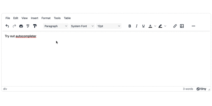
<textarea id="editor">
<div class="editable">Try out autocomplete</div>
</textarea>
</body>
</html>-
Configure TinyMCE into the demo using the CDN link to TinyMCE cloud:
<!DOCTYPE html>
<html lang="en">
    <head>
        <meta charset="UTF-8">
        <meta name="viewport" content="width=device-width, initial-scale=1.0">
        <title>Autocompelte Test 1 TinyMCE</title>
<script src="https://cdn.tiny.cloud/1/your-api-key/tinymce/6/tinymce.min.js" referrerpolicy="origin"></script>-
Replace the "your-api-key" string with your TinyMCE API key. You can sign up for a FREE TinyMCE API key using your GitHub or Google account, and your key comes with a 14-day free trial of TinyMCE's premium plugins (it also prevents any domain name errors appearing in the console).
-
Copy the following TinyMCE init script into your demo file:
<script>
            tinymce.init({
                selector: '#editor',
                plugins: 'advcode, advlist, advtable, anchor, autosave, autolink, checklist, directionality, editimage, export, formatpainter, image, insertdatetime, link, linkchecker, lists, media, mediaembed, nonbreaking, pagebreak, permanentpen, powerpaste, searchreplace, table, tableofcontents, tinymcespellchecker, visualblocks, wordcount',
                toolbar: 'undo redo print spellcheckdialog formatpainter | blocks fontfamily fontsize | bold italic underline forecolor backcolor | link image | alignleft aligncenter alignright alignjustify lineheight | checklist bullist numlist indent outdent | removeformat',
                editable_root: false,
                editable_class: 'editable',
                setup: (editor) => { }
-
Add the autocompleter with the editor registry parameters within the setup option. The following gives the autocompleter a name and sets up the required options:
setup: (editor) => {
                    editor.ui.registry.addAutocompleter("Demo-0", {
                        trigger: '/',
                        minChars: 1,
                        columns: 'auto',
                        onAction:
                    })
                  }
-
Add the autocompleterAPI options to complete setting up the onAction option:
setup: (editor) => {
  editor.ui.registry.addAutocompleter("Demo-0", {
    trigger: "/",
    minChars: 1,
    columns: "auto",
    onAction: (onAction = (autocompleteApi, rng, value) => {
      editor.selection.setRng(rng);
      editor.insertContent(value);
      autocompleteApi.hide();
    }),
  });
};
-
Configure the fetch option, including the Promise option. The promise option contains two important constants that the autocompleter needs to filter the matched characters:
setup: (editor) => {
  editor.ui.registry.addAutocompleter("Demo-0", {
    trigger: "/",
    minChars: 1,
    columns: "auto",
    onAction: (onAction = (autocompleteApi, rng, value) => {
      editor.selection.setRng(rng);
      editor.insertContent(value);
      autocompleteApi.hide();
    }),
    fetch: (pattern) => {
      return new Promise((resolve) => {
        {
          const getMatchedChars = (pattern) => {
            return specialChars.filter(
              (char) => char.text.indexOf(pattern) !== -1
            );
          };
          const results = getMatchedChars(pattern).map((char) => ({
            type: "autocompleteitem",
            value: char.value,
            text: char.value,
            icon: char.value,
          }));
        }
      });
    },
  });
};
-
Add the resolve method to complete the promise:
setup: (editor) => {
  editor.ui.registry.addAutocompleter("Demo-0", {
    trigger: "/",
    minChars: 1,
    columns: "auto",
    onAction: (onAction = (autocompleteApi, rng, value) => {
      editor.selection.setRng(rng);
      editor.insertContent(value);
      autocompleteApi.hide();
    }),
    fetch: (pattern) => {
      return new Promise((resolve) => {
        {
          const getMatchedChars = (pattern) => {
            return specialChars.filter(
              (char) => char.text.indexOf(pattern) !== -1
            );
          };
          const results = getMatchedChars(pattern).map((char) => ({
            type: "autocompleteitem",
            value: char.value,
            text: char.value,
            icon: char.value,
          }));
          resolve(results);
        }
      });
    },
  });
};
-
Copy the following list of options for the autocompleter, pasting it into the demo before the TinyMCE init script:
<script>
            const specialChars = [
               { text: 'exclamation mark', value: '!' },
               { text: 'at', value: '@' },
               { text: 'hash', value: '#' },
               { text: 'dollars', value: '$' },
               { text: 'percent sign', value: '%' },
               { text: 'caret', value: '^' },
               { text: 'ampersand', value: '&' },
               { text: 'asterisk', value: '*' }
             ]
tinymce.init({ ... })-
Save the changes, and then test out the autocompleter by running the demo index.html file in your browser with a testing command such as the Python or PHP options:
Next steps for your autocomplete feature
The autocompleter example here uses only the essential options. There are further ways you can customize the autocomplete feature:
- Changing the direction of the autocompleter window to horizontal or vertical view
- Adding in an image for the autocompleter
- Add more columns to increase the number of choices available
You can keep experimenting with the options available until you find the ideal configuration for your app, and your customers. Sign up for an API key to further test out the different plugins TinyMCE has available.
For more information, contact the TinyMCE Sales team, who can help you find the ideal combination of autocompleter or plugins for your project.


