


Large-scale web apps like Google Analytics, AutoNation, and the University of Utah Health all run on Angular. And like all of these modern web apps, Angular projects often need a powerful rich text editor (RTE).
TinyMCE is a customizable RTE that integrates smoothly into Angular applications in a few steps. In this guide, we’ll walk through how to get TinyMCE 8 up and running in an Angular project, step by step.
Evolved together: TinyMCE 8, Angular 20, and the future of frontend
TinyMCE 8 is a big step forward for Angular projects that need a feature-rich RTE. TinyMCE’s switch to ES module–based plugins aligns with Angular 20’s esbuild-powered build pipeline and esm2022 output. This makes it easier to import exactly the features you need while bundles stay lean and performant.
TinyMCE 8 also dropped legacy support for browsers like IE11, moving into the future with stronger and more modern JavaScript syntax. Because Angular 20 now also defaults to modern JS output with fewer polyfills and no more older JS targets like es5 or es2015, both TinyMCE and Angular work in the same syntax and modern environment. This means quicker load times and faster Angular and TinyMCE applications.
One dreamy compatibility progression in Angular 20 for TinyMCE 8 is easier standalone component integration. Thanks to Angular 20 scrapping ngModule and creating a more modular component structure, it’s easier to embed TinyMCE in an Angular app as a self-contained component. Combine this with TinyMCE 8’s flexible plugin architecture, and Angular developers get a modern editor integration that feels purpose-built for speedy frontend stacks.
Step one: Install Angular CLI
It’s quick and painless to install Angular CLI, a command-line tool that lets you scaffold, develop, and build Angular projects. Let’s jump right in.
Prerequisites
To install Angular CLI and work on the Angular project in this guide, you’ll need:
- Node.js: If you don’t already have Node.js you’ll need to download and install it so you can run Node Package Manager (NPM) commands.
- A TinyMCE API key: To integrate a robust rich text editor into your Angular app, you’ll need a TinyMCE API key. If you don’t already have one, you can get a free 14-day TinyMCE API key with all the premium features, cloud or self-hosted.
Install Angular CLI
Angular CLI is a command line tool that lets you deploy, create, and edit Angular projects. Install it via NPM in the directory where you’ll build your Angular project:
npm install -g @angular/cli@20To verify that Angular is installed in your environment, run ng version.
Step two: Create an Angular project
You can use Angular CLI to create a new Angular project with this command:
ng new angular-tinymce-demoWhen you create a new project, Angular CLI will ask three questions:
- If you want to create a zoneless app:
- The answer is Yes. This will create a faster app and is a new project setup question as of Angular 20.
- To choose a CSS style:
- For this guide, you can choose basic CSS.
- If you want to enable Server-Side Rendering (SSR) and Static Site Generation (SSG/Prerendering):
- The answer is No. You want the app to render on the client side to create a faster render.
Build and run the Angular project
Now it’s time to build the project’s dependencies and see the sample app locally. In the console, you’ll cd into the angular-tinymce-demo folder in the CLI, and launch the Angular app with this command:
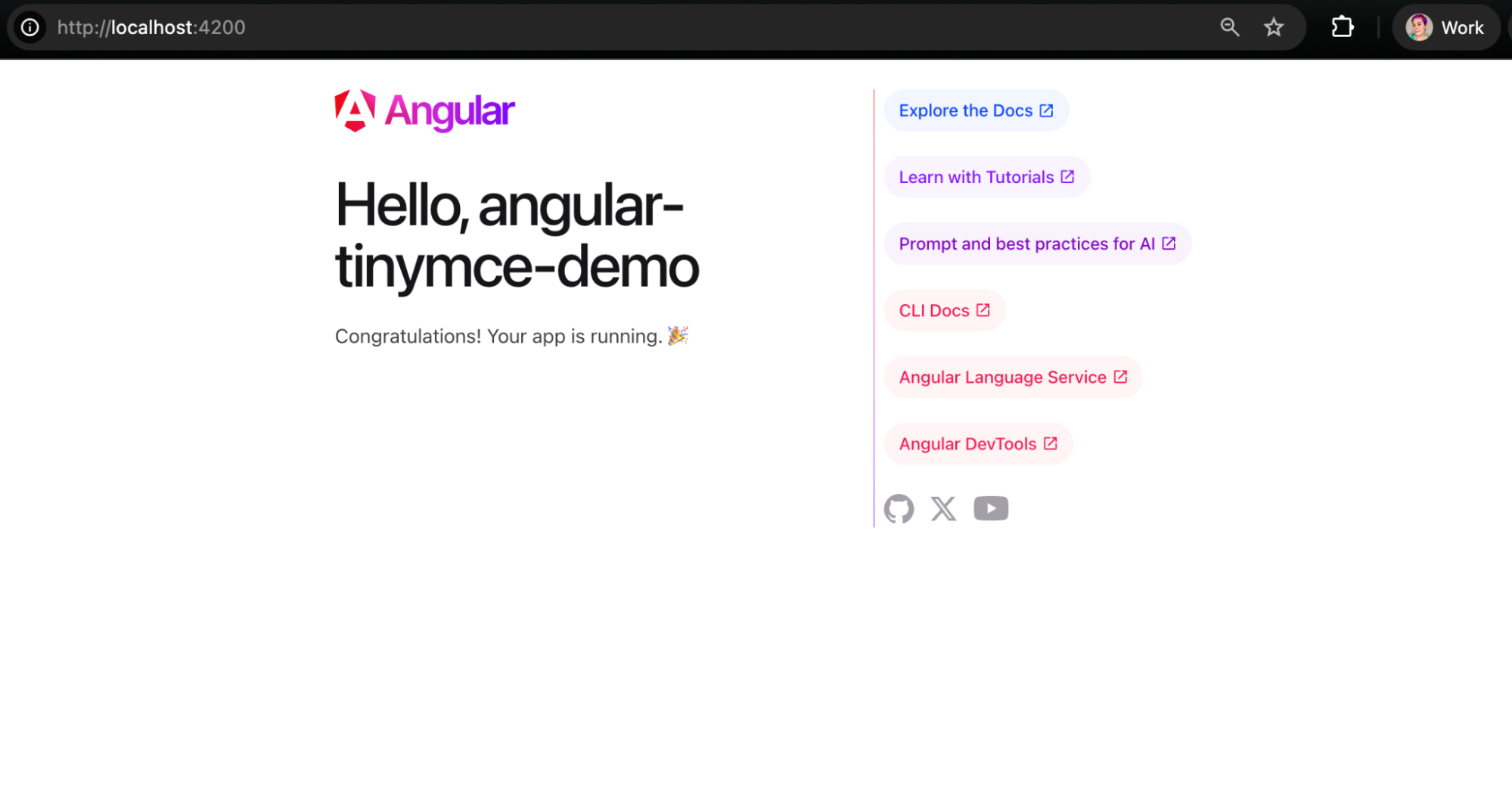
ng serveThis will launch the app to localhost:4200, where you can see the Angular app you just built. You can leave the app running, and you won’t have to rebuild it to see your changes. Just refresh the browser instance.
Your Angular app will look like this:
Step three: Add a rich text editor to the Angular project
Now it’s time to add a robust rich text editor to your Angular app. To get started, you’ll install the TinyMCE Angular wrapper via NPM:
npm install --save @tinymce/tinymce-angularAdd EditorModule to app.ts
Now that TinyMCE is installed, you’ll bring the rich text editor, known as EditorModule, into src/app/app.ts. Import it at the top of the file and under Component imports.
The default app.ts with TinyMCE’s EditorModule added looks like this:
import { Component, signal } from '@angular/core';
import { RouterOutlet } from '@angular/router';
import { EditorModule } from '@tinymce/tinymce-angular';

@Component({
  selector: 'app-root',
  imports: [RouterOutlet, EditorModule],
  templateUrl: './app.html',
  styleUrl: './app.css'
})
export class App {
  protected readonly title = signal('angular-tinymce-demo');
}Add the editor to app.html
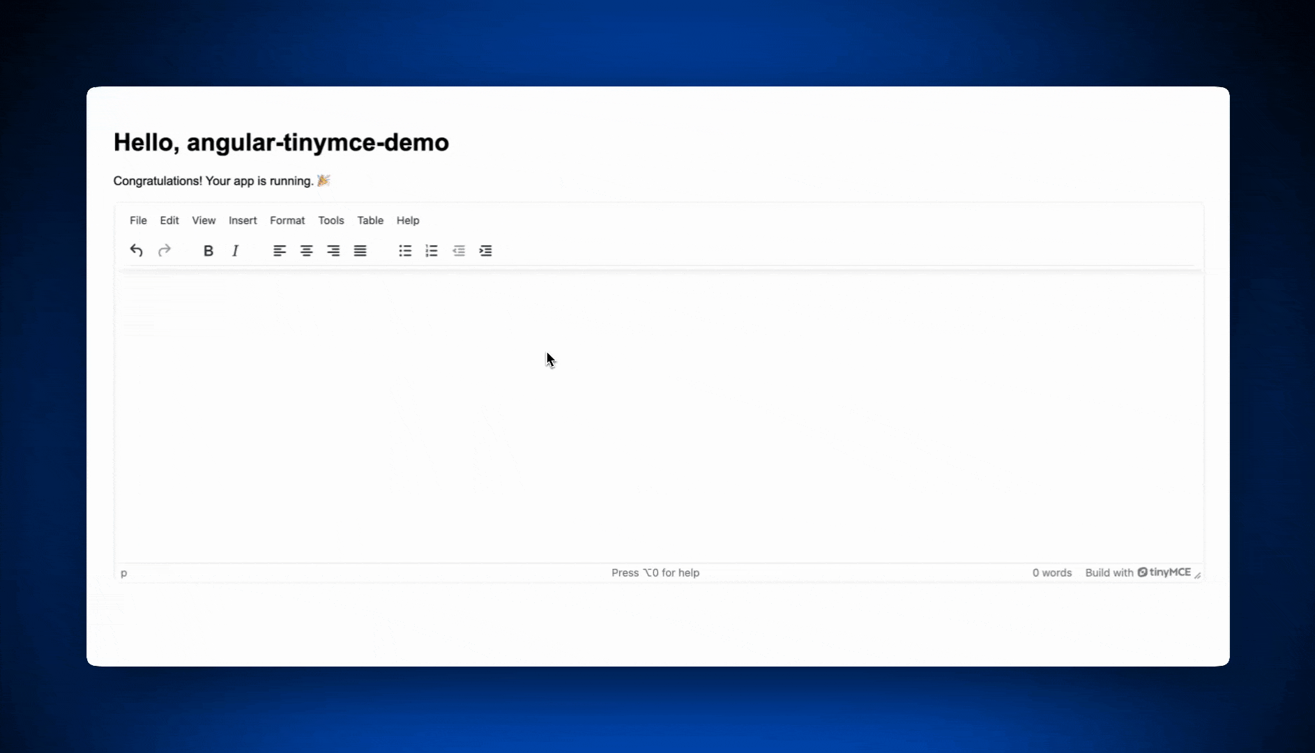
Now that the rich text editor is imported, you will need to add it to app.html so it will appear on the front page of your Angular app.
Replace all of the default app.html with the following code to see TinyMCE in action in your Angular application.
<style>
.main {
  padding: 2%;
  font-family: Arial, Helvetica, sans-serif;
}
</style>

<main class="main">
  <div class="content">
      <h1>Hello, {{ title() }}</h1>
      <p>Congratulations! Your app is running. 🎉</p>
  </div>
  <div>
    <editor
    class="rte"
    apiKey="no-api-key"
    [init]="{
      height: 500,
      plugins: 'lists link image table code help wordcount',
      toolbar: 'undo redo | formatselect | bold italic emoticons | alignleft aligncenter alignright alignjustify | bullist numlist outdent indent'
    }"
  ></editor>
  </div>
</main>

<router-outlet />⚠️ Note: Don’t forget to replace no-api-key with a real TinyMCE API key. If you don’t already have one, you can get a free TinyMCE API key for 14 days, self-hosted or cloud.
Your localhost:4200 instance will refresh automagically in the browser, and you’ll see TinyMCE ready for action! 🎉
Try TinyMCE + Angular for yourself
TinyMCE 8 brings modern, powerful editing capabilities to your Angular apps without adding complexity to your stack. With flexible configuration and painless integration, TinyMCE is a smart choice when you’re looking for a rich text editor. Sign up today to try TinyMCE free for 14 days--cloud or self-hosted--and see how easily it fits into your Angular workflow.
Got questions? Message TinyMCE to get your questions answered by a real human.


