


In design, shine effects are useful. Shine conveys luxury. It evokes feelings of high quality and rare metals (gold, silver, platinum, etc). And if your customers want effects, like gold or silver text effects, your app should be able to add that to your content. But can the app do this easily?
With TinyMCE as the rich text editor in your application, you can implement gold text effects and make content shine easily with its effortless customization.
This article explains how gold and silver text effects can be implemented in TinyMCE.
How to make gold text effects in CSS
The base of gold text effects is a linear gradient between two different colors. CSS background properties receive the linear-gradient function, which then progressively transitions the content between the two selected colors. Gold text effects only need a series of colors that create the illusion of a gold glow, for instance:
background-image: linear-gradient(
 to right,
  #462523 0,
  #cb9b51 22%,
  #f6e27a 45%,
  #f6f2c0 50%,
  #f6e27a 55%,
  #cb9b51 78%,
  #462523 100%
);How this works is, the linear-gradient CSS function combines with the background image property. The color property is set to transparent. Another CSS property is then added called background clip. These elements combine to create gold text effects by preventing the gold gradient background from appearing except through the letters that make up the text.
In other words, the MDN documentation describes the background clip property as ‘painting’ the designated background inside the foreground text. It’s an essential CSS property to create gold text effects, and making gold text fonts.
Adding gold text font with TinyMCE
To test out gold text effects, the following demo shows how to set up a gold text font effect within TinyMCE:
-
Create an index.html file, and add the following HTML to get the demo started:
touch index.htmlAnd then copy and paste this content:
<!DOCTYPE html>
<html lang="en">
<head>
    <meta charset="UTF-8">
    <meta http-equiv="X-UA-Compatible" content="IE=edge">
    <meta name="viewport" content="width=device-width, initial-scale=1.0">
    <title>TinyMCE Gold Text Effect</title>
</head>
<body>
    <h1>Gold and silver text effects in TinyMCE rich text editor</h1>
    <textarea id="editor">
      <p class="gold-text">Gold Text</p>
    </textarea>
</body>
</html>-
Add TinyMCE to the HTML file with the following script tags. The first tag connects the demo to TinyMCE through the TinyMCE Cloud CDN link. The second tag contains the TinyMCE init script. Include your TinyMCE API key here in place of the no-api-key string.
<script src="https://cdn.tiny.cloud/1/no-api-key/tinymce/6/tinymce.min.js" referrerpolicy="origin"></script>
<script>
       tinymce.init({
         selector: '#editor',
         plugins: 'powerpaste casechange searchreplace autolink directionality advcode visualblocks visualchars image link media mediaembed codesample table charmap pagebreak nonbreaking anchor tableofcontents insertdatetime advlist lists checklist wordcount tinymcespellchecker editimage help formatpainter permanentpen charmap linkchecker emoticons advtable export autosave',
         toolbar: 'undo redo print spellcheckdialog formatpainter | blocks fontfamily fontsize | bold italic underline forecolor backcolor | link image | alignleft aligncenter alignright alignjustify lineheight | checklist bullist numlist indent outdent | removeformat',
         content_css: '/style2.css'
       });
</script>-
Create a styles.css file, and copy the following CSS into it:
touch style.cssAnd then paste this CSS content:
body {
    padding: 0.5rem;
    margin: 0;
    display: flex;
    flex-direction: column;
    background-color: #0b1826;
    }

.gold-text {
    color: transparent;
    font-family: 'Times New Roman',serif;
    letter-spacing: 5px;
    font-size: 32pt;
    background-image: linear-gradient(
          to right,
           #462523 0,
           #cb9b51 22%,
           #f6e27a 45%,
           #f6f2c0 50%,
           #f6e27a 55%,
           #cb9b51 78%,
           #462523 100%
        );

    -webkit-background-clip: text;
    background-clip: text;
}-
Use the TinyMCE content_css option to link to the style sheet:
tinymce.init({
      selector: '#editor',
      plugins: 'powerpaste casechange searchreplace autolink directionality advcode visualblocks visualchars image link media mediaembed codesample table charmap pagebreak nonbreaking anchor tableofcontents insertdatetime advlist lists checklist wordcount tinymcespellchecker editimage help formatpainter permanentpen charmap linkchecker emoticons advtable export autosave',
      toolbar: 'undo redo print spellcheckdialog formatpainter | blocks fontfamily fontsize | bold italic underline forecolor backcolor | link image | alignleft aligncenter alignright alignjustify lineheight | checklist bullist numlist indent outdent | removeformat',
content_css: '/style.css'-
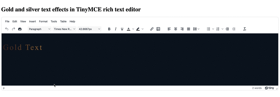
Save the changes, and then load the demo in a browser (make use of the Python test server, or PHP test server if needed), and try out the Gold text:
How to make silver text effect in CSS
For silver text, it can be hard to distinguish the specific shine of silver text from a general metallic effect. To save the silver shine, there are a few more CSS style effects that can give the design effect needed:
- Animation
- Keyframes, set to make a “shine” effect
- Linear-gradient again, with some additional values modifying it (in this case to right and 270deg)
- Background-clip again
- Background-position, to set the starting position of the silver backgrounds.
- Background-size, to set sizes of the backgrounds involved in the silver text effect.
The goal is to create some animation that recreates the mirror-finish, shine effect of polished silver under a light source. TinyMCE can support this kind of UI subtleties because of its flexibility.
Adding silver text font with TinyMCE
-
Modify the index.html file to include some silver text content inside the text area:
        <textarea id="editor">
          <p class="gold-text">Gold Text</p>
          <p class="silver-text">Silver Text</p>
</textarea>-
Add the following CSS to the style.css file to create the silver text effect with a shine:
@keyframes shine {
    0% {
     background-position: 110% 0%, 0 0;
       }
    100% {
     background-position: -10% 0%, 0 0;
       }
     }

.silver-text {
    color: #858585;
    font-family: 'Times New Roman',serif;
    letter-spacing: 5px;
    font-size: 32pt;
    @supports ((background-clip: text) or (-webkit-background-clip: text)) {
              color: transparent;
              background-image:
                linear-gradient(
                    to right,
                    transparent 0%,
                    transparent 45%,
                    white 50%,
                    transparent 55%,
                    transparent 100%),
                linear-gradient(
                    270deg,
                    #8c8c8c 1.3%,
                    #999 15%
                    #868686 29.6%,
                    #828282 29.6%,
                    #7d7d7d 31.8%,
                    #797979 31.8%,
                    #6a6a6a 38.9%,
                    #d3d3d3);
    background-position: 110% 0%, 0 0;
    background-size: 200% auto, auto;
    -webkit-background-clip: text;
    background-clip: text;
    animation: shine 3s infinite ease-in-out alternate-reverse 4s;
  }
}-
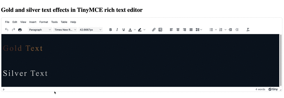
Save the changes, and test out the new silver text effect:
Tips for designing with gold and silver text effects
Why the CSS uses the @supports variable
The @supports CSS rule ensures that the silver text effects work across different browsers. Ensuring compatibility across different browsers is why both gold text effects and silver text effects created in the demo make use of -webkit-background-clip: text; and background-clip: text;.
Not all browsers support background effects, so it’s important to set up multiple options to fall back on.
Additional gold text effect and silver text effect demos
The demos in the previous sections are drawn from the following sources:
- Gold text effects from Coding Artists
- Silver text effects based on the demo created by Levrel on codepen
Some additional demos with gold and silver text effects:
- Gold text effects with animation from Ashfaq Ahmed
- Gold text effects by Mandy Michael on codepen
Text effects for TinyMCE
For some other text effects that you can set inside the TinyMCE text area, check out the following posts:
- How to style text in TinyMCE
- Neon fonts and glowing fonts in TinyMCE
- 3D text effects inside TinyMCE
You can contact us if you have any questions on how TinyMCE can help you reach your specific design goals with different text effects, or with any other UI areas that you need to customize.


