


A key part of my role as Tiny's software architect is to work across the different teams and try to understand and improve performance. There are many qualitative ways of doing this - teams will always be able to tell you their pain points and suggest improvement projects. As Tiny grows and the number of engineers grows, I have been looking at ways to add quantitative data to gain another perspective.
Measuring software engineering is difficult. Software is one of the most complex things that humans create, and the tasks that software engineers perform can be difficult to measure in a meaningful way. It's easy to misuse metrics and end up encouraging the wrong behavior or having people game the system. Picking the right metrics and socializing them within the team in the right way is challenging but essential.
I'm still new to software metrics, and I'm not a data scientist or expert on software processes. However, I'd like to share my experiences of the last few years in adding metrics to an established engineering organization.
My approach
Before getting too deep into the metrics themselves, I wanted to touch on my approach, because I think this is crucial.
I don't measure in order to judge any person or team. Each person, each team is under different pressures doing different tasks. Some people are cutting lots of code, whereas others are organizing and helping enable other team members' productivity. So, objective measures are of limited usefulness. I care most about relative measures. I care about when a metric changes.
I look for anomalies - any trends or rapid changes in a chart that may indicate something I need to look at more deeply.
I think this approach helps ward off a lot of negative results from metrics. I know that we can't measure a person on the number of Jira tasks they complete, or the number of lines of code they produce - focusing on these can lead to bad practices. But, if a team suddenly stops closing Jira bugs, or their velocity changes dramatically, or their pull requests are getting older and older - I know there's something to look into.
A risk of measuring is that people will game the system to make themselves look good. I suspect that people only game metrics when there's something to gain from it - even if it's just to prove that a metric is pointless. Paying an engineer based on a metric is probably the worst thing you could do - it will encourage a focus on the metric at all costs, whereas engineering is a balancing act of trade-offs. It's much better for metrics just to be used to help us and point out things we hadn't realized, rather than a hard score we're judged on.
Socializing my approach and collaborating with team members has also been useful to get buy-in for the metric and its usefulness. My team knows that I'm not out to make anyone look bad; I'm just trying to learn so we can improve.
Early Steps
Like many software teams, Tiny uses Atlassian Jira for task planning, and we execute tasks through Scrum or Kanban. A lot of agile wisdom seems to encourage a focus on progressing a task from beginning to end as quickly as possible - minimizing work in progress; optimizing for latency. Jira has Cumulative Flow charts for this purpose, and these were an excellent starting point.
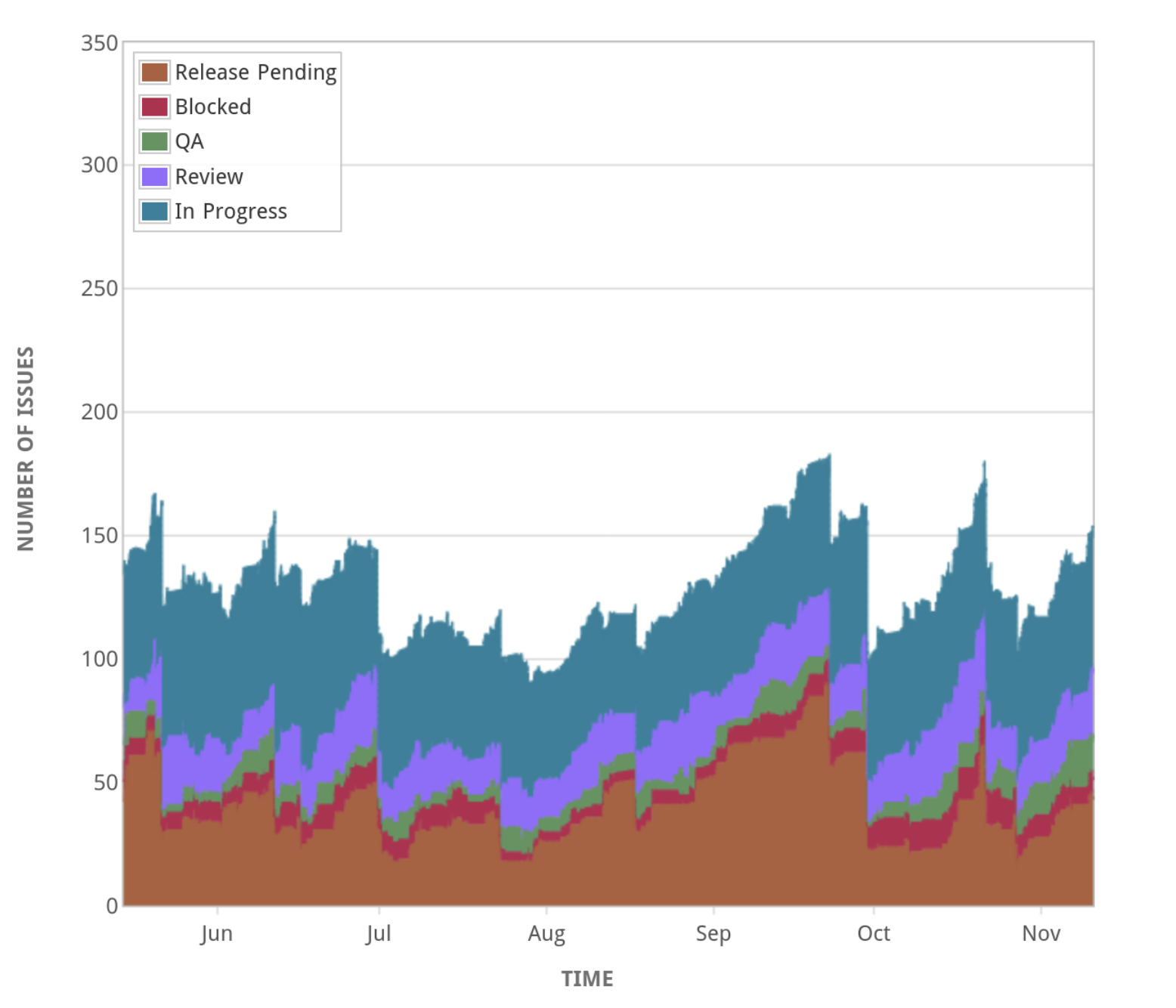
From this, I can see when the work-in-progress becomes high, and then go looking for issues that are stuck, or any process bottlenecks. Are we getting stuck in QA or code review? Is the release too big? Are we taking on new tasks before completing others?
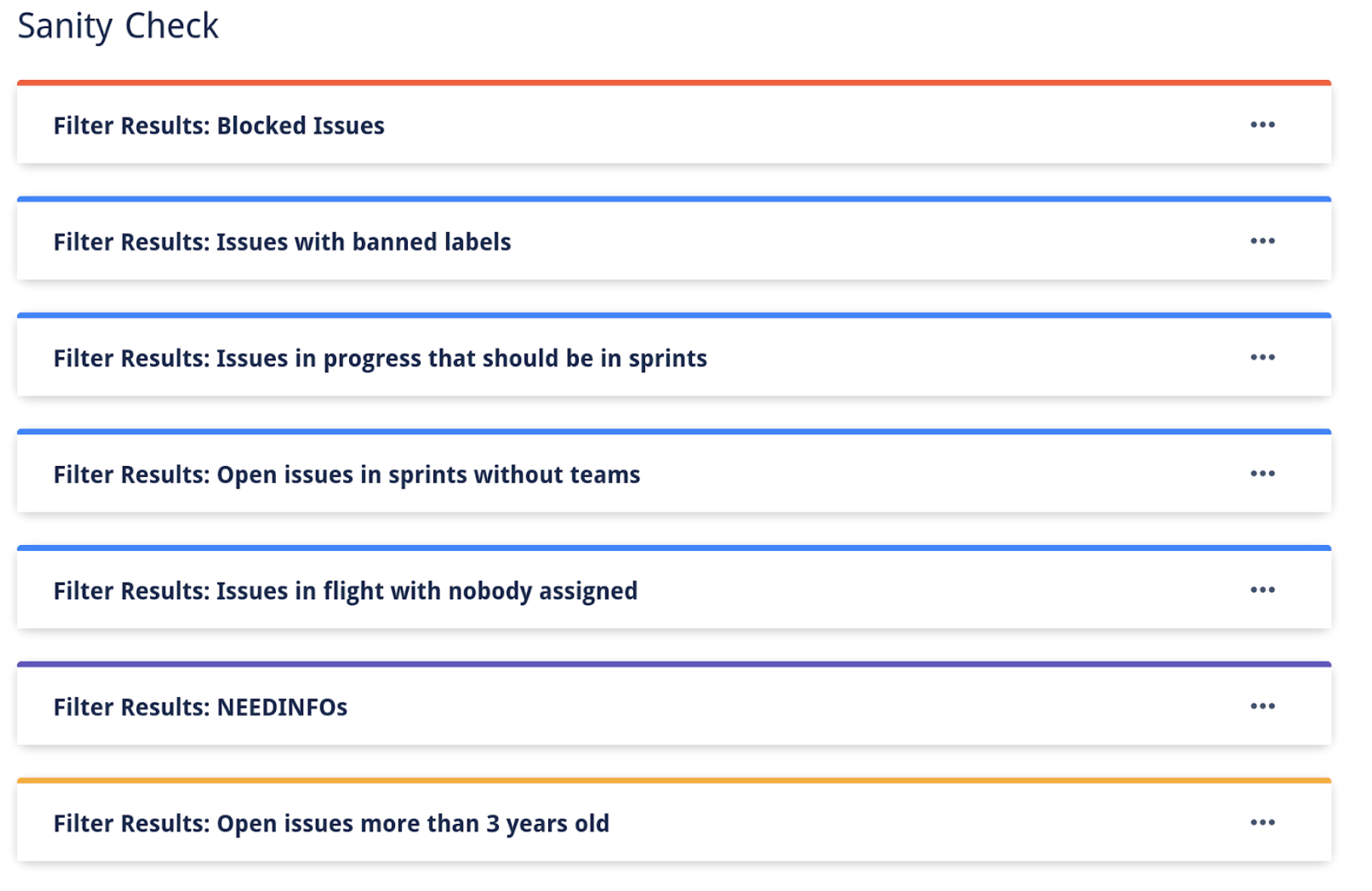
I also created what I call the "Sanity Check Report" - a Jira dashboard that shows many lists of Jira issues that match specific anomalous criteria, for example:
- What issues are blocked?
- What issues haven't changed status in two weeks?
- What issues have been open for more than three years? Are we ever going to get to them?
- What issues are in progress but aren't in a sprint?
This information is useful for team leads to find issues and help get their teams moving forward.
The Data Warehouse
A few years ago, Tiny began a project to start ingesting all of our business data into a data warehouse for insight into financial and customer data. I was involved in the project, and I noticed the data pipeline tool we chose also supports ingesting data from Jira, GitHub, and ZenDesk - the three systems we use for issue tracking.
So, I set this up - more for an experiment than anything - but it turned out to be much more useful than I expected. I now write SQL queries and create charts well beyond what is built-in to Jira. These days, most of my charts come from the data warehouse.
An excellent example of the value of a better charting system is in release readiness. In our TinyMCE team, we don't consider tasks to be done until they're shipped to customers. But, since we only release every 6 weeks or so, it's hard to tell how far we're progressing... on Jira's charts at least:
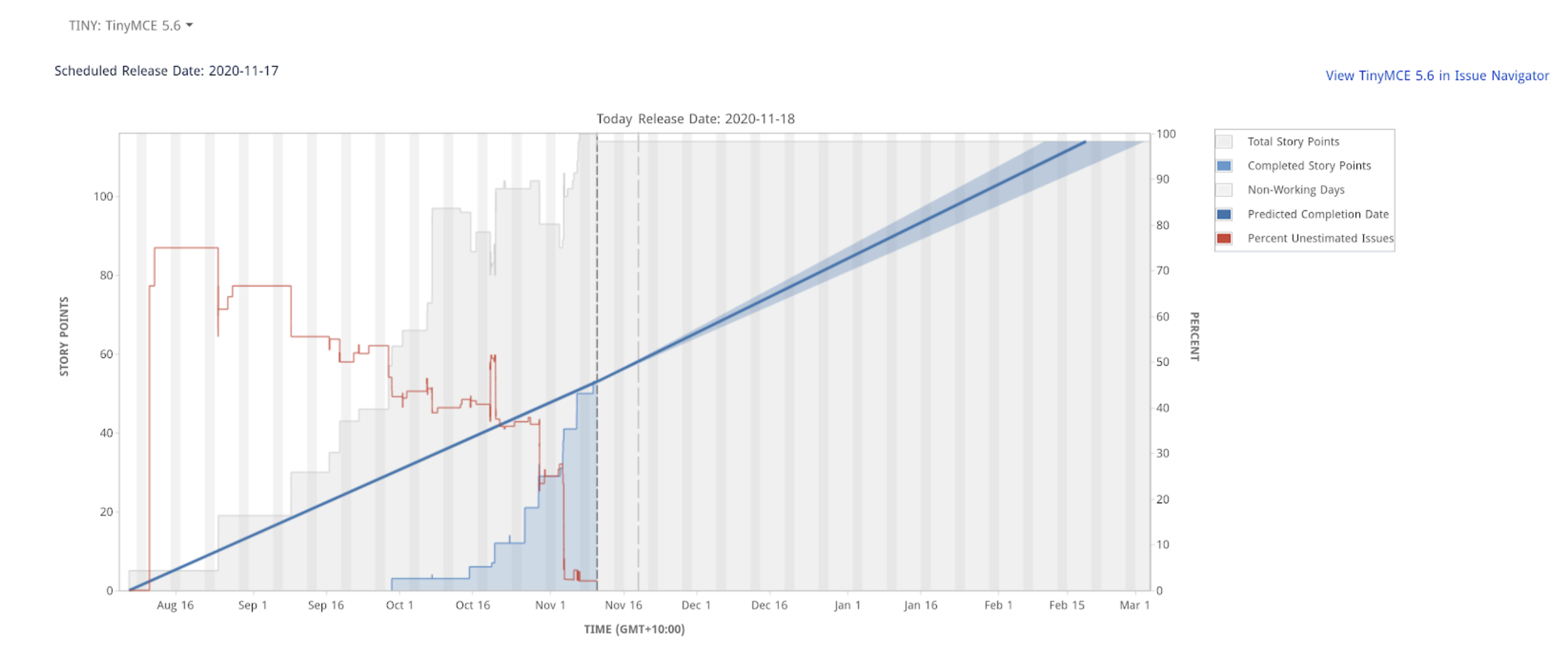
Now, I know we're much more on track than that, and Jira expects things to be done to count towards progress. Yes, there's a certain wisdom to that, but it's not our process.
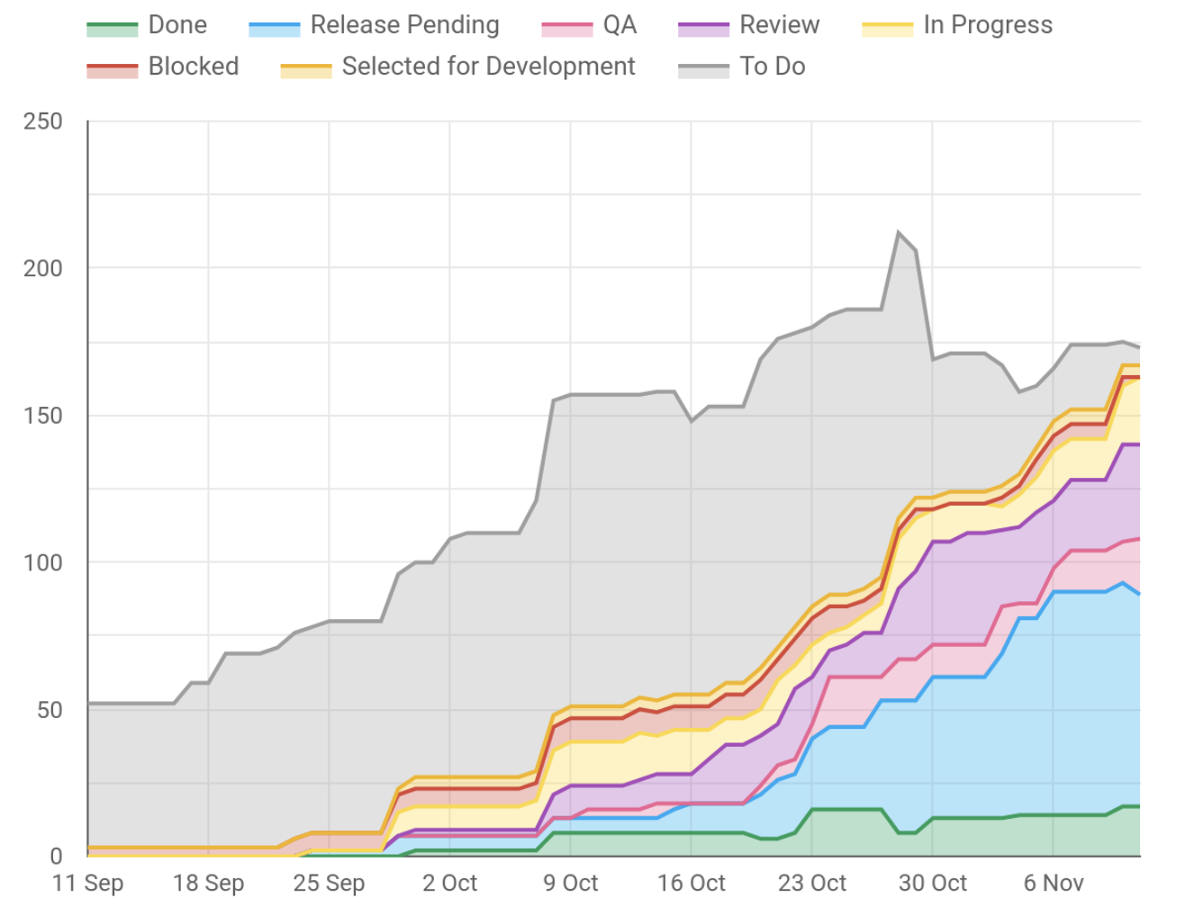
However, with the data warehouse, I'm able to make charts like the one below. Not only is this more accurate, but it paints a more detailed picture. I can see we have several tasks in Review and QA that might need some help to get over the line. I can also see nearly everything for the release has been started, and we're well on our way to completing the release. There's some overlap with the cumulative flow chart above.
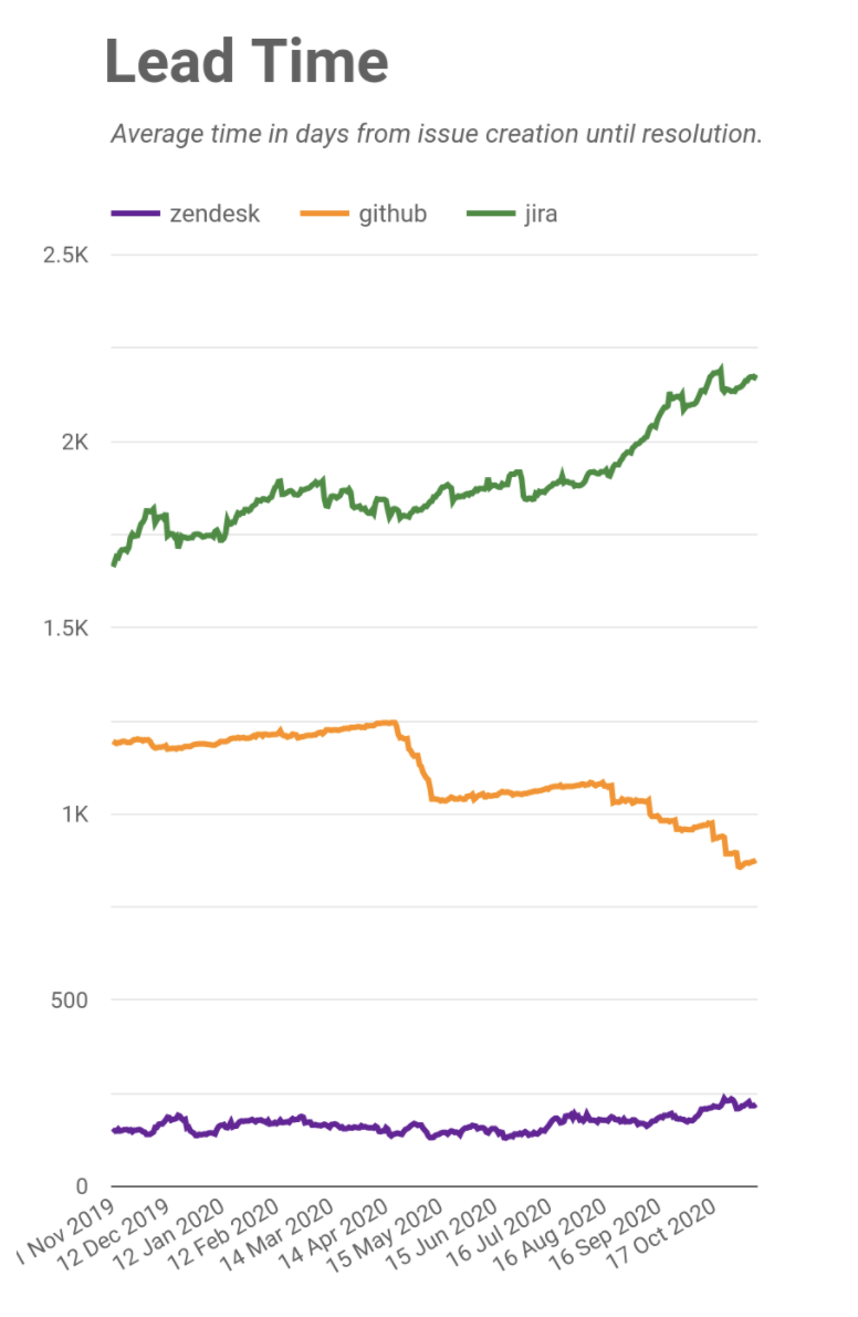
Another useful aspect is being able to compare similar data across several systems - e.g., I can see the number of open issues for Jira, ZenDesk, and GitHub over time. As ZenDesk represents our paying customers and GitHub represents our open source community users, I can see if we're keeping the interests of these two user bases in the right balance.
In addition to charts on issue counts, I've also added charts on Lead Time and Cycle Time. Lead Time is a measure of how long it takes from when an issue is created until it is closed. I can see Lead Time across the three ticketing systems to show how quickly we're responding.
In the below chart, you can see a clear downward trend on GitHub issues. This is partly due to our QA team’s initiative to audit, re-test, and close our oldest tickets. You can see a slight upward trend in our ZenDesk lead time - this is reflective of us being successful and bringing more customers on board. When we see a trend like this, we check that we're still meeting our customer SLAs and delivering the right standard of service (we are), but we may need to expand our support capabilities should it continue to grow.
Detecting Anomalies
Cycle Time is a measure of how long it takes from when an issue begins progress until it's complete. This is a measure of how quickly we execute. This works hand-in-hand with the Sanity Check report - often, issues that turn up in the Sanity Check are causes for high cycle times.
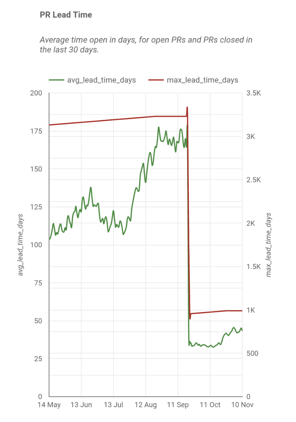
I suspected that our cycle time was also impacted by the time it takes to review a GitHub pull request, so I started measuring that. I got the average and maximum values, but clearly this isn't showing the whole picture.
So I broke it down into histograms, and now I can see that we have a backlog of old PRs that we haven't addressed, but our day-to-day PRs are actually moving very quickly. Without separating these, we may have focused on the wrong problem to improve the metric.
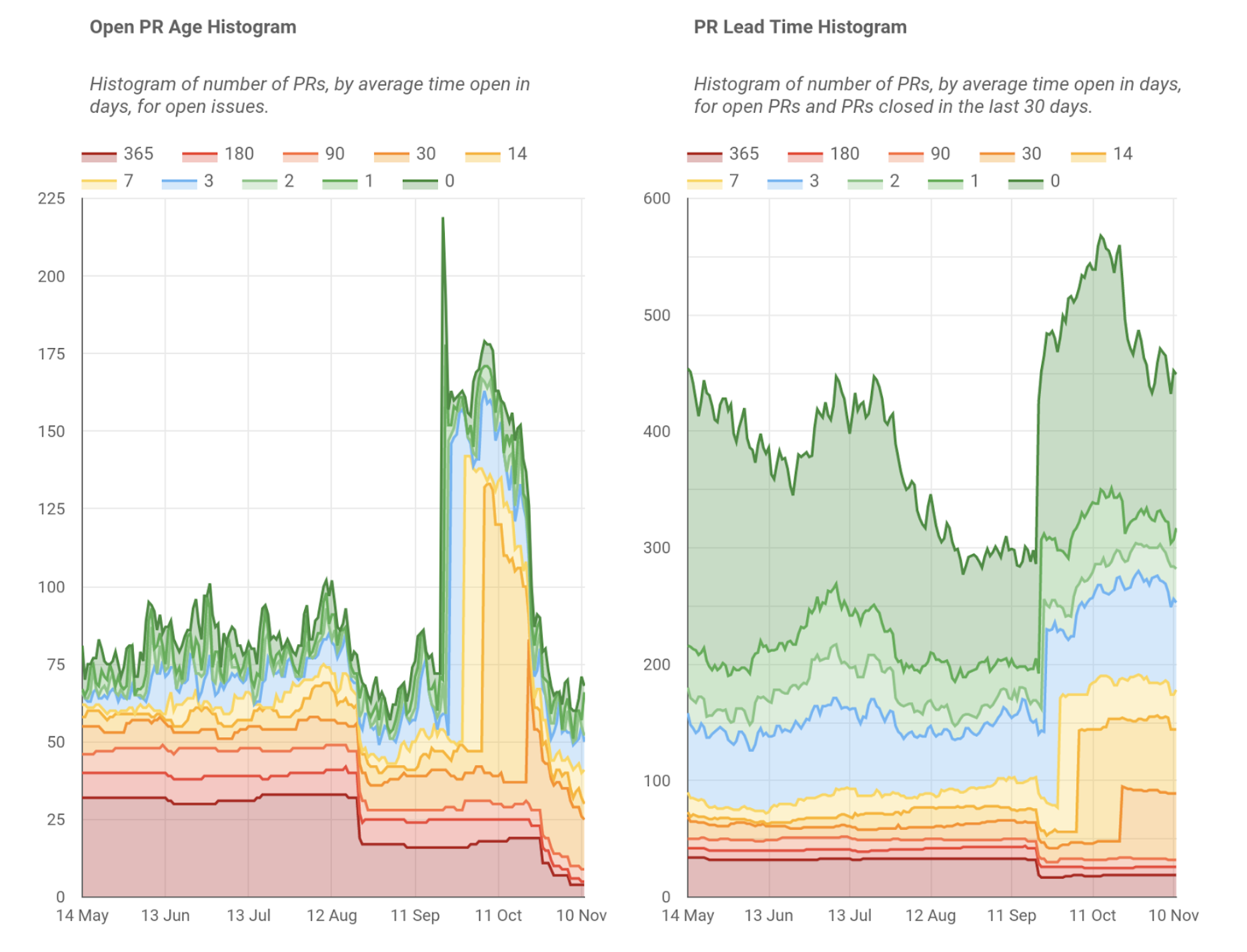
It turned out that many of the old PRs were for a legacy offering, which we are now decommissioning. It also pointed out that we have many community contributions to our products that we were not reviewing - this has allowed Tiny to put new measures in place to ensure our community contributions are seen and actioned. Ideally, we wouldn't have had these problems, but the positive is that the charts helped us discover them.
There's a huge drop in lead time around mid-September. What happened there? That was when we turned on a security setting that resulted in GitHub's Dependabot system logging hundreds of PRs to patch dependencies. Most of these were in obsolete codebases, so it helped us clean these up too, while also helping us patch our systems.
I think if we were to just focus on a goal like "decrease our PR lead time to X days", rather than looking at the richness of the data available, we would get fixated on numbers and miss the nuance and the stories behind what happened. Charts can tell stories, but they can also show you where there's a story looking to be found.
On Release Times
Another key aspect of productivity is how fast our release processes are. For automated builds, this is a fairly simple affair - plot the build time and try to improve it. However, like many software companies, our automation is not complete, and we have manual steps in some of our release processes.
As such, we decided just to keep a log of the release times in a spreadsheet. It's low-tech and manual, but it still gives us insight and can be used to show progress.
I mention this mainly to point out metrics don't have to be based on fully-automated systems to be useful.
Where to from here?
The more I dig into the data, the more I find to dig into. I'm constantly adding new graphs as I find new ways of looking at the available data. This ability to explore data in new ways is a key benefit from using a flexible reporting tool, like a data warehouse and reporting engine, rather than using a purpose-built tool.
However, getting the data into the data warehouse and ensuring it's correct has many challenges in itself, and I will admit that several of my charts have had bugs in them. We also hit limitations with integrating our data pipeline with Jira and GitHub that have been challenging to work around.
That said, my experience of using a data warehouse to analyze engineering stats has been fascinating and illuminating, and I recommend it to any lead engineer or engineering manager.


