

When developers build web forms, we face a classic challenge: get multiple form controls to sit nicely in a single horizontal row. It's a common need in modern web interfaces, and Bootstrap makes this surprisingly straightforward.
What’s Bootstrap?
Bootstrap is a widely-used CSS framework designed to simplify the creation of responsive, mobile-first designs. It offers a few things that streamline the process:
- Pre-built components for common elements like buttons, modals, and bootstrap inline form layouts.
- Utility classes for quick adjustments to spacing, alignment, and responsiveness.
- A grid system that makes layouts flexible and adaptable to various screen sizes.
In this guide, we'll walk through a practical example that shows you how to build a Bootstrap inline form the ground up. We'll cover all the essential aspects - making your form responsive across devices, implementing placeholders that actually make sense, handling password fields securely, and leveraging Bootstrap's grid system for pixel-perfect layouts. Finally, we discuss how to configure a Bootstrap WYSIWYG editor for a text area within more complex forms.
Get started with Bootstrap
There are several ways to include Bootstrap in your projects, and you can find detailed explanations in the Bootstrap documentation:
- Via CDN: The simplest method. Just link to Bootstrap’s hosted CSS and JavaScript in your HTML.
- Download Source Files: Manually download the Bootstrap files and include them in your project.
- Using Build Tools: Integrate Bootstrap with modern tools like Webpack, Parcel, or Vite, which allow for advanced configuration and optimized builds.
In this guide, we’ll set up a project with Bootstrap and Vite to create a responsive form. We’ll use Sass to customize styles, and Popper.js to position Bootstrap components like dropdowns, tooltips, and popovers.
💡 Find all the code examples for this guide in our GitHub repository.
Step one: Set up your Bootstrap project with Vite
First, we'll set up the project with Bootstrap and Vite. Create a project folder and initialize npm:
mkdir tinymce-bootstrap-inline-forms && cd tinymce-bootstrap-inline
npm init -yInstall project dependencies:
npm i --save-dev vite
npm i --save-dev sass
npm i --save bootstrap @popperjs/coreCreate the project structure and files:
mkdir -p src/{js,scss}
touch src/index.html src/js/main.js src/scss/styles.scss vite.config.jsOnce you are done, your project structure should look like this:
tinymce-bootstrap-inline-forms/
├── src/
│   ├── js/
│   │   └── main.js
│   └── scss/
│       └── styles.scss
│   └── index.html
├── package-lock.json
├── package.json
└── vite.config.jsConfigure Vite
Vite needs a configuration file (vite.config.js) to define the project's root folder, build directory, and development server settings.
import { resolve } from "path";

export default {
  root: resolve(__dirname, "src"),
  build: {
    outDir: "../dist",
  },
  server: {
    port: 8080,
  },
};
👀 Optional: To simplify running the Vite development server, set up npm scripts. To do this, add a start script in package.json:
"scripts": {
  "start": "vite",
  "test": "echo \"Error: no test specified\" && exit 1"
}Setup HTML Template
We need an HTML file for the Vite server to load and test our setup.
<!doctype html>
<html lang="en">
  <head>
    <meta charset="utf-8">
    <meta name="viewport" content="width=device-width, initial-scale=1">
    <title>TinyMCE Bootstrap Inline Forms</title>
    <script type="module" src="./js/main.js"></script>
  </head>
  <body>
    <div class="container py-4 px-3 mx-auto">
      <h1>Hello, TinyMCE, Bootstrap, and Vite!</h1>
      <button class="btn btn-primary">Primary button</button>
    </div>
  </body>
</html>Add Bootstrap to your project
To use Bootstrap’s styles and JavaScript, we'll add the CSS to src/scss/styles.scss:
// Import all of Bootstrap's CSS
@import "bootstrap/scss/bootstrap";After this, import custom CSS and all of Bootstrap’s JS into src/js/main.js:
// Import our custom CSS
import "../scss/styles.scss";

// Import all of Bootstrap's JS
import * as bootstrap from "bootstrap";
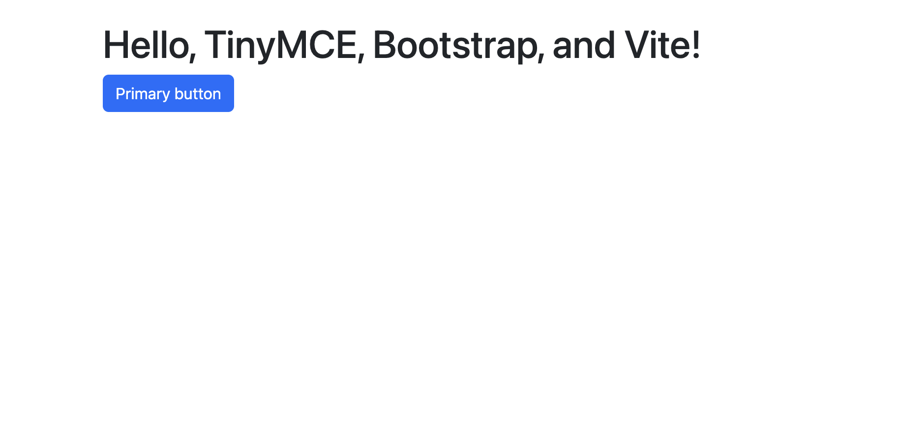
To verify the setup works and Bootstrap is integrated start the Vite server:
npm startWhen you open https://localhost:8080 in your browser, you should see a page styled with Bootstrap, including a primary button.
Step two: Add a simple form to your Bootstrap project
We'll start with a basic form layout, which we'll then transform into an inline version. We can easily add a basic Bootstrap-styled form to the project with built-in form classes.
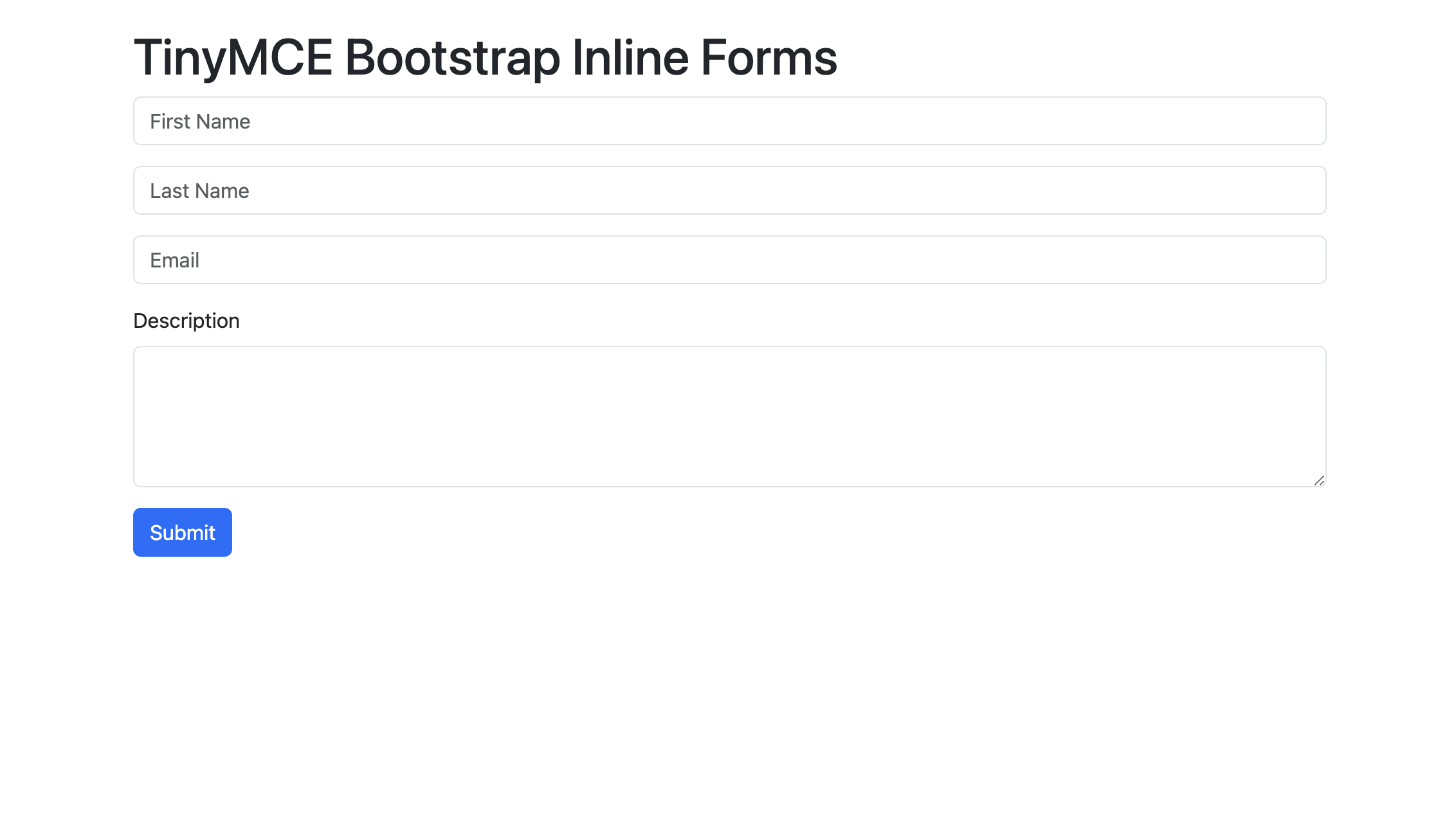
This form includes input types for First Name, Last Name, Email Address and Description, and a submit button to get us started. Let’s navigate to the src/index.html file in the project and add the following form inside the <body> tag to replace the existing <div> content.
<div class="container py-4 px-3 mx-auto">
      <h1>TinyMCE Bootstrap Inline Forms</h1>

<form>
  <div class="mb-3">
    <label class="visually-hidden" for="firstNameInput">First Name</label>
    <input type="text" class="form-control" id="firstNameInput" placeholder="First Name">
  </div>
   <div class="mb-3">
     <label class="visually-hidden" for="lastNameInput">Last Name</label>
     <input type="text" class="form-control" id="lastNameInput" placeholder="Last Name">
   </div>
   <div class="mb-3">
      <label class="visually-hidden" for="emailInput">Email</label>
      <input type="email" class="form-control" id="emailInput" placeholder="Email">
    </div>

   <div class="mb-3">
     <label for="descriptionTextarea" class="form-label">Description</label>
     <textarea class="form-control" id="descriptionTextarea" rows="4"></textarea>
   </div>

    <button type="submit" class="btn btn-primary">Submit</button>
  </form>
</div>Well done! Restart the Vite development server and open https://localhost:8080 in your browser to see the new page with the form:
It’s always best to specify the input type (type="email", type="submit", etc.) because when you do, you get a little extra functionality for free, like input validation and password obfuscation. Now that we have our basic Bootstrap form structure ready, we can modify it to be inline.
Step three: Display Bootstrap forms inline
By default, form controls will be displayed one below the other. But we can make these form labels and inputs appear beside each other horizontally when we use Bootstrap’s responsive grid system. This is ideal for search bars, quick input forms, or compact forms.
<div class="container py-4 px-3 mx-auto">
  <h1>Hello, Bootstrap and Vite!</h1>

  <!-- Inline form -->
  <form>
    <!-- Inline fields -->
    <div class="row row-cols-lg-auto g-3 align-items-center mb-3">
      <div class="col-12">
        <label class="visually-hidden" for="firstNameInput">First Name</label>
        <input type="text" class="form-control" id="firstNameInput" placeholder="First Name">
      </div>
      <div class="col-12">
        <label class="visually-hidden" for="lastNameInput">Last Name</label>
        <input type="text" class="form-control" id="lastNameInput" placeholder="Last Name">
      </div>
      <div class="col-12">
        <label class="visually-hidden" for="emailInput">Email</label>
        <input type="email" class="form-control" id="emailInput" placeholder="Email">
      </div>
    </div>

    <!-- Description textarea -->
    <div class="mb-3">
      <label for="descriptionTextarea" class="form-label">Description</label>
<textarea class="form-control" id="descriptionTextarea">What's happening here?
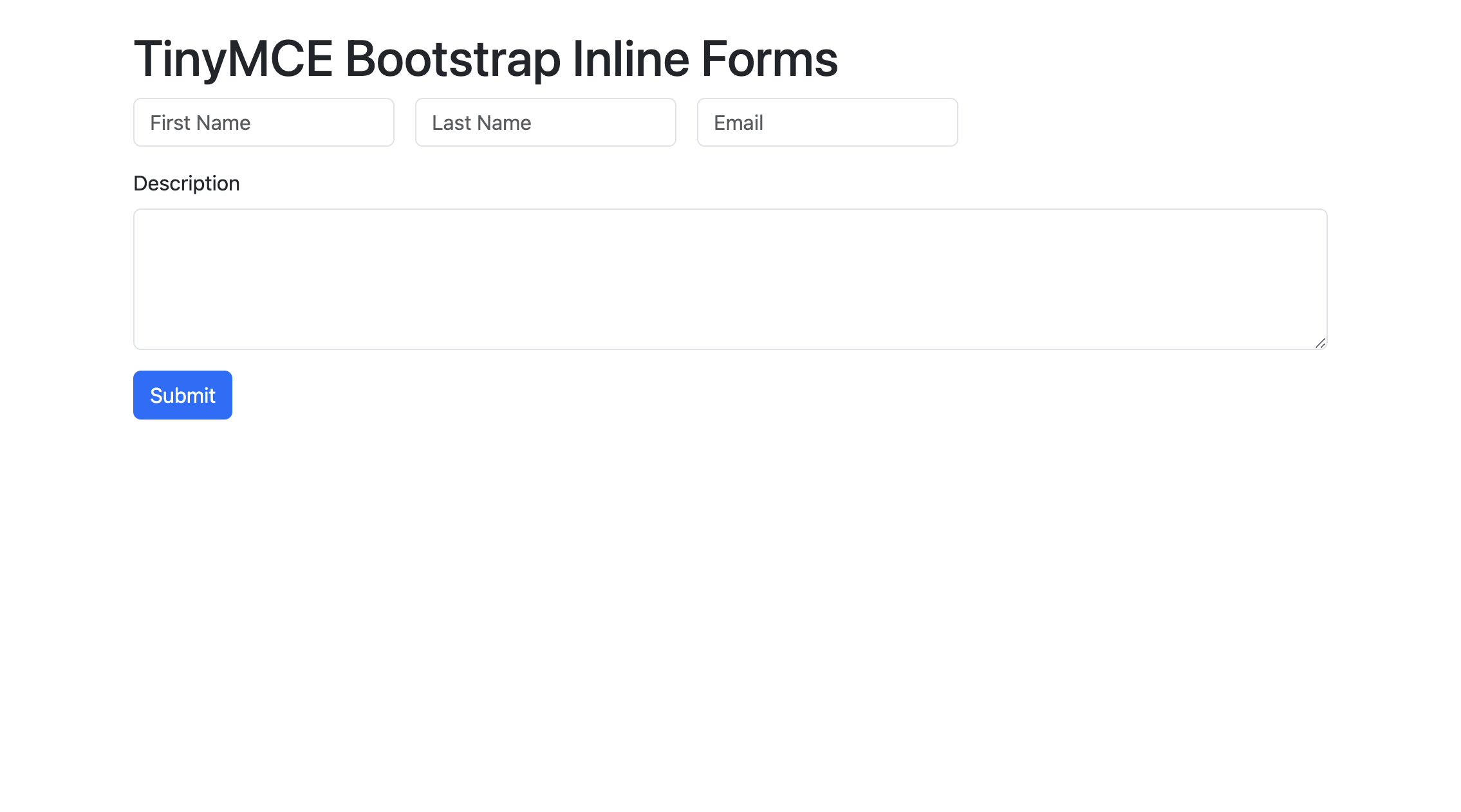
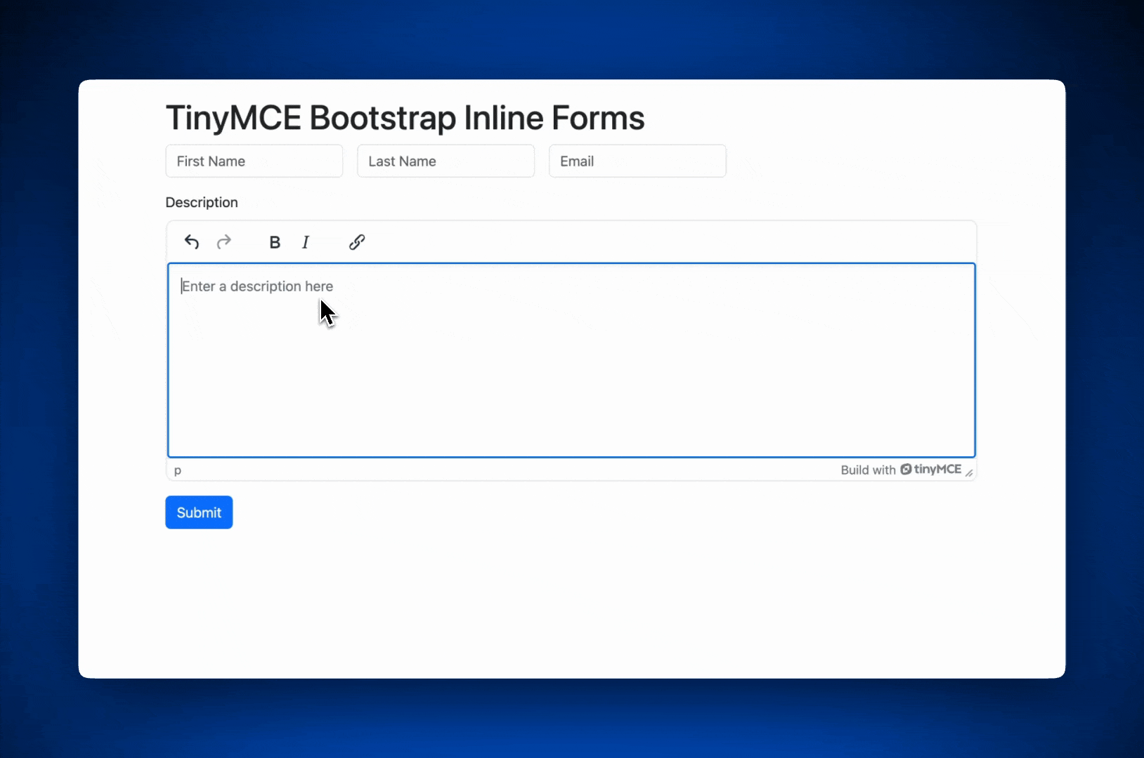
The form is built with the Bootstrap grid system to align form fields horizontally for larger viewports, and create responsive stacking on smaller screens. It includes three inline fields: First Name, Last Name, and Email, styled with .form-control for consistency, followed by a Description textarea and a Submit button.
Our layout for this guide uses:
row-cols-lg-autofor dynamic column sizing.g-3for gutters between elements.align-items-centerto vertically center the inputs within their row
Run the Vite server again on http://localhost:8080 and you can now see the Bootstrap inline form live! 🎉
Add and Edit placeholder text
A well-designed Bootstrap form should have clear placeholder text for app users in every field. You may notice that despite these fields having <label>, there are no labels outside of the input fields.
When form controls are displayed inline, they use up horizontal space. Best practice is to use placeholders that identify each field instead of labels. You can do this with the placeholder attribute. Let’s change the Description field placeholder to "Enter a description here".
<textarea class="form-control" id="descriptionTextarea" rows="4" placeholder="Enter a description here"></textarea>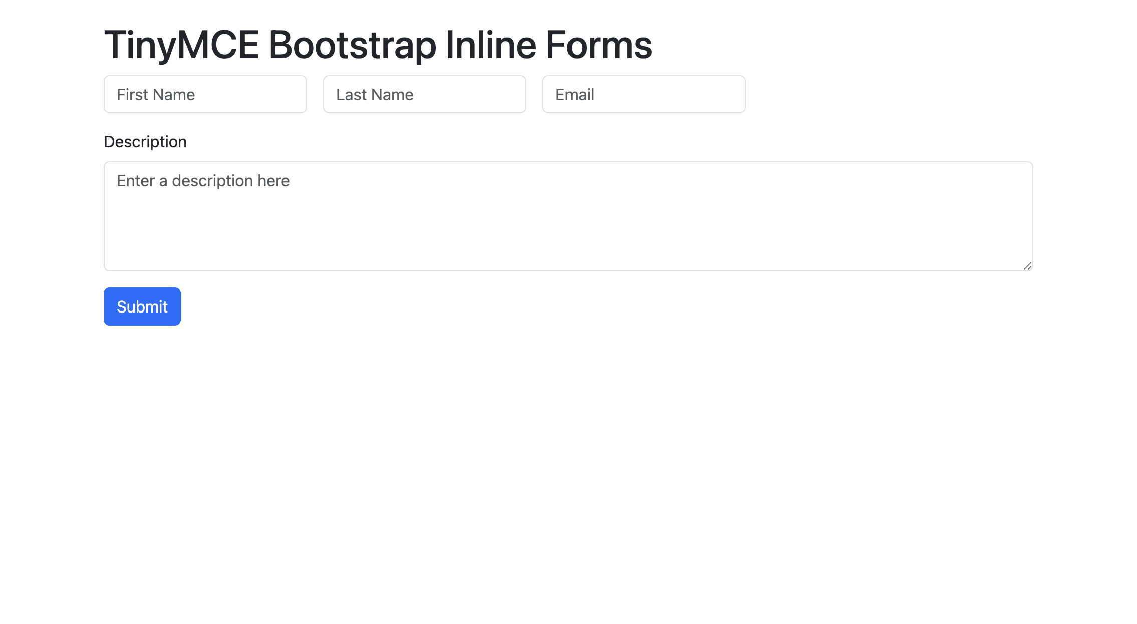
Accessibility: About the visually-hidden class
In this setup, we've also made use of the visually-hidden class. Even though you might want to remove labels from the visual design for a Bootstrap inline form, it’s always a good idea to keep them for accessibility reasons. For this reason, Bootstrap provides the visually-hidden class. Any content with this class applied will be visually hidden, but will remain accessible to assistive technologies such as screen readers.
Step four: Enhance your Bootstrap form with rich text editing
Enhancing your Bootstrap form with rich text editing improves the user experience because it gives users more options for expressing whatever they need to inside the form. Users want to format their text to write feedback or descriptions. To enhance our form, we'll integrate TinyMCE in the description area as a rich text editor.
First, we'll install TinyMCE. For this guide, we'll use the TinyMCE Cloud CDN. Add the following <script> tag to your index.html just before the closing <body> tag:
<script src="https://cdn.tiny.cloud/1/no-api-key/tinymce/7/tinymce.min.js" referrerpolicy="origin"></script>💡 Note: Replace no-api-key with your actual API key. If you don’t have a TinyMCE API Key, you can get one by signing up for TinyMCE’s 14 day free trial.
Now, we’ll initialize TinyMCE on the Description textarea by adding the following code to your src/js/main.js file:
tinymce.init({
  selector: "#descriptionTextarea",
  menubar: false, // Disable the menu bar for simplicity
  plugins: ["link", "paste"],
  toolbar: "undo redo | bold italic | link",
  height: 300,
});
Let’s run the Vite server one last time on http://localhost:8080 and we can see that the Description textarea is now a full-featured rich text editor. Fantastic job!
Wrap up
Nicely done! 👏 Users can now format text, add links, and customize their input directly in the form, which improves both functionality and user experience. This simple integration makes your Bootstrap inline form stand out with minimal setup. Thanks for following along and please, show us your favorite projects by tagging @joinTiny on X! We'd love to see them 🌟
To learn more, check out our detailed walk-through on setting up a Bootstrap WYSIWYG editor, or read our other Bootstrap blogs available from TinyMCE.


