


Ever since Don Norman, of Nielsen Norman Group, first coined the term “user experience” (UX) in the 1990s, it’s increasingly impacted the design of digital content, apps and tracking conversion rates. And blogs haven’t escaped the UX touch. Building an engaging blog requires more than just well written content, it also needs user-focused design elements to encourage engagement. That's why an understanding of blog UX best practices is now essential for every blog designer and writer.
It’s frequently forgotten that our actions aren’t driven by logic alone. Intuition, emotion and memory each play key roles in every decision. Therefore, all those attributes need to be kept in mind when you’re creating user-friendly products, websites, blogs and apps.
While the functionality of your blog is crucial, readers won’t hang around if the UX isn’t great.
Back in 2011, renowned UX designer Aaron Walter published “Designing for Emotion”. In his book, he innovated on Maslow’s Hierarchy of Needs to describe the needs of digital product users. The resulting Walter’s Hierarchy of Needs ranks from the bottom (hardest) to the easiest (top) the challenges faced by all UX designers:
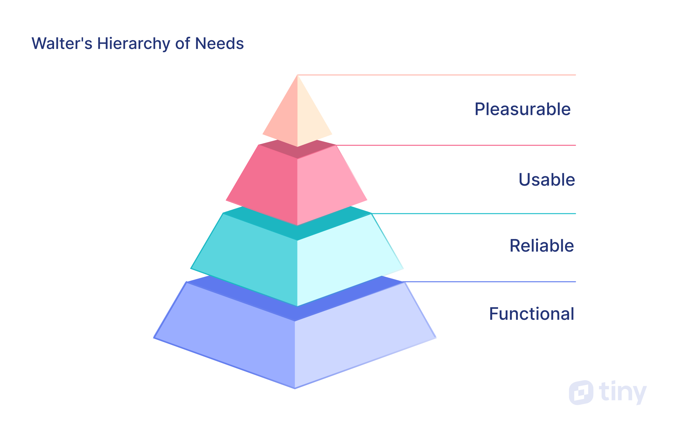
Functional: users should be able to complete tasks.
Reliable: the product shouldn’t “drop out intermittently, or [be] otherwise unreliable.”
Usable: users should be able to “learn to perform basic tasks quickly.”
Pleasurable: using a product should “put a smile on your face.”
Walter’s Hierarchy of Needs codifies much of what's considered blog UX best practices:
- A user interface (UI) must first be functional for a person's needs to be met
- Reliable in its content cadence and relevance
- Be easily usable so your user’s are enticed into moving up the hierarchy, and
- Enjoy a pleasurable experience.
So what is UX?
Simplistically, user experience (UX) is the experience your users have when they’re interacting with a product, place or digital platform/app. UX design has therefore become a central tenet of software, website and blog best practice development.
However, innovative businesses and brands not only focus on deepening their engagement with current and would-be users, they also repeatedly work to optimize interactions with their product, app or website. This is where UX also plays a central role. While there’s some ideas in UX design that change with the specific situation they’re being applied in, others remain consistent. Those are considered as best practices.
Blogs are an extension of almost every website, so when it comes to the UX design of both, it’s crucial to remember Jakob’s UX Law:
“Users spend most of their time on other sites. This means that users prefer your site to work the same way as all the other sites they already know.”
What does that mean? Your blog should function similarly to every other blog and feel very familiar – almost comfortable – like your favorite shoes. Secondly, despite there being some widely touted essential and nice-to-have blog features, sometimes ‘less is more’ is the wiser way to work, to avoid too many features – that can potentially create a negative user experience.
Why blog UX design matters
The ongoing use of blog UX best practices matter, because it creates a digital experience your readers enjoy, which encourages them to continue to return and eventually become a buyer/customer/user. The UX also impacts key success metrics:
- Page views
- Dwell time
- Conversions
By closely managing your blog’s UX, your numbers and engagement should continually grow. A blog that applies best practices is one that works 24/7 to generate traffic, educate and inform customers, build brand awareness and capture leads for you that can be converted.
The true breadth of UX’s touch and why it matters is encapsulated by NNg’s definition:
“User experience encompasses all aspects of the end-user's interaction with the company, its services, and its products.”
If you're still not convinced, think of it this way: if your readers love your blog, so will Google. That gives you greater traffic, search rankings and potential business growth.
Blog UX best practices
Blog UX best practices can be grouped into three areas: Readability, discoverability and engagement. Here are six of the best that you should consistently apply to your blog, to help grow your blog traffic and business.
Readability:
1. Make it all about your readers
The number one blog best practice is to serve your readers.
Make sure you get to know them – their likes, dislikes, needs and wants – and cater to them through your content. Your blog readers respond in different ways to those of another blog, so the content you write and feature in your blog feed should reflect the eyes that are on your site, not your own likes or dislikes (even if that’s uncomfortable for you).
Stay focused on your readers by regularly surveying them to find out:
- What aspects of your blog they like and dislike
- What content types and topics they’re interested in
- What new functionality they’d like to see on your blog
Also consider the ways in which an advanced rich text editor like TinyMCE can help your authors ensure readers are happy, by using premium editing tools like accessibility checking, link checking, and case change.
2. Use the power of white space
Enhance the readability of your blog by leaving space between UX components. Key areas to consider are:
- Line width: Aligned with the width of your page margins, each line of text shouldn’t carry any more than 60–80 characters (based on font size), to make it easier for eyes to jump from line to line. When your eyes travel long distances across lines of text, eyes fatigue and you can easily get lost.
- Typeface: Choose your typeface carefully when selecting a heading and paragraph font, because it can have a huge impact on the readability of your site. The kerning, tracking, and use of serif or sans serif fonts can make or break your user experience (let alone its accessibility).
- Font size: Take into account where the majority of your readers are viewing your content – is it on desktop, mobile or a tablet? The general recommendation is to not use paragraph fonts smaller than 16 pixels (px), although some blogs use fonts as large as 21 pixels.
- Margins: Ensure there’s ample white space either side of your blog content. The width of your page margins impacts reading speed and comprehension. If your page margins are too narrow, your eyes have to work much harder when going back and forth across the page. This impacts comprehension and overall readability.
- Sentence lengths: The general rule is to use no more than 3-4 sentences per paragraph, with 20-25 words per sentence. There are exceptions but mixing short and long sentences, within a paragraph, delivers a far more enjoyable reading experience.
- Bulleted lists: Break up large blocks of text with bulleted and numbered lists. They encourage skimming and also make it easier to comprehend information. Walls of text lower comprehension, so wherever possible break these up with either shorter paragraphs, or lists, which also inject more white space into the page.
Engagement:
3. Use accepted UX conventions
Blog content that utilizes accepted conventions of UX blog design helps the reader to decide if they'll spend time on your blog and continue reading. Frequently used UX conventions in the header/hero section are:
- Title
- Image
- Topic or TL;DR
- Reading time
- Progress bar
- Author
- Date
If you decide to experiment with some of these aspects, make sure you pay attention to your analytics as you make changes. If you change something and the dwell time increases on your site, that means your readers are reading more, scrolling deeper, and sharing more regularly. Equally, if the stats decline, the change you've made is detrimental to your blog UX.
4. Establish a visual hierarchy
The longer people remain engaged on your page, the better your page’s UX signals are for Google. If you want to stop your readers from skimming your content or bouncing off your page, try to incorporate visual elements throughout your posts. Used thoughtfully, they can positively interrupt a scrolling reader, and improve your length of engagement.
Try incorporating aspects like these:
- Quote blocks
- Charts and infographics
- High resolution images
- Rich, multi-media embeds
- Explainer images, demos and animated how-tos
- Interactive elements
- Responsive/sticky table of contents
Discoverability:
5. Make content shareable
Social shares are a positive and influential UX signal for Google. Minimize the work your readers need to do, to share your content, by giving them social share icons on your page. With social icons embedded and linked, it’s more likely they'll pass your content onto others, which helps your audience grow, and search engines will notice the love.
6. Prioritize page load
The loading speed of your blog plays a crucial role in determining its overall user experience. In Jakob Nielsen’s pioneering book “Usability Engineering” from 1993, he defined the three response-time limits which are determined by human perceptual abilities:
- 0.1 second: a feeling of instantaneous response
- 1.0 second: keeps the user’s flow almost seamless
- 10 seconds: the limit for the user’s attention
Since then, the response-time limit has continued to fall. Slow loading speeds lead to frustration, dissatisfaction, and even abandonment of the website or application by users. Ten seconds may still be the upper limit, but in the majority of cases, people now leave your blog if the page doesn’t load almost instantaneously.
Common blogging mistakes to avoid
Usually, all blog and UX designers strive to provide an excellent user experience in order to achieve greater user engagement. But, often one small UX mistake can make a lot of difference.
1. Payment/subscription gateways
Unless your business depends on a paid content model, gating your content with payment requirements is best avoided. Many popular blogs are set up to make money in other ways, like:
- Selling a product or service
- Paid sponsorships
- Affiliates
- Display ads
Generally, blog UX best practice is to make your blog content easy to access and free – regardless of where your business is in its development cycle. Your aim should be to remove any and all barriers, so your audience stays on your site, reads the entire article, and comes back for more.
2. Small, thin fonts and poor contrast
Legibility is mandatory, not optional. While small or thin fonts may look elegant and clean, thin typefaces can cause usability problems and therefore lower the UX on your blog. To achieve accessible color contrast and legibility, blog UX designers should always work towards the optimal combination of size, weight, and color in their designs.
Color contrast accessibility affects the readability of your digital content. It’s caused by poorly designed materials that haven't considered the decreased ability of some users – who have low vision, color vision deficiency or are colorblind – to see certain colors or distinguish differences in color.
3. No next steps or CTAs
Having no call to actions (CTAs) is a big blogging mistake to avoid. A CTA indicates (and encourages) the next step you want your reader to take. Ideally, the CTA should entice them to take a specific action, like read more, download, subscribe, sign-up, buy, share their email address or get in contact.
Without a CTA, there’s no clear path for them to take. Your CTAs should move them along the journey you ideally want them to take, towards the ultimate goal you desire.
4. Not optimizing for mobile
Not all the readers of your blog view it on a desktop device. Many will see it on a mobile phone or tablet, and those smaller resolutions and screen sizes create unique problems for effective user experience.
Thankfully, there’s a wealth of information and training materials available on responsive techniques to help blog designers to design different solutions for various screen sizes.
5. Autoplay video or audio
While multimedia options on your blog generally add value for an audience, autoplaying video or audio can be annoying.
If taken by surprise, and unable to find the “pause” button quickly enough, readers are more likely to close the window and not return, which isn’t good for your bounce rates. It’s also not a great idea to add background music to your blog (or any part of your website).
6. Undated posts
There was a trend towards undated blog posts, but this can erode trust, transparency, and usefulness.
Unless your posts are evergreen (and essentially timeless), it’s blog design best practice to date-stamp them, and whenever you update them, add an “updated on” date-stamp – to show that your content is fresh and relevant.
7. “Admin” author
The author field is an often overlooked but important detail on your blog, that’s a missed opportunity to build trust, and connect with your readers.
Too often, posts are published under a default “Admin” username, instead of the real author’s name. Wherever possible, publish your content using the author’s name or a suitable representative from your company or brand.
8. Instant pop-ups

The fastest way to annoy a blog visitor, is to trigger a pop-up window asking for their email address as soon as they land on your site.
Usually most people click to close the window, without a second thought. They may even leave your site in annoyance, which doesn’t improve your UX signals to Google, and negatively impacts your bounce rates.
9. Too many widgets, sidebars and busyness
Don’t be tempted to cram plugins and widgets into every available spot on your blog, especially on the sidebars.
This can overwhelm your readers, impact readability and make it hard for them to focus on your content. Plus, it can bloat your site and make it slow to load. Blog UX best practice is to stick with a lightweight blog with plenty of whitespace and only include features that add value and help your audience find and share your content.
How to design a user-friendly blog
Applying these six best blog UX best practices means you’re well on your way to building a blog that keeps your readers’ user experience top of mind. In turn, those positive experiences help to build your engagement, improve discoverability and increase readability, all of which raises your UX signals to Google.
To create an even better experience for your users, pay constant attention to their feedback and their needs, and know those nine most common blogging mistakes to avoid. With some smart research, an understanding of blog UX best practices, out-of-the-box thinking, hard work and empathy with your readers, you’ll be a lot closer to creating a user-friendly blog design.


