


Whether it’s a learning management app or an ecommerce website, any kind of web application that has a content editor will need to handle images. From alignment to styling to resizing, users will expect to do it all and want it to be reliable and intuitive. Programming image controls into any application is hard to begin with; adding in advanced capabilities is another level of difficulty.
Resizing images in content editors is a common challenge for web developers. Whether you’re building a CMS or a storefront, you’ll need to give users intuitive tools to manage image dimensions without breaking your layout or degrading performance.
TinyMCE is a rich text editor that supports basic image handling out of the box. Its customization options also allow developers to opt for advanced image functionalities when they need them.
One of the basic content customization options available to any user of an RTE is HTML. HTML can be used for image resizing, and often users who want to fine-tune their content will dive into its source code. In this post, we’ll walk through how users typically resize images using HTML inside TinyMCE. We’ll also look at the Image Optimizer feature, which takes image capabilities for web apps to the next level.
Width property and height property in HTML
The width and height properties for the <img> tag in HTML control exactly what they say they do: width and height of an image. These properties have been around since the inception of images in HTML. Whether users need a fixed-size thumbnail or a responsive image, these properties define how an image fits into the content.
To understand what dimensions to use in your HTML, here’s a reference of standard image sizes in web design:
|
Purpose |
Size (Width x Height) |
Aspect Ratio |
|
Background Image |
1920 x 1080 |
16:9 |
|
Hero Image |
1280 x 720 |
16:9 |
|
Thumbnail Image |
150 x 150 |
1:1 |
We’ll dive into how to use the width and height properties in an <img> tag later on. For now, here’s a quick code example of what these properties look like:
<img src="TinyMCEHusky.jpg" alt="A cute husky with a laptop" width="1280" height="720">Why app users want to resize images
Images aren’t just a basic part of content; they’re critical. They help break up walls of text, share information quickly, and can completely change the content’s tone. End users want a clean and easy way to control images in their content while they’re working, whether it’s on a financial analysis report, a lesson in quantum mechanics, or a product description.
Consider an app like Hopin, Whova, or Zuddl that allows the creation of complex landing pages for events. Users need to upload images of various sizes, from a marketing banner for the top of the page to smaller images of the speakers in the description of the event. One page must handle different image sizes and resolutions no matter the device.
That’s a big challenge for an events manager assigned to create the latest landing page for an important tech conference. They have to submit design requests a month or more in advance so designers can create all the necessary assets. They must coordinate with all of the different event speakers and get their images in the proper size and resolution so the signup page for the conference is usable on mobile and desktop. They need to make sure all their partner logos are included where necessary. This is a lot to do, and it’s not even all that’s required for creating a landing page for a tech conference. Having the ability to control image size within the content makes users’ workflows much easier, and eliminates wait times for other teams to properly sized images.
Try it out
If you’d like to try out TinyMCE and HTML resizing for yourself as we walk through the options, follow these steps to get a demo up and running in a few minutes.
Step one: Set up your HTML file
To set up this file, you will:
- Create an HTML file called index.html
- Copy and paste this TinyMCE configuration for a basic RTE that we can launch locally:
<!DOCTYPE html>
<html lang="en">
<head>
  <title>TinyMCE HTML Resizing Demo</title>
  <!-- Replace 'no-api-key' in the link below with your API key -->
  <script src="https://cdn.tiny.cloud/1/no-api-key/tinymce/7/tinymce.min.js"
    referrerpolicy="origin"></script>
</head>
<body>
  <textarea id="editor">Hello, world!</textarea>
  <script>
    tinymce.init({
      selector: '#editor',
      plugins: 'lists link image table code help wordcount',
      toolbar: 'undo redo | blocks | bold italic | alignleft aligncenter alignright alignjustify | outdent indent'
    });
  </script>
</body>
</html>👉 Replace “no-api-key” with a real TinyMCE API key. If you don’t have one already, you can get a free API key with a 14-day trial of TinyMCE in just two minutes.
Step two: Test your app
To see how this configuration works inside TinyMCE, you’ll need to use http-server. Here’s a quick way to set it up if you don’t already have it installed:
- Install Node.js from nodejs.org
- Install http-server by running:
npm install -g http-serverTo start the demo, navigate to the project folder in Terminal and run these two commands:
npm i
http-serverThis will launch the app you built inside index.html in your local browser. Go to http://localhost:8080/ to see your app. Now you’ll be able to alter any HTML during this guide, and see those changes in your TinyMCE instance. 🎉
Three ways users resize images in HTML
There are a few different ways that users commonly resize images in HTML. In some cases, they use height and width as inline HTML elements.
|
Method |
Use Case |
Pros |
Cons |
|
|
Quick manual resizing |
Simple, quick to use |
Not responsive by default |
|
|
More control with CSS |
Responsive if used correctly |
Can clutter HTML |
|
External CSS |
Best for scalability and DRY code |
Clean HTML, reusable styles |
Requires file management |
Let’s take a look at some examples with code. Follow along with the demo if you’d like to.
Using the width=”” and height=”” attributes
It’s quick and easy to set manual width and height within an <img> tag. It's as simple as adding the attributes to the tag. In the example, we’ve set the width to 750px and the height to auto-adjust.
<img src="https://plus.unsplash.com/premium_photo-1743539107729-b824bc94fc3a" alt="An image of a palm tree from Unsplash" width="750" height="auto">In TinyMCE, go to the menu and choose View > Source Code. A window will open that gives you access to the content’s HTML. Once you paste the above code in the Source Code window, it will show the image in rich text editor:
Using the style=”” attribute
Another attribute that can be added to the <img> tag is the style attribute. This attribute holds CSS that will apply only to that image.
A brief sidebar about CSS units
Using HTML and CSS together is a common practice. It’s critical to understand and get CSS units right even in HTML. Understanding how these units behave gives users the control they need to fine-tune their images. Let’s take a look at the two types of CSS units:
- Absolute units (like px, cm, mm, and in) lock an image to a specific size, no matter the screen or container. Great for precision, but not flexible.
- Relative units (like %, vw, and em) let images adapt based on the context—perfect for responsive designs. For example, vw scales with the width of the browser, and em ties size to the surrounding font.
Read the sister guide to this blog post to learn more about how to resize images in CSS.
Let’s look at a code example with sample content that contains two different images using the style attribute, but with a different width and height for each one.
<h1><img style="width: 375px; height: auto; float: left; padding: 1em;" src="https://plus.unsplash.com/premium_photo-1743539107729-b824bc94fc3a" alt="An image of a palm tree from Unsplash"> Join us in Palm Springs this summer</h1>
<h3><em>Ready for a little sun, relaxation, and desert magic? ☀️ 🍹 Join the team this summer for a getaway to Palm Springs! </em></h3>
<p>Think poolside lounging, retro charm, great food, and a much-needed chance to unwind together. Whether you’re into soaking up the sun, exploring local spots, or just kicking back with a cold drink—this trip’s all about easy vibes and great company.</p>
<p>We’ll be keeping it casual and fun, with plenty of time to recharge and reconnect. More details to come soon*, but for now, mark your calendar and let us know if you're interested. We’d love to see you there!</p>
<p><strong>Date: </strong>July 20-27</p>
<p><em>*The company will not provide air travel expenses for this trip, but provides accommodations and meals.<img style="float: right; padding: 1em; width: 106px; height: 106px;" src="https://i.imgur.com/lUeVdDY.png" alt="Travel Deals Logo"></em></p>It ends up looking like this in our TinyMCE example:

As you can see, the width and height of each individual image are in the style attribute. Style holds all of the CSS that applies to that image, from size to padding to alignment and more.
Using the <style> tag
It’s possible to take CSS even further in HTML with the <style> tag. However, in TinyMCE, by default the RTE does not support <style> tags in the document <body>. This is because TinyMCE is an iframe.
Instead of using the HTML <style> tag to hold CSS classes, we recommend adding the content_css option in the TinyMCE configuration. To implement this in the example, create a CSS file and reference it in the TinyMCE config. Then, replace the style attributes for the images with classes that match the classes in the CSS file.
TinyMCE Config Change in index.html
tinymce.init({
  selector: "#editor",
  plugins: "lists link image table code help wordcount",
  toolbar:
    "undo redo | blocks | bold italic | alignleft aligncenter alignright alignjustify | outdent indent",
  content_css: "/style.css",
});
New CSS file called style.css
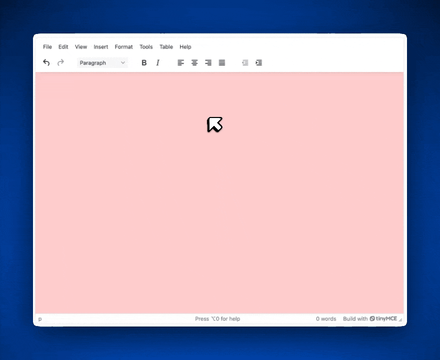
body {
    background-color: #ffcccc;
    padding: 1rem;
  }
  .logo-image {
    float: right;
    padding: 1em;
    width: 106px;
    height: 106px;
  }
  .primary-image {
    width: 375px;
    height: auto;
    float: left;
    padding: 1em;
}Source code for content inside TinyMCE
<h1><img class="primary-image" src="https://plus.unsplash.com/premium_photo-1743539107729-b824bc94fc3a" alt="An image of a palm tree from Unsplash">Join us in Palm Springs this summer</h1>
<h3><em>Ready for a little sun, relaxation, and desert magic? ☀️ 🍹 Join the team this summer for a getaway to Palm Springs! </em></h3>
<p>Think poolside lounging, retro charm, great food, and a much-needed chance to unwind together. Whether you’re into soaking up the sun, exploring local spots, or just kicking back with a cold drink—this trip’s all about easy vibes and great company.</p>
<p>We’ll be keeping it casual and fun, with plenty of time to recharge and reconnect. More details to come soon*, but for now, mark your calendar and let us know if you're interested. We’d love to see you there!</p>
<p><strong>Date: </strong>July 20-27</p>
<p><em>*The company will not provide air travel expenses for this trip, but provides accommodations and meals.<img class="logo-image" src="https://i.imgur.com/lUeVdDY.png" alt="Travel Deals Logo"></em></p>Now, our RTE with our content inside it looks like this:
💡 Note: If it’s important that your users be able to adjust custom styles with the <style> tag, you’ll want the Inline CSS plugin so that your CSS inside <style> tags is retained in the document body.
How to test responsiveness of the image in HTML
Creating the right image size with responsiveness in mind means that the image can adapt to fit the screen size of whatever browser, operating system, or app is displaying it. It’s a better way to protect the UX experience for content viewers on every form factor. The MDN Web Docs have resources to help explain more about responsive images.
To make an image responsive using HTML, it’s best practice to set width to 100% and height to auto. To test responsiveness, you can flex the browser window to different sizes.
If you have Chrome, you can open the Developer Tools and click the “Toggle Device Toolbar” button. From there you can choose what kind of device you want Chrome to emulate. This is another quick way to test the responsiveness of your images.

How Image Optimizer makes resizing images easier
HTML and CSS are common ways to resize images and handle their styling. We’ve covered a few of the basic ways that users can adjust images in HTML as well as ways that developers can control image adjustments in TinyMCE.
These methods are common but not ideal. There’s a host of configurations involved for platform-specific CSS classes and HTML attributes to ensure images in your apps:
- Don’t bog down page loads
- Are responsive on as many platforms as possible
- Are compressed as necessary for app speed
These are all tough to achieve from scratch. It’s easier to implement a web component like TinyMCE that has an ecosystem of advanced plugins. One such plugin is Image Optimizer, powered by Uploadcare. Image Optimizer is an advanced image optimization and responsiveness tool available for TinyMCE.
Users can drag the corner of an image to resize it or manually adjust it to a specific size with Image Optimizer. No configuration is needed from developers on the back end or users on the front end to access these capabilities; they're native to the plugin. To add more image options to your app, check out TinyMCE’s latest addition to Image Optimizer, image filters.
Wrap up
For developers, adding intuitive image resizing to a content editor is often one of those deceptively complex tasks. But TinyMCE helps reduce that complexity with out-of-the-box HTML support and flexible configuration options for handling everything from inline styles to responsive scaling.
We’ve walked through how developers can enable HTML-based resizing inside TinyMCE, and how to extend that experience with a plugin like Image Optimizer. Whether it’s a learning platform, an ecommerce site, or a financial dashboard, TinyMCE offers scalable tools so developers can build image support into web apps without writing endless custom CSS or validation rules.
If your app needs rich, responsive content editing, TinyMCE gives you the building blocks to make it happen quickly and cleanly. Try out premium features like Inline CSS and Image Optimizer for free for 14-days with a Tiny MCE trial.


