


When you’re building a content creation tool, image handling can’t be an afterthought. It’s one of those tricky but necessary parts of the editing experience, especially when users expect intuitive controls for resizing and formatting their content. Rather than trying to solve all of that from scratch, it helps to start with a rich text editor that already understands these challenges.
TinyMCE’s RTE brings image management into focus with both native capabilities and advanced plugins. In this post, we’ll talk about how to handle image resizing using CSS inside TinyMCE. Then, we’ll show you how Image Optimizer takes things even further, automating device-specific optimization and offering built-in editing tools. Whether you're supporting creative teams or business editors, TinyMCE makes image handling a smooth, integrated part of the editing workflow.
Image resizing in CSS
Image resizing in CSS gives users control over how an image appears within its container without needing to alter the original file. Fixed dimensions are set using width and height properties, and images are made responsive with values like max-width: 100% to ensure they scale with the layout. It’s a quick, flexible way to manage image presentation, perfect for content that needs to adapt across screen sizes or maintain a consistent visual structure.
Why your app users may want to resize images
Images do more than decorate; they help tell a story, guide the reader’s eye, and shape the feel of the page. That’s why users need more than just a way to upload an image; they need control over how it shows up.
Rich text editors are often embedded in event landing page builders or internal communications platforms, where image size can’t be left to chance. A sponsor logo might need to fit snugly in a header, or a hero image might need to scale down cleanly for mobile. In cases like these, resizing isn’t just a cosmetic tweak. It’s part of how users make content feel polished and on-brand.
Width property and height property in CSS
When you're resizing images with CSS, the width and height properties are your main tools, and you can do a lot with just these two. Whether you're aiming for a fixed-size thumbnail or a responsive image that scales with its container, these properties help define how your image fits into the layout.
Understand CSS units
Getting the units right is critical. It’s the line between a clean, well-aligned layout and an image awkwardly spilling out of bounds. Here’s the quick breakdown:
- Absolute units (like px, cm, mm, and in) lock an image to a specific size, no matter the screen or container. Great for precision, but not flexible.
- Relative units (like %, vw, and em) let images adapt based on the context, perfect for responsive designs. For example,
vwscales with the width of the browser, andemties size to the surrounding font.
Understanding how these units behave gives you the control you need to keep images looking sharp and consistent.
|
Purpose |
Size |
Aspect Ratio |
|
Background Image |
1920 x 1080 |
16:9 |
|
Hero Image |
1280 x 720 |
16:9 |
|
Website Banner |
205 x 250 |
1:1 |
|
Thumbnail Image |
150 x 150 |
1:1 |
Try it out
Want to try out TinyMCE and CSS resizing for yourself as we walk through the options? Follow these steps to get a demo up and running in a few minutes.
Step one: Set up your HTML file
To set up this file, you will:
- Create an HTML file called index.html
- Copy and paste this TinyMCE configuration for a basic RTE that we can launch locally:
<!DOCTYPE html>
<html lang="en">
<head>
  <title>TinyMCE Demo</title>
  <!-- Replace 'no-api-key' in the link below with your API key -->
  <script src="https://cdn.tiny.cloud/1/no-api-key/tinymce/7/tinymce.min.js"
    referrerpolicy="origin"></script>
</head>
<body>
  <textarea id="editor">Hello, world!</textarea>
  <script>
    tinymce.init({
      selector: '#editor',
      plugins: 'lists link image table code help wordcount',
      toolbar: 'undo redo | blocks | bold italic | alignleft aligncenter alignright alignjustify | outdent indent'
    });
  </script>
</body>
</html>👉 Replace “no-api-key” with a real TinyMCE API key. If you don’t have one already, you can get a free API key with a 14-day trial of TinyMCE in just two minutes.
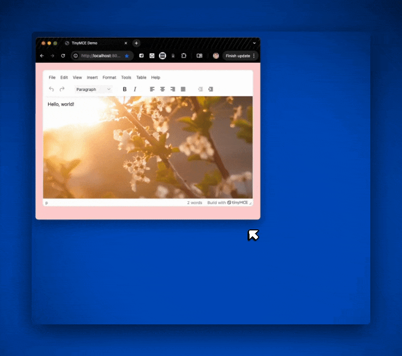
Step two: Test your app
To see how this configuration works inside TinyMCE, you’ll need to use http-server. Here’s a quick way to set it up if you don’t already have it installed:
- Install Node.js from nodejs.org
- Install http-server by running:
npm install -g http-serverTo start your rich text editor demo and run TinyMCE locally, you’ll navigate to your project folder in Terminal and run these two commands:
npm i
http-serverThis will launch the app you built inside index.html in your local browser. Go to http://localhost:8080/ to see your app. Now you’ll be able to alter any CSS inside a content_style configuration while following this guide and see those changes in your TinyMCE instance. 🎉
Three ways users resize images
Resizing images with CSS gives you more flexibility than using HTML alone. With CSS, you can define custom classes for different image roles, like thumbnails, banners, or background visuals, and apply consistent styles across your content. You can even manage everything in a separate stylesheet, which helps keep your HTML clean and your layout easier to maintain. The examples below walk through a few ways to handle image sizing depending on your content goals.
Scaling images with CSS
Scaling an image when resizing with CSS means setting properties that are designed to keep images in proportion with the content around them. So as the user adds content, the background image will scale with that content.
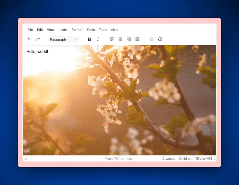
Let’s use the TinyMCE content_style option to scale a background image for the editor. Add the following code to the end of your TinyMCE configuration:
content_style: `
        body {
          background-image: url("https://images.pexels.com/photos/72473/pexels-photo-72473.jpeg");
          background-size: contain;
          background-repeat: no-repeat;
        }
      `;
Once you’ve saved your index.html file and refreshed http://localhost:8080/, you’ll see the background image scale according to the content inside the editor. Keep in mind the image will scale at its original resolution.
Fitting the section with an image in CSS
If you're working with background images, CSS gives you even more tools to fine-tune how they appear inside a container. The background-size property is especially handy here. For example:
- Use
background-size: coverto make sure the image fully covers the container, cropping if necessary to maintain its aspect ratio. - Set a single size value (
background-size: 50%) to control just the width of the image, with the height scaling automatically. - Or define both width and height (
background-size: 50% 100%) to get specific about how the image stretches or fits.
In TinyMCE, you can experiment with this in the content_style property. Try setting it to cover to see how a background image adapts to fill its section.
          section {
                background-image: url("https://images.pexels.com/photos/72473/pexels-photo-72473.jpeg");
                background-repeat: no-repeat;
                background-size: cover;
}Now that background-size is set to cover, the background image covers the whole of the editor’s background.
Stretching an image with CSS
Sometimes you’ll want stricter control over the size of the image in the background of the content. Both the height and width properties of the image can be controlled in background-size.
For a simple example, you can change background-size to a value of 100% to stretch the background image at its own aspect ratio. As the content scales, the image will also scale at 100%.
          section {
                background-image: url("https://images.pexels.com/photos/72473/pexels-photo-72473.jpeg");
                background-repeat: no-repeat;
                background-size: 100%;
}If you implement this code for the demo, your RTE will look something like this:
How to test responsiveness of the image
Setting image size with responsiveness in mind means that the image in the layout of the content adapts to fit the screen size of the viewer. It’s more efficient and helps give readers a better experience. MDN Web Docs has resources to help explain more about responsive images, including information on why they’re important to understand.
Image resizing with Image Optimizer
Using CSS is a common way to resize an image, and we’ve only looked at a few of the methods available. But images resized with CSS don’t always scale responsively no matter the device, browser, or operating system settings. It can be unreliable for use across multiple platforms without a lot of configuration and extra classes. Thankfully, CSS isn’t the only tool users have for image resizing.
Resizing an image is simple and quick with TinyMCE’s advanced image optimization and responsiveness tool, Image Optimizer. It takes a user just moments to drag the corner of an image to change it or click into the image adjustments tool and manually adjust it to a specific size. No configuration is needed from developers on the back end or users on the front end to access these capabilities. They are native functionalities for Image Optimizer.
For teams that want to add even more image capabilities for their users, check out Image Optimizer’s latest addition, image filters.
What’s next? Try it yourself!
Ready to see it in action? Whether you're fine-tuning image sizes with CSS or streamlining everything with Image Optimizer, TinyMCE gives you the tools to make images look just right, no matter the screen size or use case. Try it out for yourself with a free 14-day trial of TinyMCE, and start building a richer, more responsive content experience today.


