


A rich text editor (RTE) is one of those components that looks deceptively simple until you try to build it properly in React. This guide walks through adding TinyMCE to a demo team collaboration app, wiring the WYSIWYG editor that can handle rich text and more into your components, and extending it with features users expect, like mentions, emojis, links, and sane defaults, all without turning your codebase into a fragile mess.
Step one: Clone the project and launch the app
You’ll need Git and React. GitHub CLI experience is helpful but not required. You'll also need a TinyMCE API key (free) for the editor integration.
Get the project
Clone the TinyMCE team collaboration app from GitHub using either method:
- Navigate to the TinyMCE blog-demo-teamapp repository and select the green Code button.
- Execute this GitHub CLI command in your local GitHub directory:
gh repo clone tinymce/blog-demo-teamapp
This downloads the blog-demo-teamapp project, which can be opened in your preferred IDE.
Run the app locally
Launch the project by running:
npm installto add dependencies.npm run devto start your React app at http://localhost:3000/.
Access localhost to view the React team collaboration app in development mode. Changes you make to the app will appear automatically without requiring manual refreshes. It should look like this when you launch:
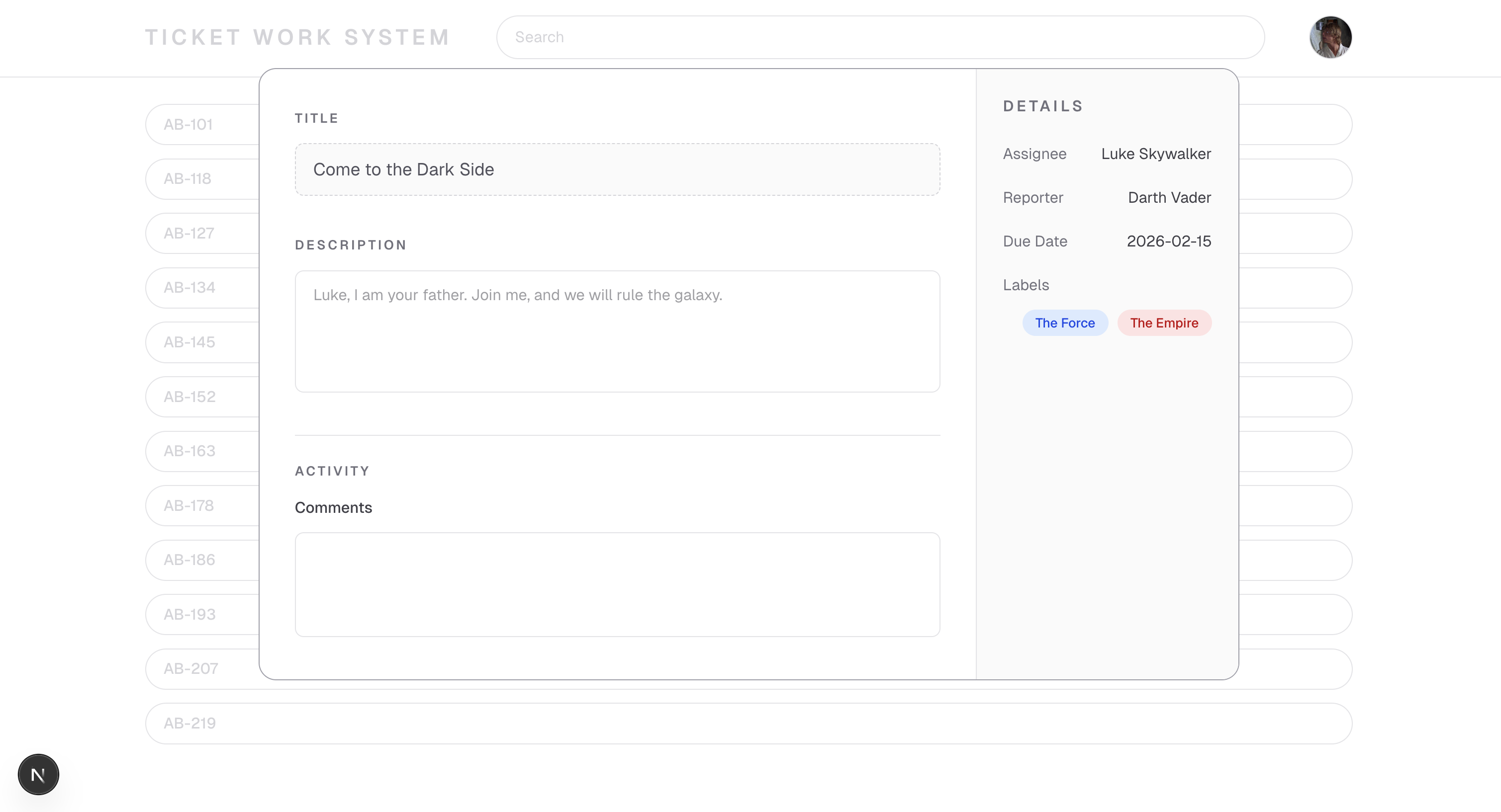
Step two: Add TinyMCE to TicketLightbox.tsx
Now that you have a React team collaboration app demo ready to go, it’s time to add TinyMCE to the Description section of the ticket so that your users can enrich ticket descriptions with lists, emoji, user mentions, and link validation.
Add NEXT_PUBLIC_TINYMCE_API_KEY to .env.local
Add a value called NEXT_PUBLIC_TINYMCE_API_KEY to a new file called .env.local and put in your new TinyMCE API key. Like this:
NEXT_PUBLIC_TINYMCE_API_KEY = mytinymceapikey123;
TinyMCE won’t fully work without this API key, so make sure it’s set before you’re ready to use it.
Add TinyMCE to the project
Add TinyMCE’s native React component to the project with an NPM command in blog-demo-teamapp:
npm install @tinymce/tinymce-reactImport TinyMCE to TicketLightbox.tsx
Now add TinyMCE as an import at the top of app/components/TicketLightbox.tsx. This code is doing quite a bit of work:
- Imports the working
Editorfrom the TinyMCE native React package. - Adds a
constthat brings in the valid TinyMCE API key. - Creates the foundation for Editor state management with
EditorClientProps.
import { Editor } from "@tinymce/tinymce-react";

const tinymceApiKey = process.env.NEXT_PUBLIC_TINYMCE_API_KEY;

type EditorClientProps = {
  initialValue?: string,
  onChange?: (content: string) => void,
};
Now you’ll add the EditorClient to TicketLightbox.tsx as a component that can be reused in multiple places. In this case, it will be reused in the Description and Comments fields.
function EditorClient({ initialValue, onChange }: EditorClientProps) {
  return (
    <Editor
      apiKey={tinymceApiKey}
      initialValue={initialValue}
      tinymceScriptSrc={`https://cdn.tiny.cloud/1/${tinymceApiKey}/tinymce/8/tinymce.min.js`}
      init={{
        height: 300,
        menubar: false,
        plugins: "lists link image table code help wordcount",
        toolbar:
          "undo redo | formatselect | bold italic | alignleft aligncenter alignright alignjustify | bullist numlist outdent indent | link image code",
        toolbar_mode: "floating",
        branding: false,
      }}
      onEditorChange={(content) => {
        onChange?.(content);
      }}
    />
  );
}
Now the editor is available for multiple instances in TicketLightbox.tsx.
🤔 What’s this code doing?
EditorClient handles state management and contains important values that define the rich text editor’s features and settings. For example, menubar: false hides the File/Edit/etc menu since your users won’t need that in these RTE instances. And toolbar_mode: floating makes sure that any overflow in the toolbar doesn’t take up extra UI space, by adding an ellipses button for users to see other plugins. You’ll come back to this code later to add more features for your users.
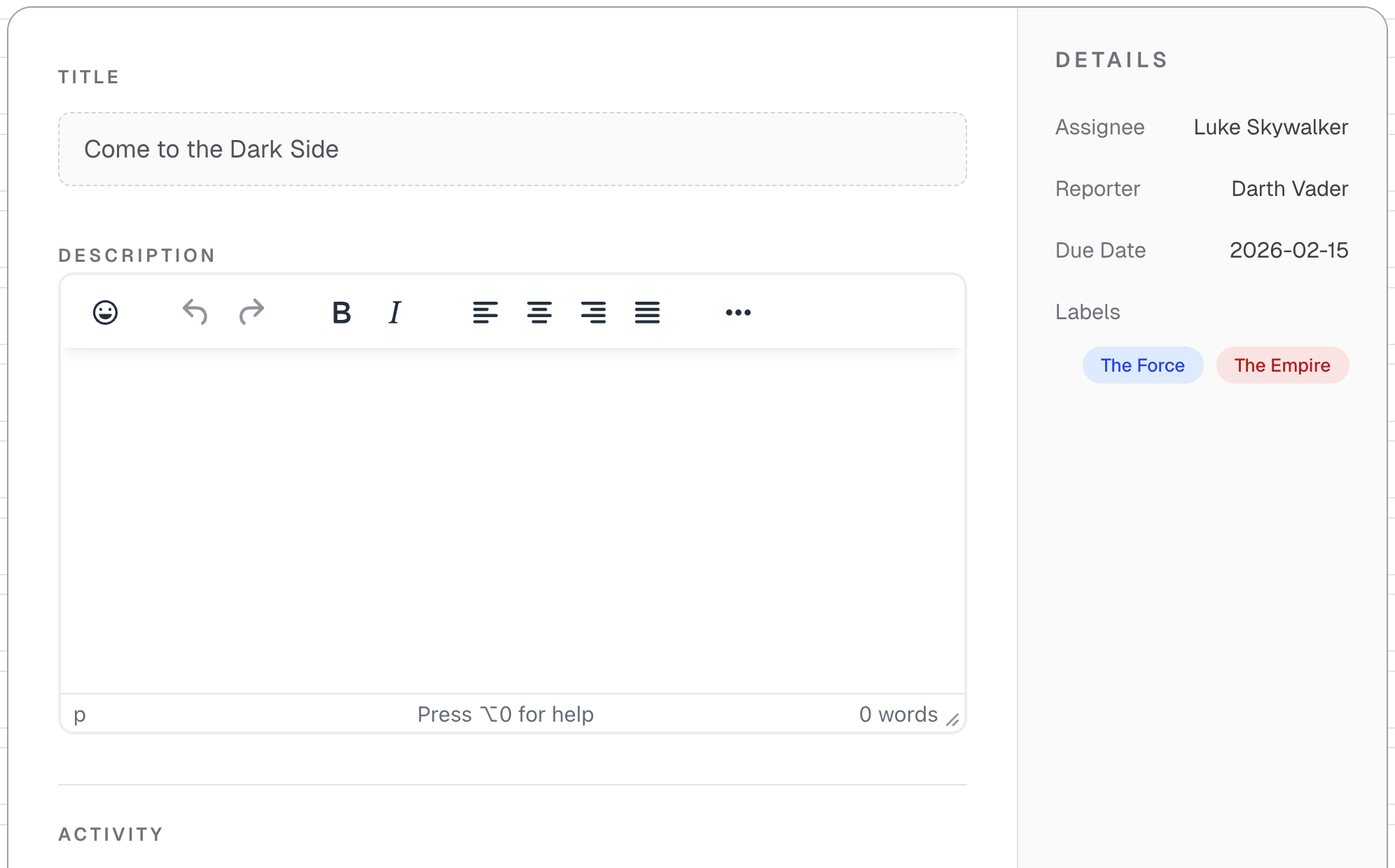
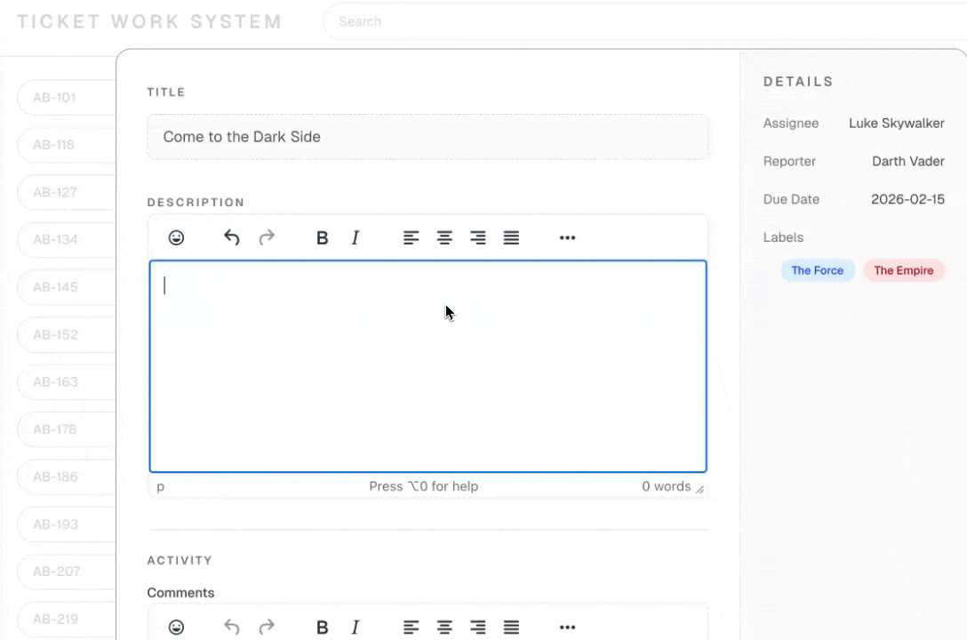
Step three: Replace the Description textarea with TinyMCE
In the TicketLightbox.tsx file, find the Description <div> that looks like this:
<label className="text-xs font-semibold uppercase tracking-[0.18em] text-zinc-500">
  Description
</label>;
You will replace it with a working instance of the Editor instead of the plain textarea, to get your WYSIWYG editor that handles rich text and more.
Replace the whole <div> with this one:
<div>
  <label className="text-xs font-semibold uppercase tracking-[0.18em] text-zinc-500">
    Description
  </label>
  <EditorClient
    key="description-editor"
    onChange={(content) => {
      setDescription(content);
    }}
  />
</div>;
🤔 What’s this code doing?
This new <div> replaces the textarea with an import of EditorClient. The key distinguishes this editor instance from the upcoming editor in the Comments section. The key is essential if you’re using two instances of the same component on one page. This way, React treats both instances as distinct.
At this point, the editor is fully functional. 🥳 Now you’ve got a robust editor in the Description section.
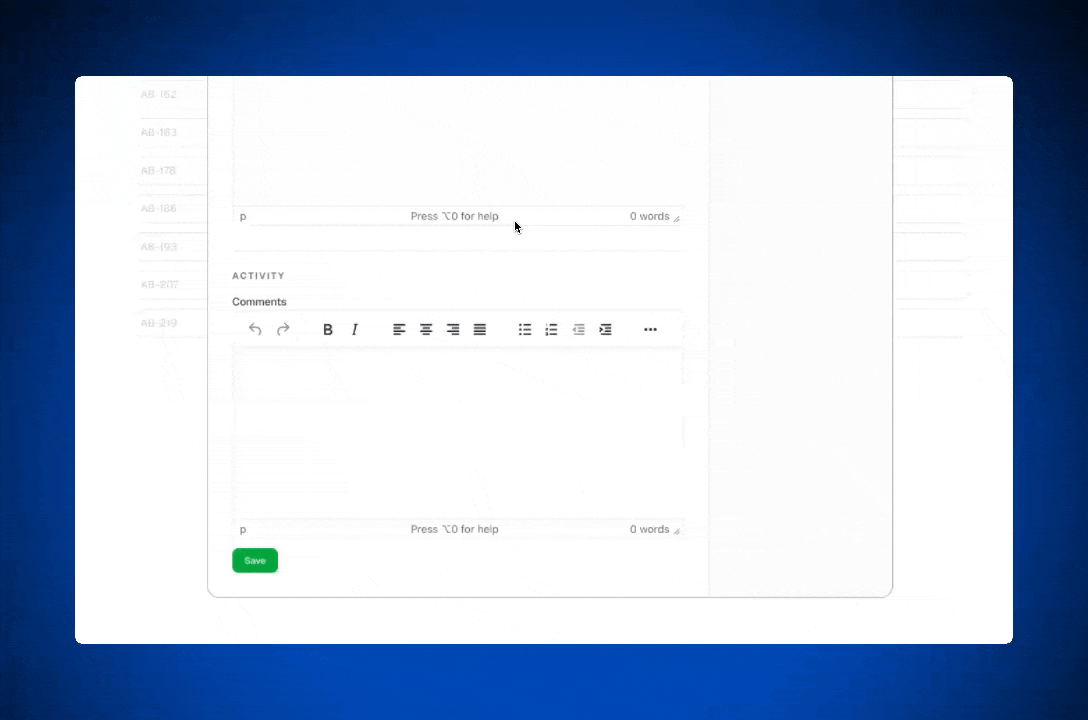
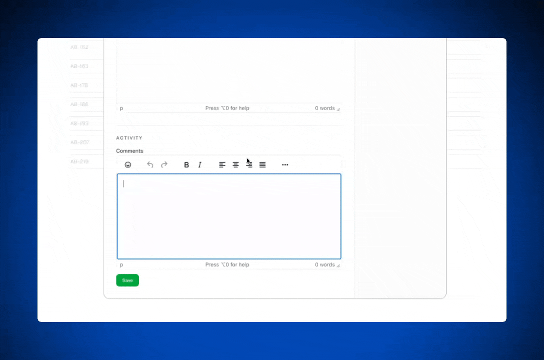
Step four: Replace the Comments textarea with TinyMCE
Just like Description, you’ll replace the Comments textarea with EditorClient and its onChange code. The difference here is the key, which separates this editor instance from the one in Description.
              <div className="mt-4">
                  <div className="text-sm font-medium text-zinc-700">
                    Comments
                  </div>
                 <EditorClient
                    key="comments-editor"
                    onChange={(content) => {
                      setCommentsDraft(content);
                    }}
                  />
                  <button
                    type="button"
                    onClick={handleSaveComment}
                    className="mt-3 rounded-lg bg-green-600 px-4 py-2 text-xs font-medium text-white hover:bg-green-700"
                  >
                    Save
                  </button>
...
// remaining codeAnd that’s it! You now have two separate editor instances that you can control with one function.
Optional: Manage the editor configurations separately
If you need tighter control over the editor instances, and want to treat the two editor instances differently when it comes to size, plugins, or the toolbar, you would:
- Extend the
EditorClientPropstype to accept configuration options (like height, toolbar, plugins, etc.) as optional props. - Update the
EditorClientcomponent to use those props instead of hardcoded values, with sensible defaults. - Pass different config when instantiating the editors, and the Description editor one set of options and the Comments editor different ones.
It would look like this for each Editor instance if you want to do this:
// Description
<EditorClient
  key="description-editor"
  onChange={(content) => {
    setDescription(content);
  }}
  config={{
    height: 500,
    plugins: "lists link image table code help wordcount",
    toolbar: "undo redo | formatselect | bold italic | alignleft aligncenter alignright alignjustify | bullist numlist outdent indent | link image code",
    branding: false,
  }}
/>

// Comments
<EditorClient
  key="comments-editor"
  onChange={(content) => {
    setCommentsDraft(content);
  }}
  config={{
    height: 250,
    plugins: "lists link code",
    toolbar: "bold italic | lists | link",
    branding: false,
  }}
/>Step five: Add team collaboration features
Team collaboration apps need functionality like user mentions, clickable links, attachment support, and emojis to express themselves. Let’s add a few TinyMCE features to this demo so that you can (a) see how easy and quick it is to add plugins, and (b) make this demo more like a real team collaboration app.
Here are some of the free plugins already present in the demo that you won’t need to add:
- Bullet and number lists.
- Image support.
- Tables.
- Wordcount.
- Source code to see the HTML.
Add user mentions
Mentions (a Premium feature) enables autocomplete-based user tagging in TinyMCE using the @ symbol. Rather than creating your own autocomplete or notification system from scratch, simply configure a user list and TinyMCE takes care of the input detection and suggestion list.
In a live application, you'd retrieve your user list from your database and connect mentions to your notification infrastructure. In this example, you'll implement a basic mention dropdown.
To integrate Mentions into TinyMCE:
- Include the word
mentionsin the plugins array. - Set up a user list to use instead of querying a real database.
- Build a
mentions_fetchcallback function to retrieve users. - Add the
mentions_fetchcallback function to your TinyMCE init configuration.
For this guide, the mentions_fetch callback will grab from a user list that's defined locally in your team collaboration demo app. In a real-world scenario, you'd write a callback function that queries your database for the user list.
For now, add this const as a list of fake users that the mentions_fetch callback function can call. Add it before the EditorClient function in TicketLightbox.tsx so that the editor can reference the callback function.
const fakeUsers = ["Leia", "Han", "Chewie", "Lando"];

function mentions_fetch(query: any, success: (items: any[]) => void) {
  const term =
    typeof query === "string"
      ? query
      : query && (query.term || query.query || "");
  const q = (term || "").toLowerCase();
  const results = fakeUsers
    .filter((u) => u.toLowerCase().includes(q))
    .map((u) => ({ id: u, name: u }));
  success(results);
}
After you've added the callback function for Mentions, add the plugin and mentions_fetch callback to your EditorClient:
<Editor
  apiKey={tinymceApiKey}
  initialValue={initialValue}
  tinymceScriptSrc={`https://cdn.tiny.cloud/1/${tinymceApiKey}/tinymce/8/tinymce.min.js`}
  init={{
    height: 300,
    menubar: false,
    plugins: "mentions lists link image table code help wordcount",
    toolbar:
      "undo redo | formatselect | bold italic | alignleft aligncenter alignright alignjustify | bullist numlist outdent indent | link image code",
    toolbar_mode: "floating",
    branding: false,
    mentions_fetch: mentions_fetch,
  }}
  onEditorChange={(content) => {
    onChange?.(content);
  }}
/>;
Now you’ve got mentions available in both the Description and Comments editors.
Optional: Add styling to distinguish Mentions in the text
If you want to distinguish mentions in the text, you can do two quick things to do so:
- Add
content_styleto theEditorClientin TicketLightbox.tsx:content_style: ".mention { color: #1d4ed8; font-weight: 700; }", - Add some global CSS styles to app/global.css:
/* Mentions styling for rendered content */
.mention {
  color: #1d4ed8 !important;
  font-weight: 700 !important;
}
It’s that simple! User mentions will now stand out as unique identifiers in bold and blue.
Add emojis
In team collaboration apps, users expect the ability to use emojis in their tickets and comments. Adding emoji capability to TinyMCE is quick and easy.
All it takes is adding the value emoticons to the plugins and toolbar lists:
...
      plugins: "emoticons mentions lists link image table code help wordcount",
        toolbar: "emoticons | undo redo | formatselect | bold italic | alignleft aligncenter alignright alignjustify | bullist numlist outdent indent | link image code",
...
// rest of the codeVoila!
Add a link checker and autolink
It’s important for links to work in team collaboration apps so users don’t have to worry about whether or not their colleagues will be able to click through.
Link Checker (Premium feature) is one of the easiest to add. It’s just the word linkchecker in the plugins list. While you’re in there, you can also add Autolink, so links work immediately.
plugins: "autolink linkchecker emoticons mentions lists link image table code help wordcount",Save your TicketLightbox.tsx to see the changes.
Wrap up: Add more plugins to try
You’ve built a demo team collaboration app in just five steps. Congratulations! 🎉
All of TinyMCE’s premium features are available for the 14 day free trial that you signed up for when you got your TinyMCE API key. It's possible to sign up for premium features with the TinyMCE dashboard or in the EditorClient code. You can integrate even more plugins, like:
- Enhanced tables for structured data sharing.
- Importing an MS Word document, or using PowerPaste.
- Exporting content as Word or PDF.
- Attaching and storing files with Media Optimizer.
To get the most out of your free trial and learn more, check out the guide What to Expect From the TinyMCE 14-Day Free Trial, or contact our friendly TinyMCE Developer Relations Manager, Fred Harper.


