


With the release of TinyMCE 5.1 comes the best mobile experience for our WYSIWYG HTML editor yet, complete with a slick, new, modern UI. Read about the features, try the demo, and find out how to enable mobile for your users.
Productivity on mobile devices has never been greater, and businesses are rethinking their digital transformation strategies to stay ahead of the curve.
We think in the next five to 10 years the 100 percent mobile employee will be the majority.
At Tiny, we are passionate about content creation. As the demand for mobile productivity increases, we want to make sure we are ready for however your clients and users wish to take advantage of our world-class content creation solution — at their desk or on the move.
With this in mind, we’ve taken a step back to rethink our design with a mobile-first mindset, and we are now excited to share the new mobile experience in TinyMCE 5.1.
TinyMCE is ready to be used by anyone, anywhere, anytime.
Try the live demo
Try the full featured live demo for yourself!
6 things you should know about the new mobile experience
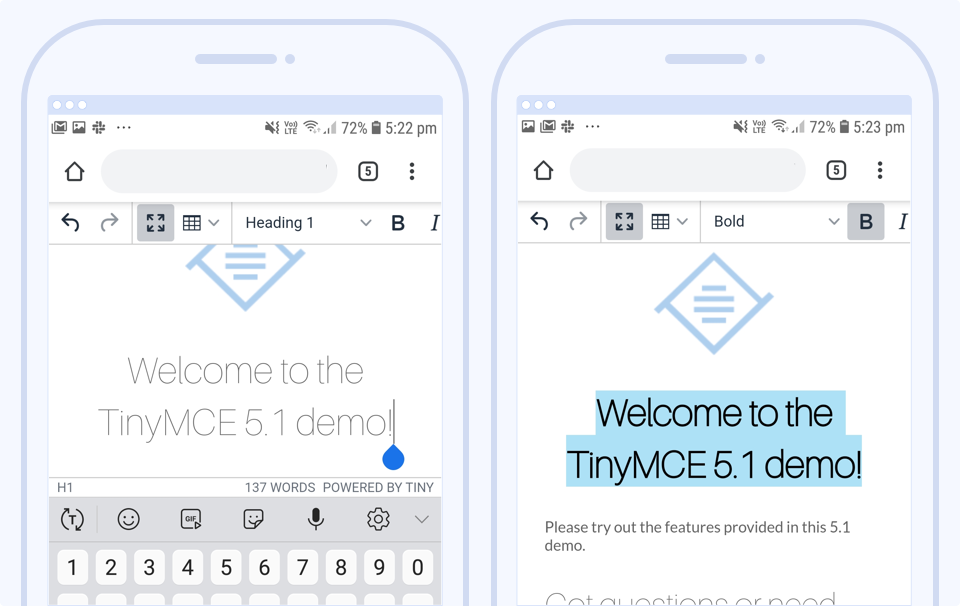
1. 100% true mobile design
Often the mobile experience of a product is just the desktop experience running on mobile, possibly with some minor tweaks. But that’s not the case here. TinyMCE 5.1 has been redesigned specifically to optimize for mobile so our users are getting the best experience possible on any device. We’ve taken the lessons learnt from our previous successes in the mobile space and applied them, now to our flagship product, resulting in a product far superior to any of its predecessors.
2. Responsive design
It has a fully responsive design that adapts to all devices and screen sizes. TinyMCE detects the platform and presents an optimal UI experience given the device type and screen size. There is also a fullscreen option so you can make the most of your screen real estate and focus solely on interacting with the content in the editor.
3. Elegant interface
In addition to the sleek silver theme that has been adopted as the default for mobile in 5.1, we’ve introduced some new user UI elements that enable the true mobile design:
- Side-scrolling toolbars and horizontal menus are used with “swipe” gestures, so longer toolbars can appear without occupying too much screen space.
- Alternative keyboards can be presented to users depending on the context when a user focuses the input element.
4. Plugin availability
The new mobile experience allows most of the TinyMCE plugins to work on mobile devices; including:
- PowerPaste
- Spell Checker & Spell Checker Pro
- Accessibility Checker
- Advanced Tables (new in version 5.1)
- Checklist
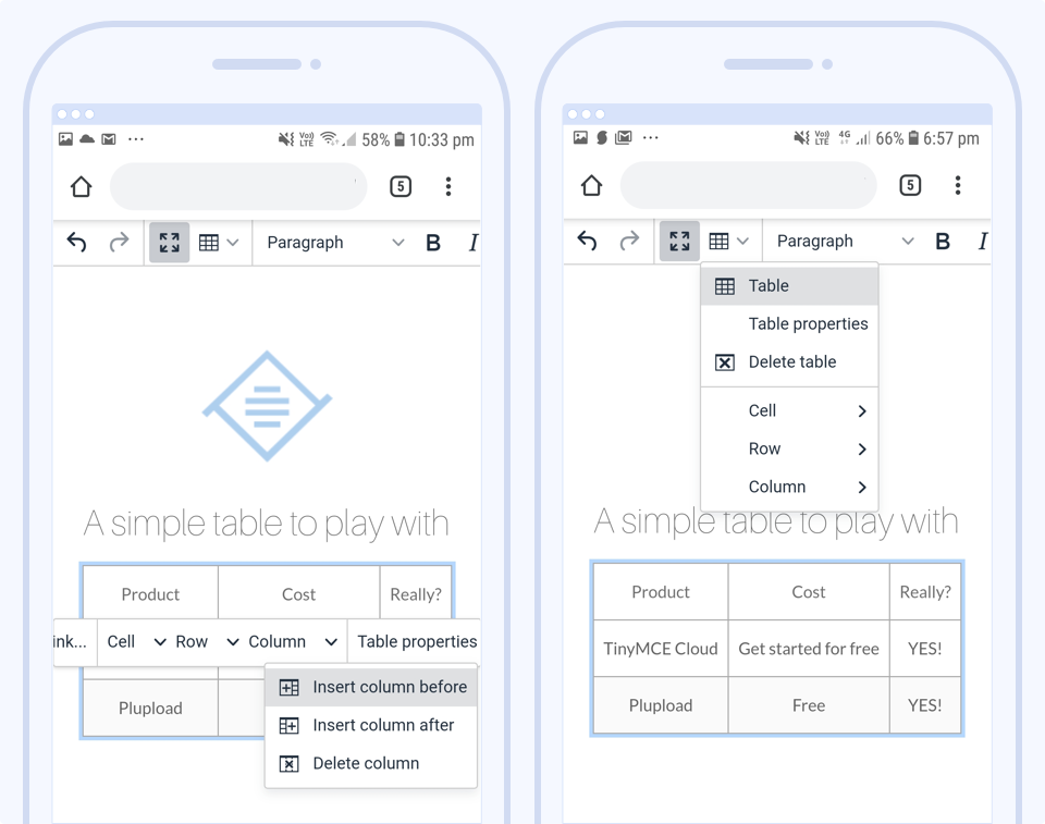
5. Support for tables
TinyMCE has a superior interface for adding and manipulating tables on mobile. Use the horizontal scrolling toolbar or the dropdown menu for advanced styling and configuration.
6. Customizable
You can customize the mobile experience, separate from the desktop UI. The mobile-specific default values are set to disable unsupported settings for mobile devices and provide the best mobile experience, and you can customize them for your own purposes as required.
Want to know more?
For a more comprehensive overview of what’s new for mobile and TinyMCE 5.1, check out the relevant parts of our documentation.
How to go mobile with TinyMCE 5.1
1. Get TinyMCE 5.1
If you’re a cloud user, your editor should already be updated with TinyMCE 5.1.
For self-hosted instances and more information about upgrading, refer to the documentation about upgrading TinyMCE.
2. Configure TinyMCE 5.1 for mobile
IMPORTANT: To ensure the mobile editor functions as intended, add the following code to the head of your pages that are using TinyMCE.
<meta name="viewport" content="width=device-width, initial-scale=1">Check out our documentation for more information about configuring mobile.
What next?
Want early access to our future products, features, and enhancements?
Join our beta testing community. As a member, you get early access to future products and releases, and you play a pivotal role in influencing the direction they take through the feedback you provide.
Enjoy the new Tiny mobile experience, and don’t hesitate to reach out to us if you have any questions at all.


