

By now, you’ve likely noticed a new look Tiny across our brand and website.
Over the last few months, I've been leading the design efforts for Tiny's brand and logo refresh. While it’s been a long process, the results are a big change for Tiny that we are all really proud of. So, let me share with you some of what we’ve been doing behind-the-scenes, and a little more about the process we followed to refresh the Tiny logo.
But first, why a “brand refresh” and not a rebrand?
To rebrand or refresh?
A question that most companies will face at some point or another, is whether they should rebrand or refresh. A key difference is that a rebrand usually means leaving everything behind and evaluating every aspect of your company.
For Tiny, our fundamental market position wasn’t in question, however, mirroring our position with our brand absolutely was.
How we looked not only needed to reflect our position in the market, but also align more closely with our vision and values as a company. Our messaging and products also made shifts to be more value based for our customers. So, while a lot has changed we’re still Tiny (the company, not size).
Now that we’ve got that out of the way, here’s the first part of our refresh process specifically for the logo...
Step 1: Discovery
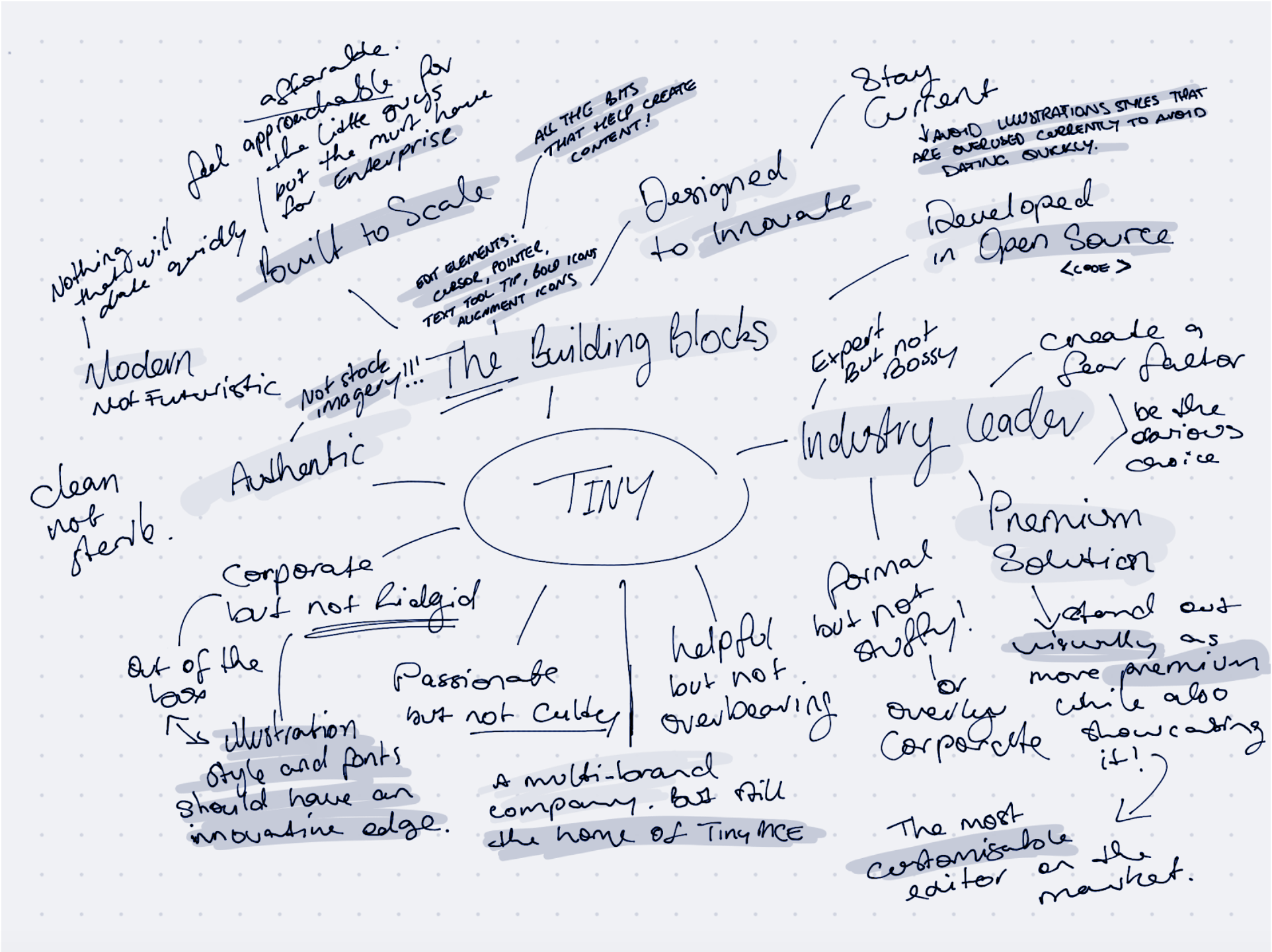
Before diving into our creative process it was important to take a step back. The discovery phase is all about ensuring we have the information needed to help inform our design decisions.
In this step an analysis of everything from our key target audience, competitors and internal workshops . This included key insights that had come from the marketing team’s messaging refresh, like:
- Improving the clarity around what our products do and making it less technical
- Supporting the key message, “we are the building blocks to content creation”
- Making sure we look and feel like the market leader in this space
I also reviewed the key personas to make sure I knew who I was targeting and what they’re interested in. I knew from the groundwork our marketing team had done for this project, that we’d be targeting the developer persona much more strongly than we had in previous iterations of the Tiny brand. Their findings, research and direction helped to define what the brand was and wasn’t. For example: modern, not futuristic; formal, not overly corporate; clean, not sparse; prestigious, but not uber luxurious.
For this brand and logo refresh, it was all about figuring out how we should put ourselves out into the market so that we’d reach our target audience of developers without excluding our enterprise customers. We have such a broad range of customers - from open source through to big enterprise, and we needed to find a way to appeal to them all without being boring, plain, run-of-the-mill… and we didn’t want to look like everyone else. It was time for a bit of personality!
We knew that a lot of developers (similar to designers) prefer to use products that look cool or seem to have an edge to them. They like to use products they’d personally choose. So, we wanted to make sure the Tiny brand appealed to the aesthetic that we know developers respond well to.
At the same time, we needed to build on that prestige feeling that enterprise customers look for. Tiny needed to still have that element of seriousness and trustworthiness because we can and do solve problems for big companies with huge volumes of users.
Our previous brand iteration had a very templated look and feel with the standard whites, greys, and blues, but it lacked personality and the unique details that would help it stand out. In other words, it was vanilla.
Step 2: Idea generation
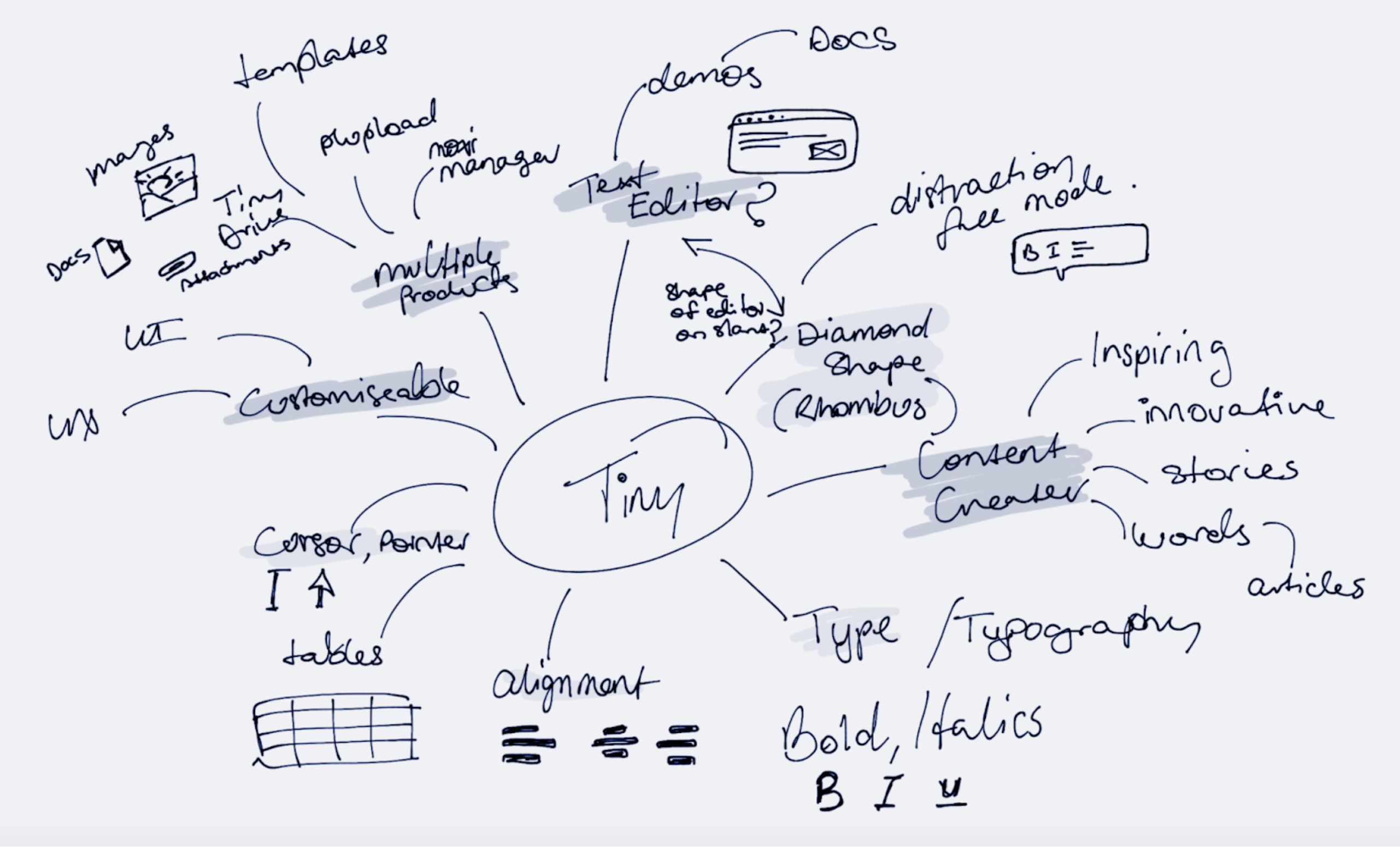
The next part of our brand refresh process was all about idea generation. This is where we let our creative minds run wild and consider how we might like the brand to look based on our research and findings in the discovery phase.
Here, we benchmarked design styles, sketched out ideas, while noting down concepts, and brainstorming with pencil and paper - or in my own experience an iPad and pencil. This allows us to get ideas out as quickly as possible, and start to consider how we might better communicate who tiny is and what we do.
This helped us to inform a new brand direction and key visual elements that we’d like to see included in the overall brand experimentation stages. Some of our findings included:
- Dark mode - A lot of developers like to use dark mode as they spend a lot of time looking at screens and it gives their eyes a break and allows them to focus for longer
- Gaming aesthetic - A lot of our audience love their gaming and are familiar with those user interfaces (where dark mode is also a common theme)
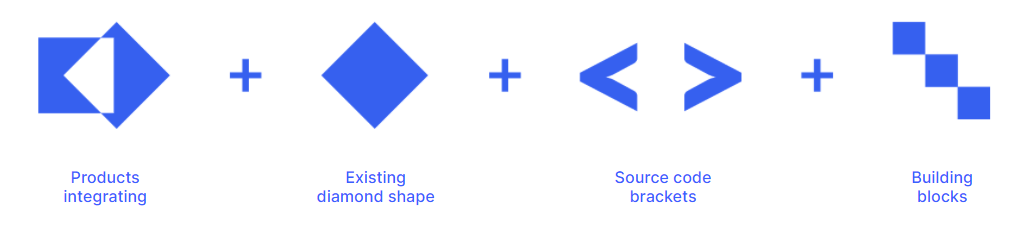
- Code elements - The programs our developer audience use for coding have a certain look and feel, while the code languages use source code brackets as a common element.
- Heritage elements - To ensure long-term customers continued to recognize our brand, blue hues and diamond shapes were experimented with and embedded into the new brand direction
- Darker palettes - Darker color palettes are often seen to be prestigious and this aligned with how we wanted to be seen especially at our enterprise customer level.
Step 3: Logo sketches
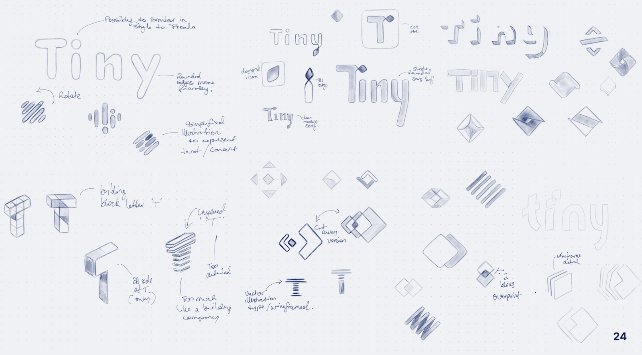
Once a strategic direction was in place we jumped headfirst into messy logo sketches, drawing inspiration from our brainstorming session. The idea here was for us to get ideas out as quickly as possible, they aren’t supposed to be showcase worthy concepts just yet. Here we also revisit our benchmark findings for those small details we thought aligned well for the Tiny brand. Now I’m not talking about specific logos here, our benchmarks included specific letterforms (‘y), fonts and shapes.
We pushed ourselves here until we were out of ideas and then revisited later to re-evaluate and experiment further. Next steps involved reviewing our rough sketches and deciding on what should be taken forward and refined further.
When reviewing the logos we looked for concepts that were bold, simple, and innovative (but not over the top). The concepts that we felt were worth further exploration were then taken into our design programs.
Step 4: Iterating on concepts
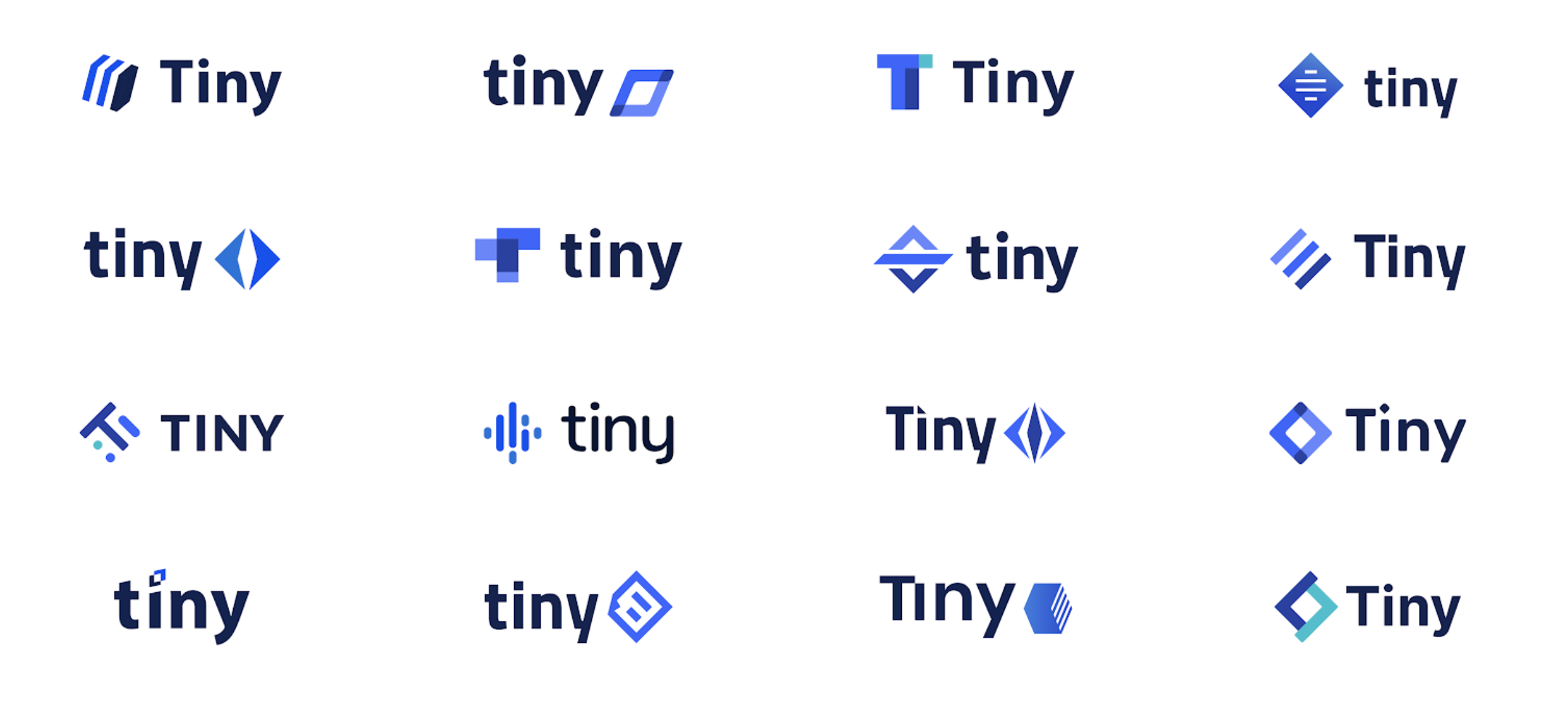
Time for refinements. After recreating our narrowed sketched concepts digitally, further culling was done before presenting our progress to our key stakeholders. Here we weren’t looking for design direction or final decisions, but more so to involve our stakeholders in the process and to help them understand how we reached this stage.
When presenting our concepts for the first time, we showcased them all in the same color to ensure our stakeholders could focus on the shape first (and avoid getting distracted by a favorite color). We also took this approach as concepts in monotone can also help demonstrate how strong the concept is - whether it's black, white, monochrome, scaled up, scaled down. For a logo to be successful you don’t want it to fall over as soon as you put it on a web page or shrink it down to icon size.
We involved and worked closely with our stakeholders early on in the process, showing them our ideas, sketches, thoughts, and illustrations - a lot of which wouldn’t usually be seen.
This helped us to:
- Show that each decision had been informed by facts, not opinions or emotion
- Give them a clearer understanding of what they’re looking at
- Give stakeholders a framework in which they can provide constructive feedback
- Get stakeholders onboard, with a lot less pushback
Initial design conclusions and feedback from our stakeholders included things like:
- All caps didn’t feel right for Tiny as a brand and voice
- ‘T’ icon felt repetitive
- Rounded typefaces felt too familiar and close to a close competitor
- The letter ‘y’ caused balance and alignment issues
- Concepts that were closer to our current logo felt like they restricted our product offering
From this feedback, we were able to narrow down the concepts and make further iterations.
Step 5: Finalizing the logo
For our final concepts, we presented three logo options, explaining the inspiration, thought process, and meaning behind the concepts.
With these options the core brand refresh team made a design recommendation along with a strong validation as to why.
In the end, all stakeholders looked at the facts and process, and agreed with our recommendation. After a few final adjustments, we finalized the logo and our legal team began the Trademarking process.
And what you see today is the new look Tiny logo rolled out across our new website design and materials. Stay tuned for more behind the scenes to come.
What's next?
A logo and a new set of colors isn’t a brand. It is just one small component that makes up a much wider brand consideration including; market research, style scapes, website designs, development and the rollout.
If you are interested in learning more about our brand journey you can check out articles by other Tiny team members;
If you have any questions about our brand refresh, tag us on Twitter @joinTiny - we’d love to know what you think.


