


You’ve probably seen placeholder text a thousand times: those helpful little hints inside input fields that vanish the moment you start typing. But have you ever stopped to think about how they work, why they exist, and the best way to use them? Textarea placeholders are more than just a design convenience; they play a crucial role in user experience, accessibility, and functionality. Let’s dive into everything you need to know.
What is placeholder text? Definition and usage
Placeholder text is a short hint or instructional text displayed inside a form field before a user enters data. It provides guidance on what type of input is expected but disappears when the user starts typing.
While placeholders are commonly used in text fields, they are especially useful in <textarea> elements where users might need additional context on formatting, content expectations, or structure.
Historically, textarea placeholders have been a critical piece of the UI in form design that have evolved alongside web technologies. They actively improve user experience by making form input purposes clear, thus helping with accessibility, and can even have design purposes.
How to add placeholder text in HTML5 textareas
HTML5 made it incredibly easy to add a textarea placeholder with the placeholder attribute. Here’s how you can do it:
<textarea placeholder="Enter your message here..."></textarea>It’s that simple. This method works across modern browsers with no extra JavaScript or CSS required.
Don’t fall into the trap of using placeholders as a substitute for labels. Since placeholder text disappears once a user starts typing, it can create usability and accessibility challenges. According to usability research from Nielsen Norman Group, textarea placeholders should support, not replace, form labels to prevent usability issues.
Common issues with textarea placeholders
You added a placeholder, but it’s not showing up? It happens more often than you’d think. Here are some common culprits:
- CSS conflicts: Sometimes styles like
opacity: 0ordisplay: noneunintentionally hide placeholders. - Browser compatibility issues: Not all browsers handle placeholders the same way. Check Can I Use for up-to-date support.
- Framework-specific quirks: In React, placeholders in controlled components need special handling, like ensuring
valueupdates correctly in a<textarea>component.
Before pulling your hair out, inspect the element with browser dev tools and check if conflicting styles or scripts are getting in the way.
Placeholder text best practices in UX design
Textarea placeholders can be incredibly useful or incredibly frustrating depending on how you use them. Let’s walk through some best practices that will make your textarea placeholders useful, helpful, and ideal.
✅ Do use with purpose
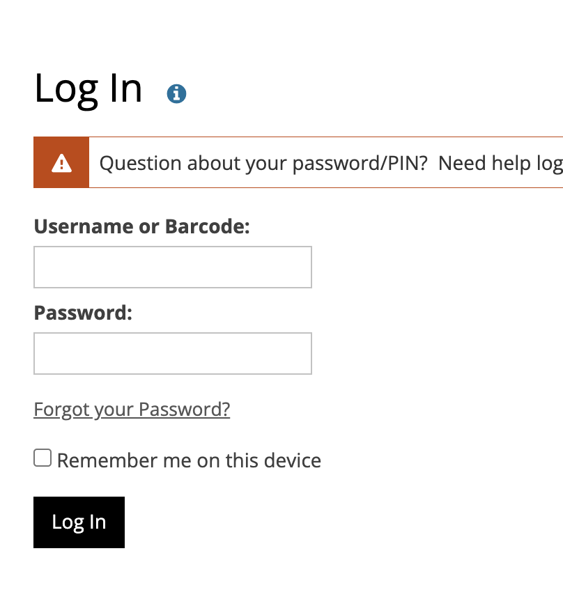
A textarea placeholder should be intentional, and always have a specific purpose. Don’t leave out textarea placeholders or instructions on your forms. Otherwise your users will be left with a nondescript web form like this local library’s example of no placeholders below:
❌ Don’t replace labels
Placeholder text should generally supplement and not replace form labels. Visible labels are recommended by the Web Content Accessibility Guidelines (WCAG) because a textarea placeholder disappears when a user types in the field. This creates a more accessible web app.
✅ Do keep it short and informative
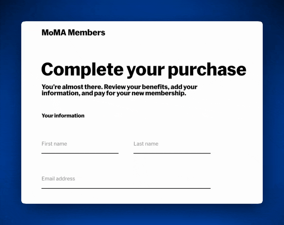
Any textarea placeholder should contain focused, supplemental information. As long as it remains useful, it aligns with best practices. Here’s a great example of that’s simple, informative, and dynamic on the American Museum of Modern Art’s website.
✅ Do maintain visual accessibility
Low-contrast placeholder text can be a real hassle for users with visual impairments. According to usability.gov, it’s best to make sure web apps maintain proper color contrast for textarea placeholders so they remain readable.
To maintain ideal accessibility, have purpose and clarity in your web apps, and increase user traffic, these best practices need to be habits for your team. Investing time in great textarea placeholders on every part of your web app is worth the return on investment: stronger, more intuitive applications.
Placeholder text examples and guidelines for effective usage
Now that you know the best practices, let’s look at a few more quick examples. Clear, meaningful placeholders guide users effectively without causing confusion. Here are some differences between good and bad placeholder text.
Effective Placeholder Text
- ✅ Search Bar: "Search for articles, topics, or authors"
- ✅ Feedback Form: "Tell us about your experience (max 500 words)"
- ✅ Legal application: “Old driver’s license number”
Ineffective Placeholder Text
- ❌ Vague: "Enter text here..."
- ❌ Overly Long: "Please write a detailed explanation of your experience, including specifics about what you liked and what could be improved."
- ❌ Fake values: “1-800-123-4567”
UX impact and research insights on placeholder text
So, does a textarea placeholder really help? The answer: it depends on how you use it.
Poorly implemented placeholders can lead to user frustration, increased input errors, and accessibility issues. WebAIM analyzed a million home pages and found that a staggering 39% of the 4.4 million form inputs weren’t properly labeled. This makes web forms a major accessibility headache.
Studies do also show that users tend to ignore placeholder text, especially when it blends too much into the UI. To make placeholders work for you, ensure good contrast, use them as supplemental to labels, and avoid relying on them for critical instructions.
Conclusion
Thanks for exploring what placeholder text is and why it’s important in web development. Using a textarea placeholder properly requires a balance of usability, accessibility, and design. Every user in every application is different, though as we create any product we hope to create a consistent experience. Though many users behave the same way, it’s best to assume that there needs to be clear, helpful, and accessible information in a textarea placeholder. This way your web app is compliant and a better experience for your users.


